
HUMAN OS website design
UX/UI for an interactive site where the interface is not the hero. 49 screen-states instead of pages and scrolling: one scene — one viewport, a photograph or material in the foreground, data as a thin line on the side. I designed the scene structure, navigation, a dark design system with an accent for every module, flat controls, rules for motion and sound, responsive behaviour and accessibility.
01 / the task
A site without pages: one viewport, 49 states and an interface that gives way to the body
An ordinary site can be shown as a stack of sections. Here that is impossible: the user's path is a drama of 49 screens with a boot, four chapters, returns to the main map and a finale. The interface must lead but not command: no scores, no progress in percent, no “best next step”.
So the design rests on three decisions: a scene always takes one screen, a photograph or material stays the main element, and the whole UI is reduced to a thin mono line and flat buttons. Everything else — the dark palette, the typography and the motion — is subordinate to this.
02 / scene structure
Anatomy of a screen: five zones repeated in every one of the 49 scenes
Every scene is assembled from the same frame. The user does not relearn the interface: only the scene content changes, while the position of the title, the stage, the readouts and the buttons does not.
- Header. On the left the HUMAN_OS wordmark, on the right the process label (“Process 01 / Sleep”). Nothing else is in the header.
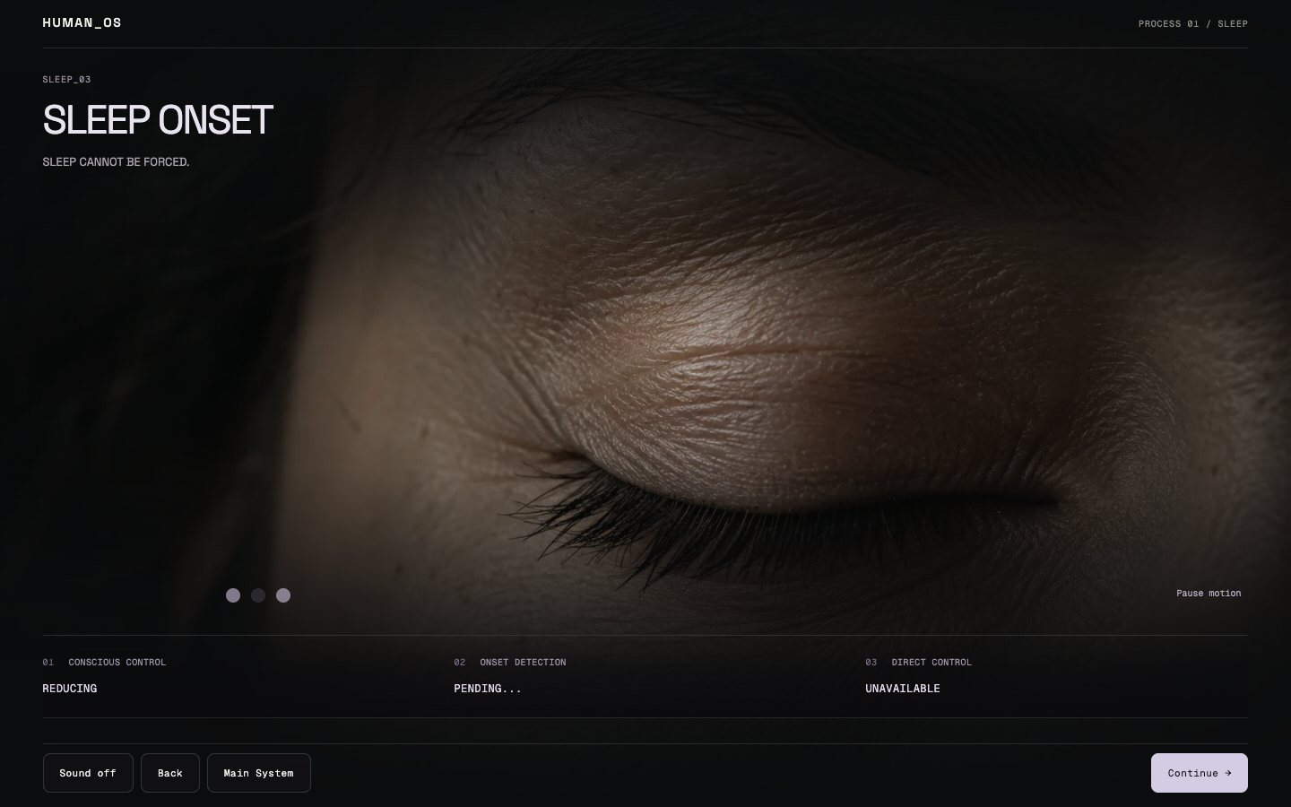
- Code and title. A service scene code (SLEEP_03) in mono and a large title of 1–2 lines, with one statement phrase under it.
- Stage. A photograph or material across the full width with darkened edges — the body or the object is stronger than the data.
- Readouts. Three “parameter — state” pairs in a row: categories and words instead of numbers and percentages.
- Control bar. Sound, Back, Main System when needed, and one primary Continue button on the right — always in the same place.
- Fixed places. Buttons do not jump between scenes: in any scene you can go back, and the exit to the main map is in the same spot.
03 / navigation
A flow of 49 states that can be held in the head
Navigation is a finite-state machine. Every state is reachable and testable, and the user is never lost: there is always a step back and a return to the main map.
- One line. The path goes strictly forward: Boot → Main → four chapters → Optimization → Reveal; the main map returns after each chapter.
- The map changes. The main map updates after each chapter: first “structured”, then “interdependent”, “permeable” and “incomplete” — that is the progress, without percentages.
- Events. NEXT, BACK, RETURN_MAIN, OPEN_MODULE: four actions cover the whole experience, so the interface stays simple.
- No auto-navigation. The system does not choose the order of chapters for the user and does not suggest a “best” next one.
04 / screens
Nine key screens and the patterns they rest on
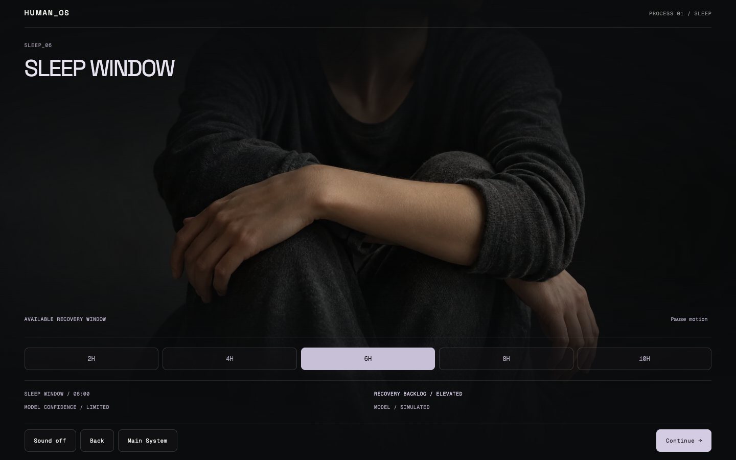
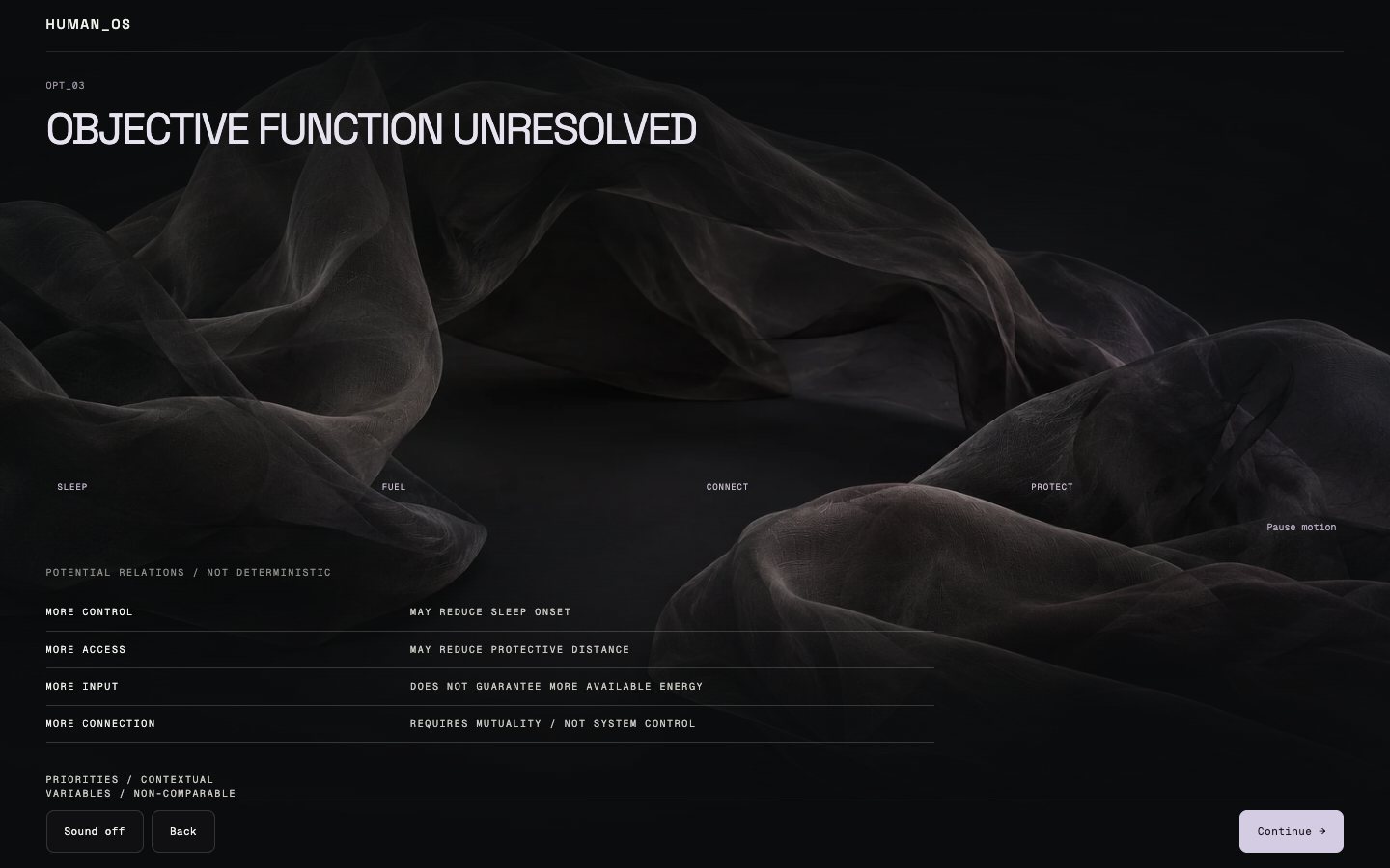
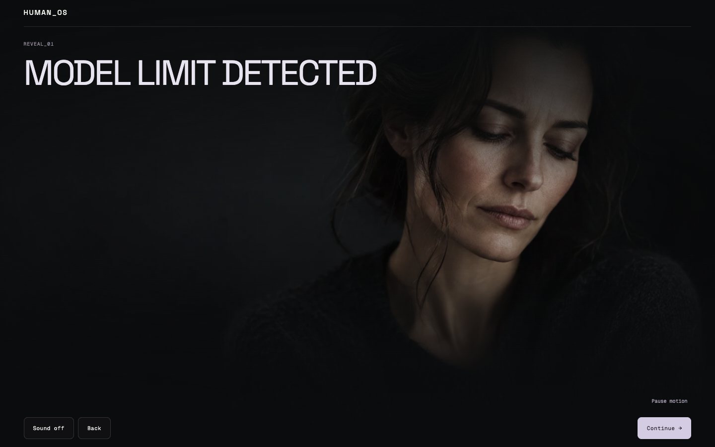
The shots are taken from the running site at 1440×900. Each screen shows one interaction pattern.




05 / design system
A dark design system on CSS variables: colour, type, spacing, motion and components
The whole system lives in one tokens file and CSS modules: 45 components, 33 style modules. It is broken down below in full — this is live HTML with values from the working code.
Colour
A dark base and warm grey text; colour appears only as a module accentThe palette deliberately has no saturated colours: the four module accents are muted, and the control accent is lighter and taken from the active module. “Green = good” and “red = bad” are forbidden in the system.
Background and text
Lines and opacity
Module accents
Control accents
Typography
Two typefaces: Space Grotesk for text and Geist Mono for system labelsHeadings are dense with tight leading; labels and readouts are mono, tracked at 0.16 em and in capitals. The scale has nine steps from 11 to 128 px (the last is fluid).
Conscious control is reducing, direct control is unavailable.
SIMULATED SYSTEM MODEL
--fs-00 · 11 pxHuman OS--fs-0 · 12 pxHuman OS--fs-1 · 14 pxHuman OS--fs-2 · 16 pxHuman OS--fs-3 · 20 pxHuman OS--fs-4 · 28 pxHuman OS--fs-5 · 40 pxHuman OS--fs-6 · 64 pxHuman OS--fs-7 · 64–128 pxHuman OSSpacing, radii and layers
Ten spacing steps from 4 to 128 pxSpacing follows the scale 4-8-12-16-24-32-48-64-96-128. Radii are minimal — 0, 2 and 6 px (buttons 8 px), lines are 1 px with two opacity levels, and there are six z-index layers from the background to the modal.
Spacing steps
Radii
z-index layers
| --z-bg | 0 |
| --z-media | 10 |
| --z-trace | 20 |
| --z-ui | 30 |
| --z-nav | 40 |
| --z-modal | 50 |
Motion
Five durations and three curves — every movement has a causeFast (160 ms) — control reactions, UI (280 ms) — interface elements, scene (700 ms) — scene changes, slow (1.4 s) — background fields, biological (2.2 s) — breathing and trace. There are three curves: UI, scene and “biological”.
Duration
| Token | Duration | Where it is used | |
|---|---|---|---|
| --dur-fast | 160 ms | control reactions | |
| --dur-ui | 280 ms | interface elements | |
| --dur-scene | 700 ms | scene changes | |
| --dur-slow | 1400 ms | background fields | |
| --dur-biological | 2200 ms | breathing and trace |
Curves
| --ease-ui | cubic-bezier(.22,.61,.36,1) |
| --ease-scene | cubic-bezier(.16,1,.3,1) |
| --ease-biological | cubic-bezier(.37,0,.63,1) |
Components
Flat controls: state is read from fill, not from shadowButtons have no shadows or gradients: the primary action and the selected state are a solid fill with the module accent, the disabled state is a muted grey. Focus is a 2 px outline with a 3 px offset.
Primary button
Continue →Selected
Sound onDefault
BackDisabled
Continue →Focus
Main SystemSegmented control
Readout
Process label
PROCESS 01 / SLEEP
06 / motion and sound
The rules by which the interface moves and sounds
Motion here is not decoration but a message. If an animation has no cause (light, breathing, loss of cursor control), it does not exist.
| Rule | How it is done |
|---|---|
| Cause | every movement is tied to an event: falling asleep switches off cursor influence, breathing sets the pace of the trace |
| Less interface | as uncertainty grows, the UI disappears first, while the body and material remain |
| No “errors” | Optimization failed is not a red screen or a glitch: the interface goes quiet while the system keeps breathing |
| Reduced motion | 94 places respect prefers-reduced-motion; there is also a separate “Pause motion” button on every scene |
| Sound on request | five ambient tracks start only on the “Sound” button, with no success or alarm tones |
07 / responsive
A phone is not a shrunken desktop: the same frame, different priorities
The scene rearranges across four ranges (1440+, 1024–1439, 768–1023 and below 768 px). On mobile everything that needs a cursor is removed, and the control bar takes the lower part of the screen.
- Touch. All buttons are at least 44×44 px, with no cursor logic on touch screens: falling asleep, for example, works without it.
- The same scenes. The scene frame stays: title, photo, readouts, bar — top to bottom; the readouts turn into a column.
- Connect. Two humans do not turn into a vertical priority list: both keep the same status.
- Low height. A separate rule for screens below 740 px so that the control bar does not cover the scene.


| Range | What changes |
|---|---|
| 1440+ | Full scene: a full-width photo, readouts in three columns |
| 1024–1439 | The scene compresses, the readouts stay in a row |
| 768–1023 | Tablet: readouts in two columns, a denser control bar |
| < 768 | Phone: one column, the control bar at the bottom, no hover actions |
08 / accessibility
Readability and control checked by the numbers
Contrast was calculated per WCAG against #0B0C0D. Main text and accents are above 5:1; the only exception is the “ghost” third text level for decorative labels.
| Token | Colour | Contrast |
|---|---|---|
| --fg-0 | #F1F0EC | 17.2 : 1 |
| --fg-1 | #C9C7C1 | 11.6 : 1 |
| --fg-2 | #8D8C88 | 5.8 : 1 |
| --fg-3 | #64635F | 3.3 : 1 · decor |
| sleep / fuel / connect / protect | #7A819F · #B48B5A · #A67572 · #A77B53 | 5.0–6.3 : 1 |
| controls (4 modules) | #C7C0D6 · #CCBDA9 · #B2C9D2 · #C7B8CA | 10.4–11.4 : 1 |
- Focus. A 2 px outline in the module accent with a 3 px offset; on ordinary elements 1 px #E7E4DB with a 4 px offset.
- Touch targets. At least 44×44 px for every button.
- States. Selected buttons are marked with aria-pressed and a fill, not by colour alone.
- Screen readers. Service text is hidden with an sr-only class but stays in the accessibility tree.
- Motion and sound. There is a system reduced-motion setting and a manual pause; sound is enabled only by the user.
- Keyboard. The whole path can be walked with the keyboard; there are no hover-only actions.
09 / technology
How it is built
A static Next.js export: the host needs neither Node.js nor a database. The interface is a set of React and TypeScript components, and the states are described by a finite-state machine.
- Next.js 15 (App Router, static export), React 19, TypeScript
- XState 5 for 49 states and navigation events
- CSS Modules and variables: tokens for colour, type, spacing and motion
- GSAP and 5 WebGL shaders for background “fields”
- Web Audio API: five ambient tracks enabled by the user
Discuss a project
Need a website or app design?
Tell me about the project and audience — I will propose the structure, scope, timeline and price.
Order website design10 / other projects of the service