
Government Identity
Taglines, logos and visual identity for public holidays, forums, congresses and anniversaries. Projects below include event materials and greeting cards.
01 / design system
Ustav — a signage system for state institutions

A design system for signs of state institutions: colour shows the field of activity, one template with the coat of arms fits any name, a purpose-built typeface reads from five metres. The pilot is the Republic of Tatarstan, with two state languages.
Open the system →02 / holiday
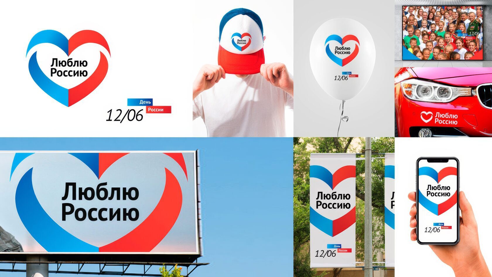
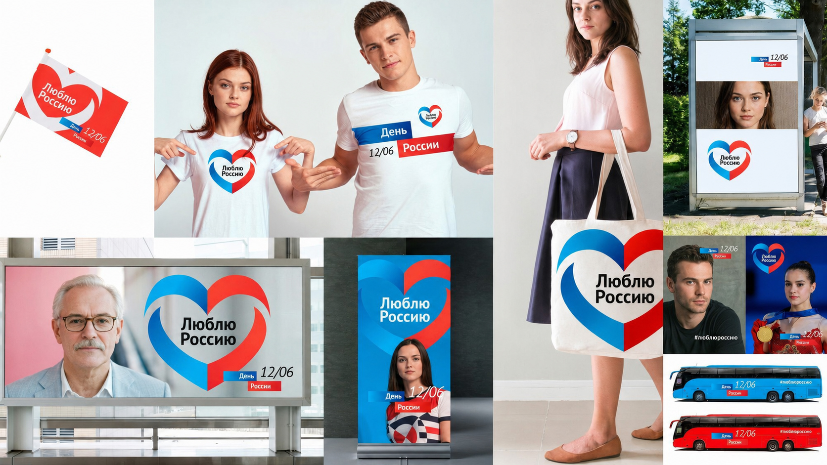
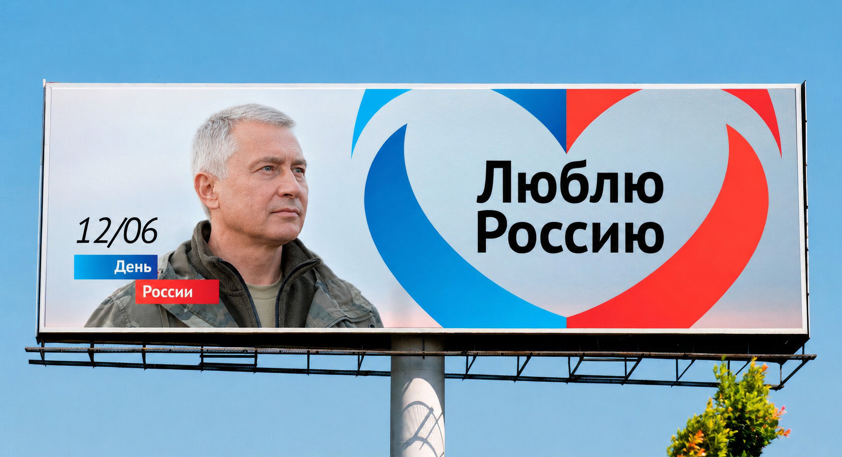
Russia Day

Tagline, logo and visual identity for Russia Day, with examples of event materials.
03 / championship
Kazan 2018
Logo and merchandise for Kazan 2018 — identity for the host city of the FIFA World Cup. At the core of the mark is the Zilant, Kazan's heraldic symbol, set on a ball — legend and sport in one compact emblem that reads equally well on a cap, a t-shirt, and a ball.
04 / infrastructure
Sovereign Internet .РУ
Name and logo for the "Sovereign Internet .РУ" project — a "naming plus identity for infrastructure" brief: it needed a name and mark that sound official and technical at once, without excess metaphor, yet with the recognizable character of the .РУ domain.

05 / congress
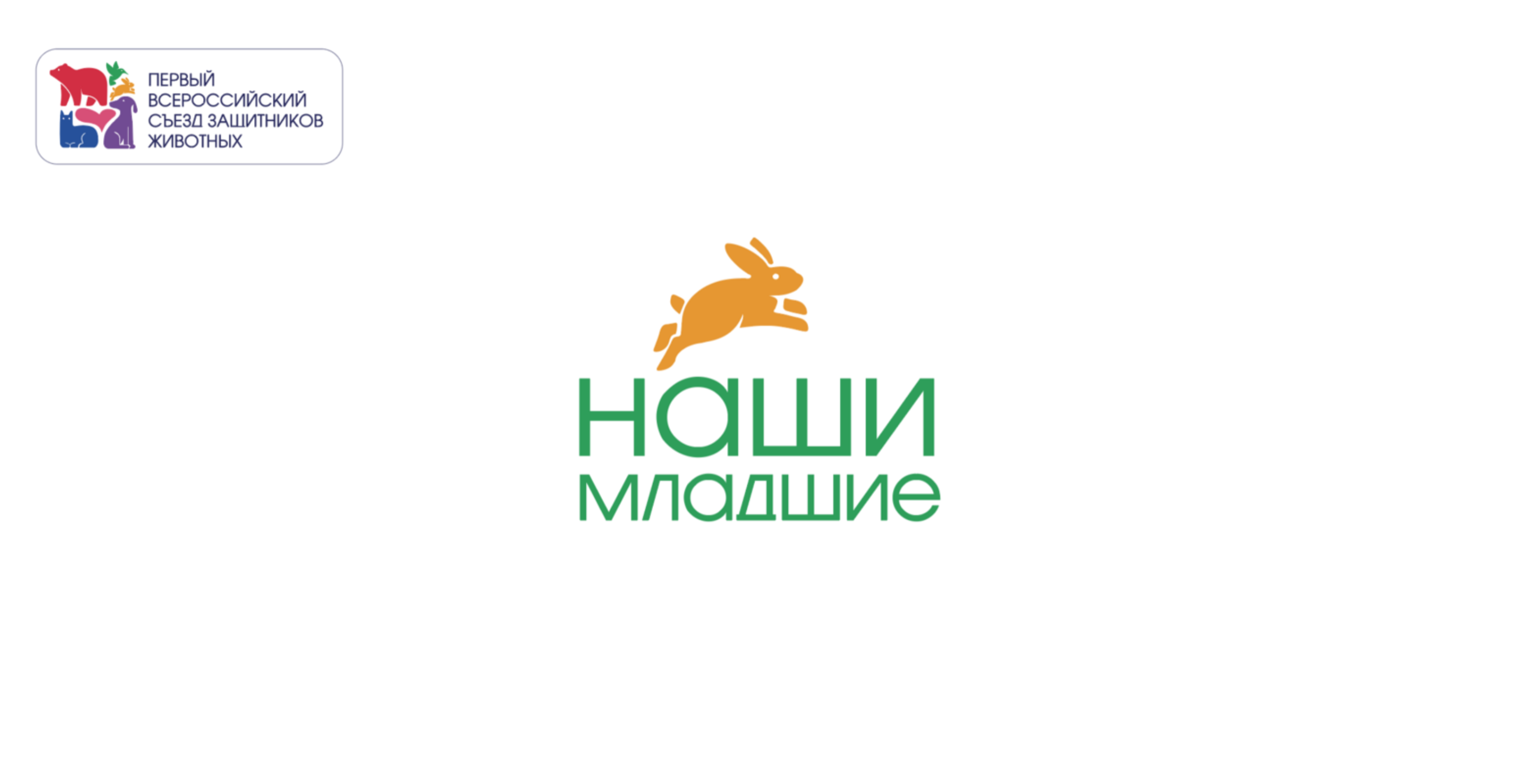
First All-Russian Congress of Animal Advocates
Visual identity, the slogan “Наши младшие” (“Our Little Ones”), indoor signage and merchandise for the First All-Russian Congress of Animal Advocates.
06 / anniversary
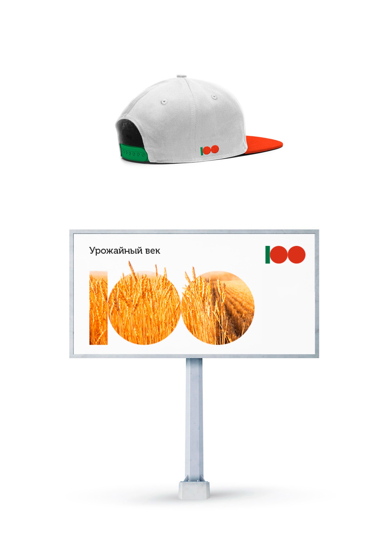
100th Anniversary of the Tatar ASSR
Slogan, logo, and visual identity for the 100th anniversary of the Tatar ASSR — an anniversary identity that had to work both as a solemn state symbol for the date and as material for mass reproduction: from posters to souvenirs.


07 / symbolism
Flag of the Republic of Tatarstan
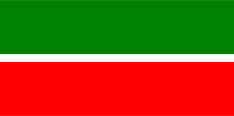
From the Reference Standards for the Construction and Use of Elements of the Official and Business Style of the Republic of Tatarstan: in accordance with Republic of Tatarstan Law No. 2284 of July 14, 1999, "On the State Symbols of the Republic of Tatarstan," the State Flag of the Republic of Tatarstan is a rectangular panel with horizontal stripes of green, white, and red.
Constructing the flag
The white stripe makes up 1/15 of the flag's width and sits between equal-width stripes of green (light cobalt green) and red (light cadmium red). The green stripe is on top. The ratio of the flag's width to its length is 1:2. Approved by Decree of the President of the Republic of Tatarstan No. UP-880 of September 9, 2013. The author of the State Flag is T. G. Khaziakhmetov.
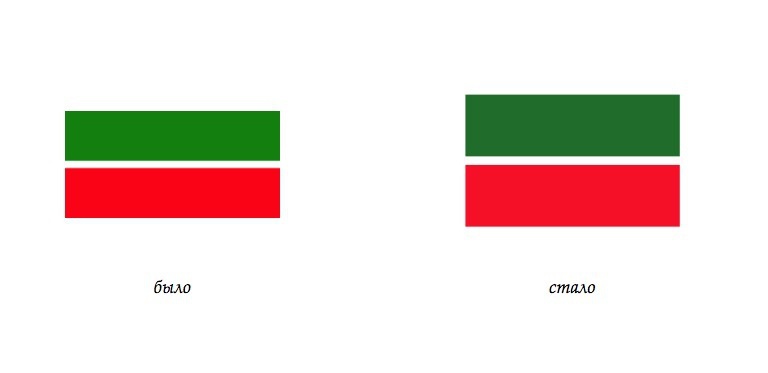
A new construction of the flag using the golden ratio system
This construction uses a grid based on the golden ratio. The diagram shows the proportions and positions of the stripes.

On color
The colors of the State Flag of the Republic of Tatarstan signify: green — the green of spring, the color of Islam, renewal; white — the color of purity; red — maturity, energy, strength, life.
According to another interpretation, the green represents the ethnic Tatars living in the republic, and the red represents ethnic Russians. The white stripe symbolizes peace and accord between them.
The version shown uses bright red and dark spring green.

Comparison
A comparison of the original construction and the proposed version: stripe proportions, grid and colours. This section presents design work on the flag construction.
08 / document
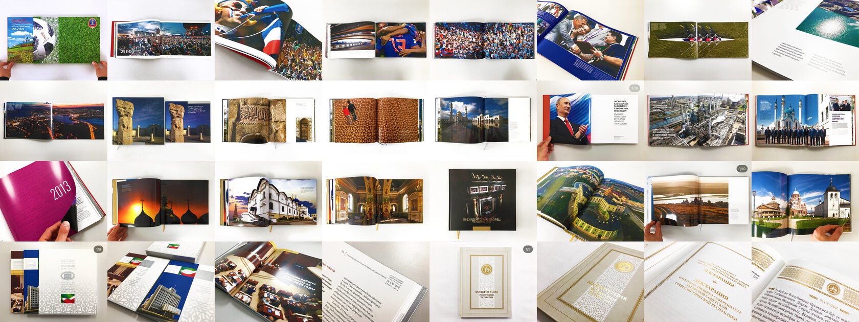
State Book
An official ceremonial book — a format where typography and materials matter just as much as in the rest of a government identity: restraint, quality of execution, and a fitting presence in the hands of officials.
09 / greeting card
Presidential Greeting Card, "70 Years of Victory"
Design of a greeting card from the President of the Republic of Tatarstan for the Victory Day anniversary. The idea drew on the mood of a soldier's homecoming — imagery provided by the National Museum of the Republic of Tatarstan.


- Work done for
- A1 company
- Concept and design
- Evgeny Maksutov
- Lead
- Olga Dubova
- Project manager
- Sergey Abdullin
- Photographer
- Oksana Glushchenko
- Material provided by
- National Museum of the Republic of Tatarstan
10 / investment
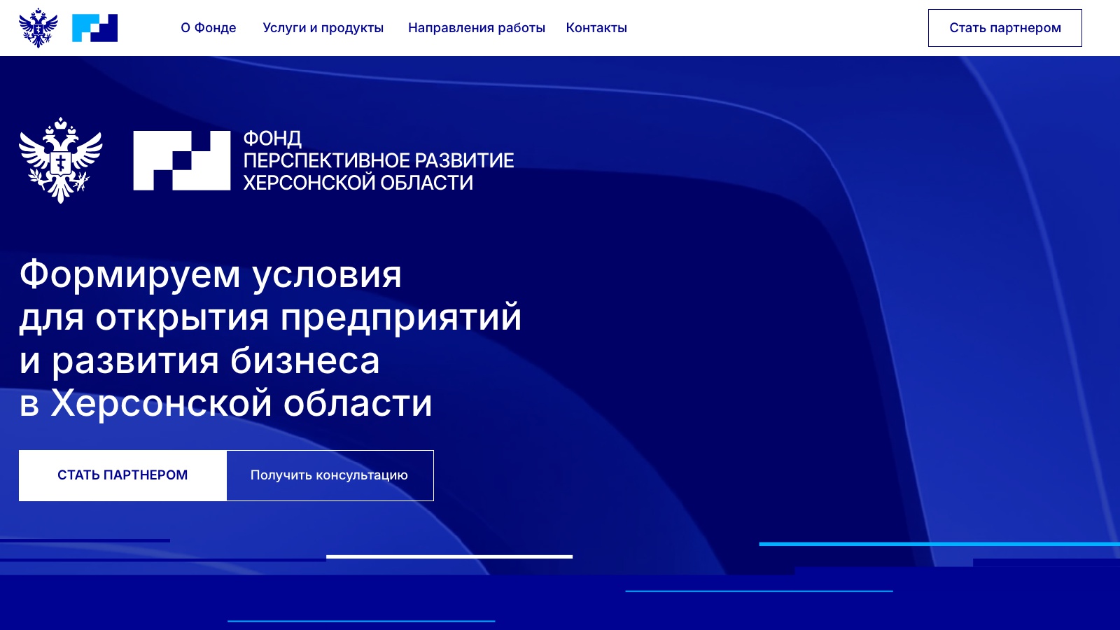
Foundation for the Promising Development of the Kherson Region
Two projects in one: website design for a foundation that supports entrepreneurs in the reunified territories, and a visual identity with staging for the Tavrichesky Investment and Economic Forum (TIEF). The web design brief was to combine an official state tone (coat of arms, strict navigation) with the business clarity of an investment platform: service sections, areas of work, forum figures, and contacts all had to be one or two clicks away, without excess decorative layers.
11 / exhibition
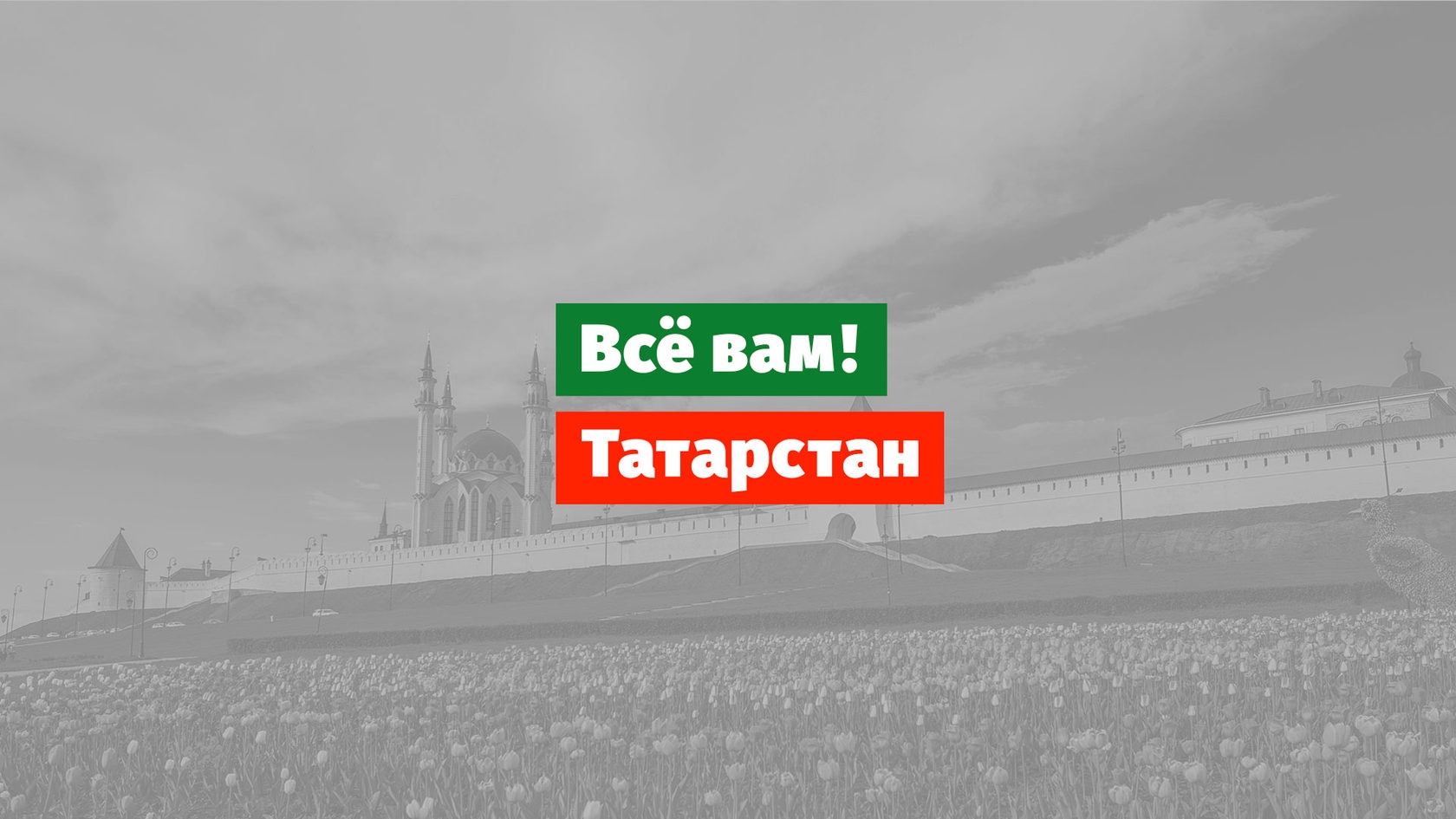
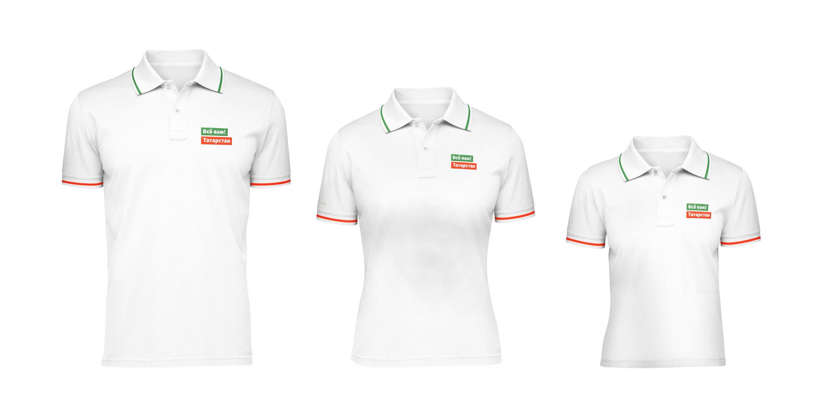
Slogan for the "Everything for You! Tatarstan" Exhibition
Slogan and branded plate for Tatarstan's exhibition stand — a short, welcoming "Everything for you!" instead of long descriptions: the mark works both on a banner with a view of the Kremlin and on the smallest merchandise detail — on the chest of a polo shirt of any size.
12 / ministry
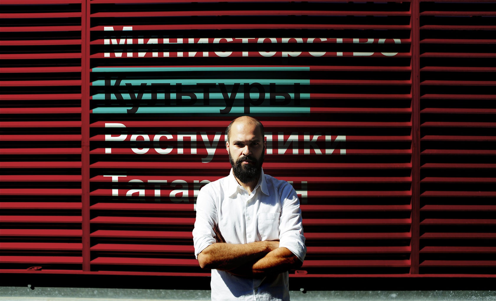
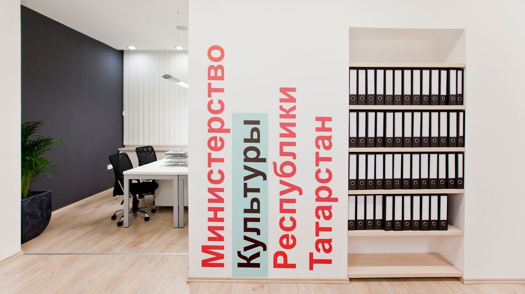
Ministry of Culture of the Republic of Tatarstan
Wayfinding typography for the office of the Ministry of Culture of the Republic of Tatarstan — large vector letters right on the wall work at once as signage, spatial zoning, and part of the interior, and the ministry's logo became part of this system rather than a separate mark at the entrance.
13 / concept
Youth Center Development Concept for Almetyevsk
Presentation created at A1 (Kazan). Lead: Olga Dubova. Art director and designer: Evgenii Maksutov. Project manager: Sergey Abdullin.
14 / settlement identity
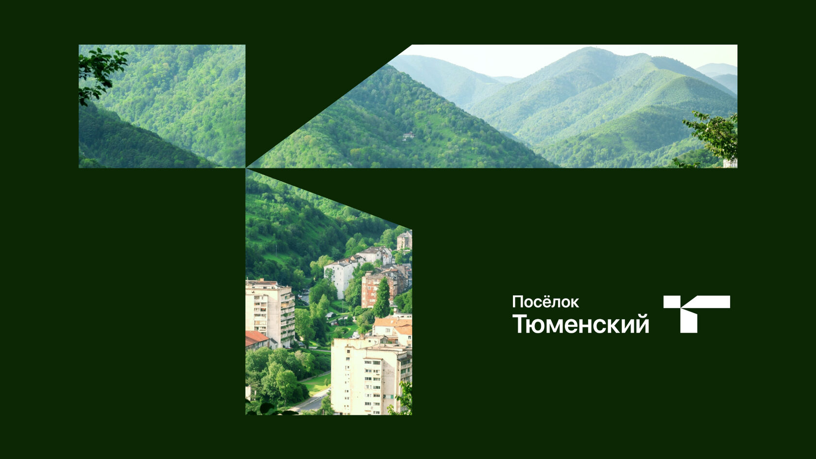
Posyolok Tyumensky
A mark for Posyolok Tyumensky. Coordinates: 44°11′00″ N, 38°58′30″ E.
Government identity for people.
Discuss a project
Need an identity for a region, city or program?
Tell me about the task and audience — we will discuss scope, timeline and price. I have experience with competitions and tenders.
Discuss the projectNext