1 — presentation
Presentation for a Developer
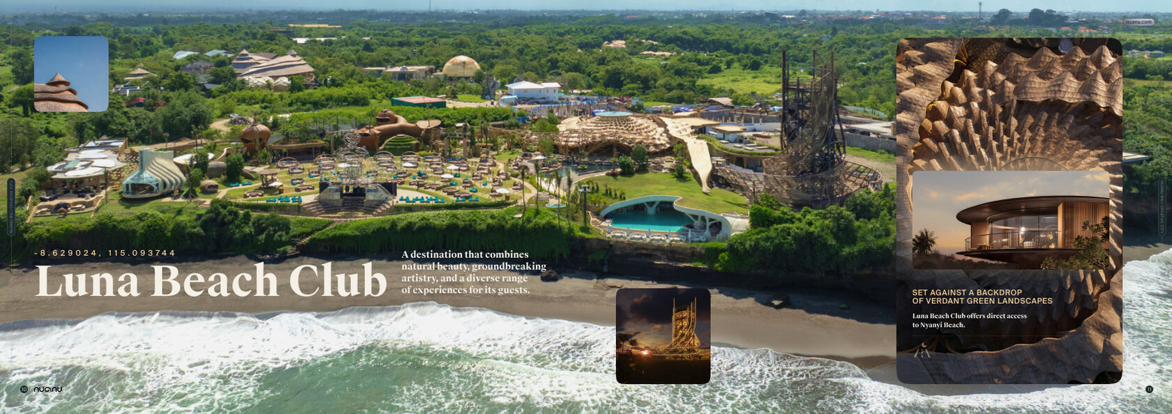
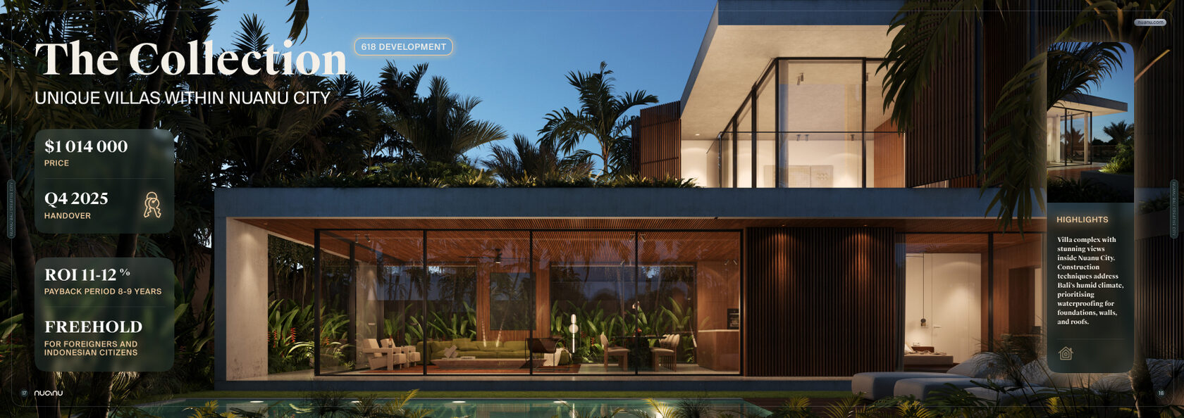
Layout of an investment presentation for the Luna Beach Club resort complex (Nuanu, Bali): spreads with large photographs and project data.


 MAKSUTOV DESIGN
An archive of non-standard projects and concepts: presentations, packaging and web design — things that don’t fit into the usual service categories.
Layout of an investment presentation for the Luna Beach Club resort complex (Nuanu, Bali): spreads with large photographs and project data.
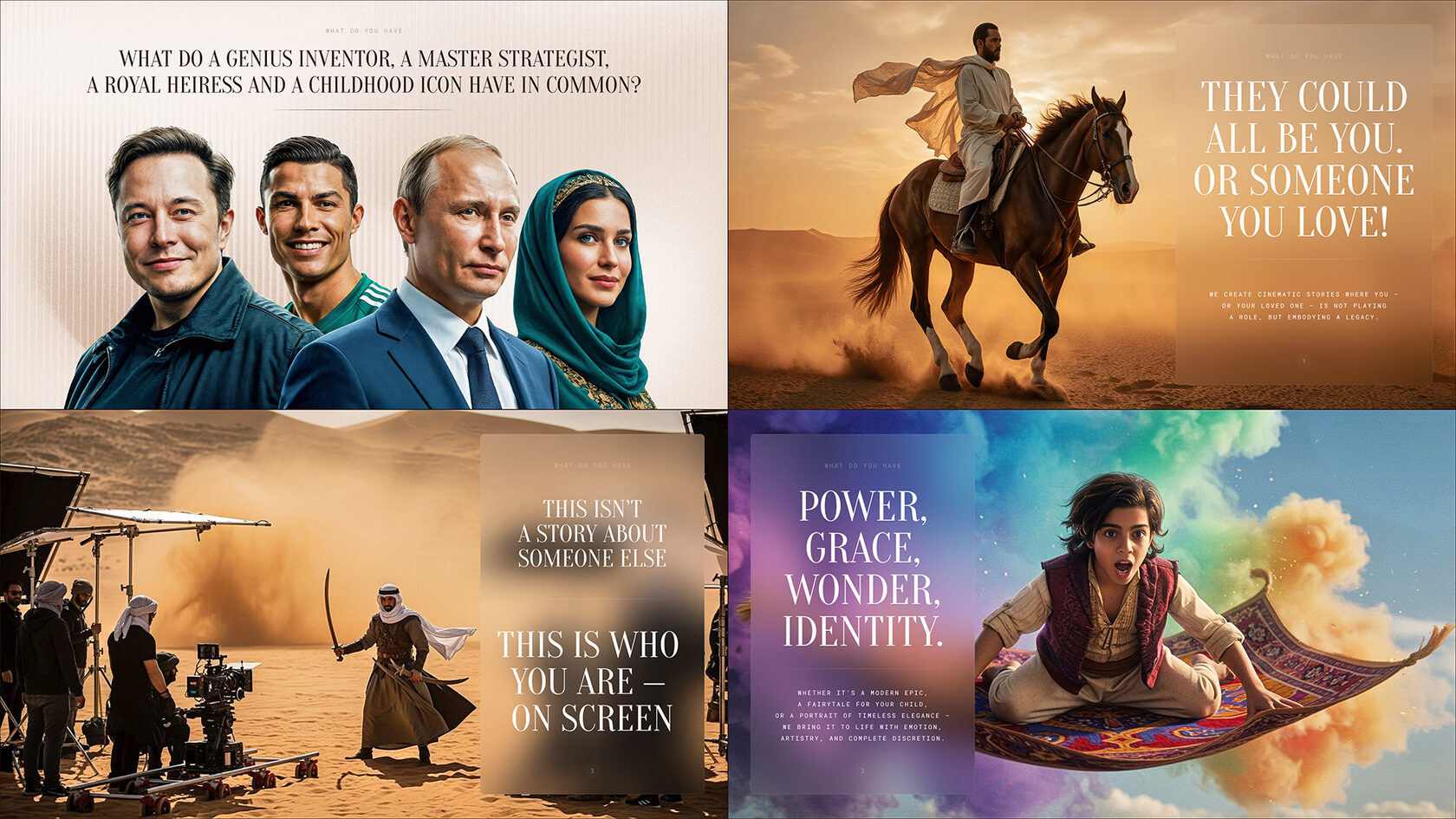
A slide from a media project pitch presentation: a selection of cinematic AI-generated images to showcase the story’s visual style.
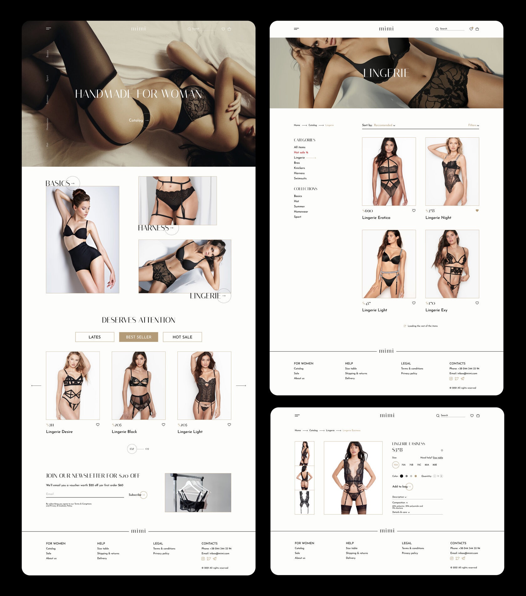
Design of the MIMI lingerie online store: home page, catalog with filters, and a product card.
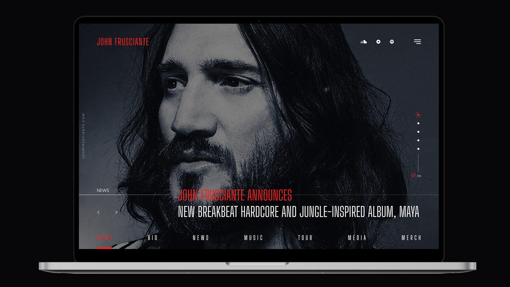
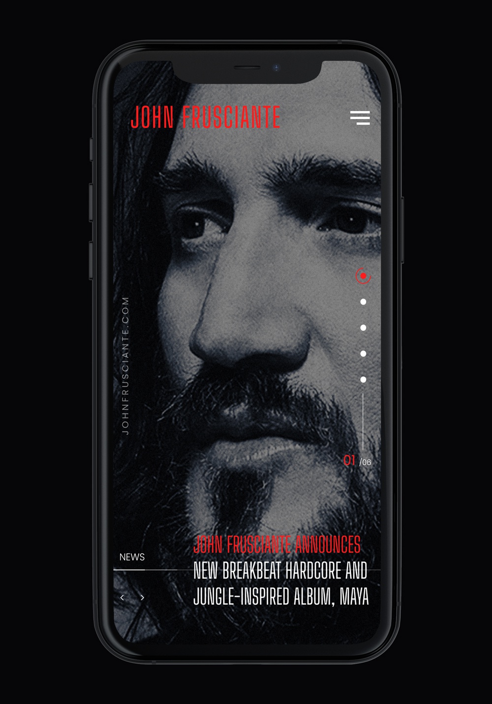
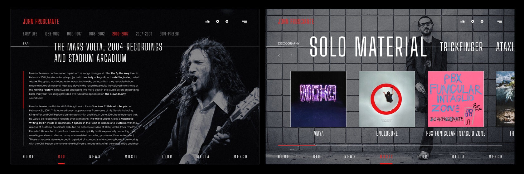
A concept website for musician John Frusciante: a cover with a large portrait, a biography section organized by career periods, and a discography of solo albums and projects.
A concept website for the rock band Psychea: a home page with upcoming concerts and merch, member pages, and a concerts section.


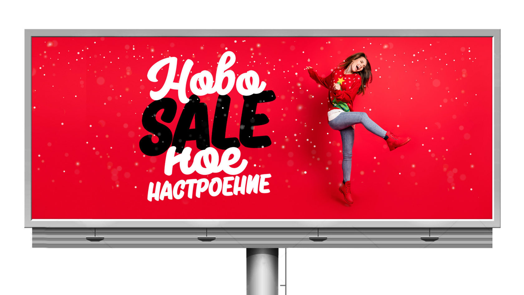
Slogan development and billboard concept: a pun blending “New Year’s” and “sale” for a New Year’s clearance sale.
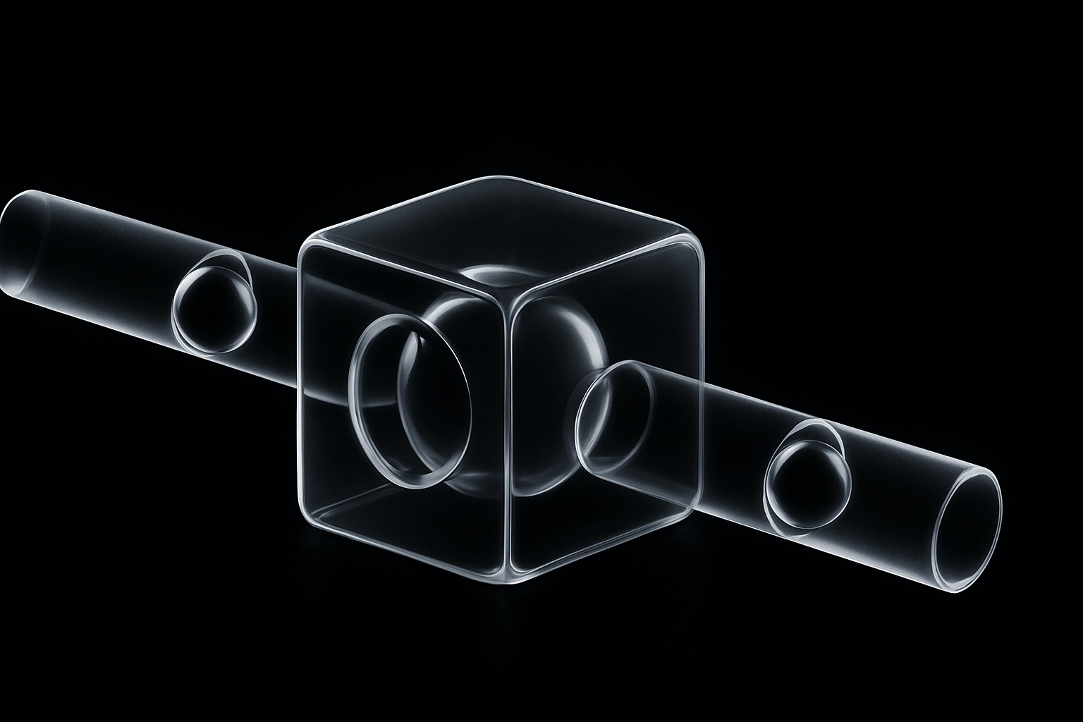
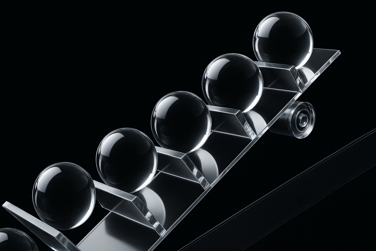
Slides for a corporate presentation: abstract 3D graphics, a transparent render of an executive chair, and a set of service pictograms.


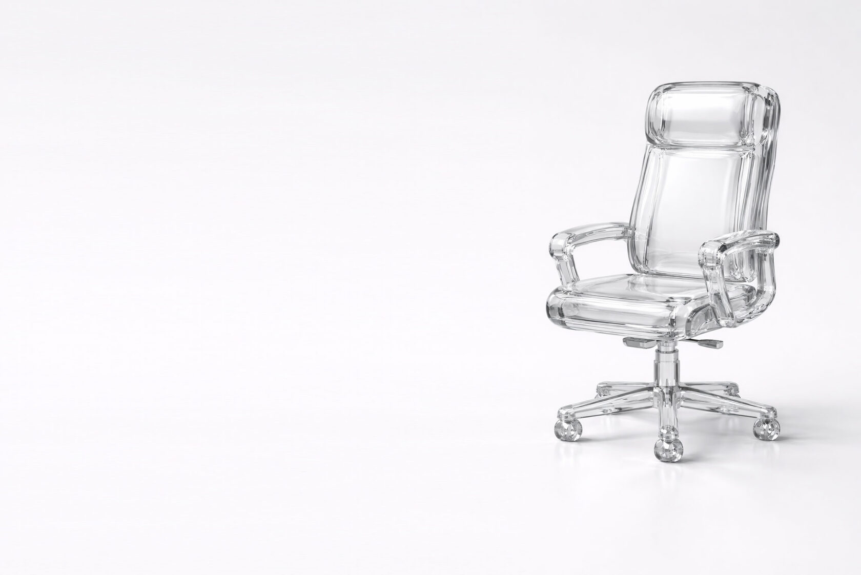


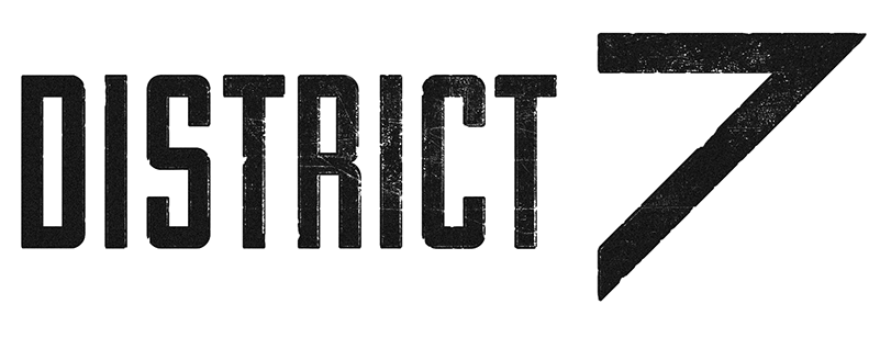
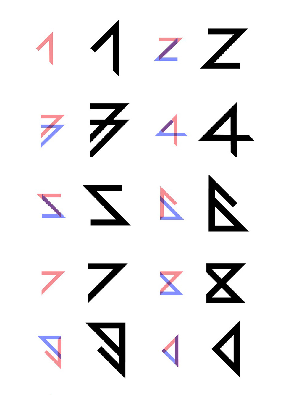
The task: take the branded “seven” from the project’s logo as the starting point.

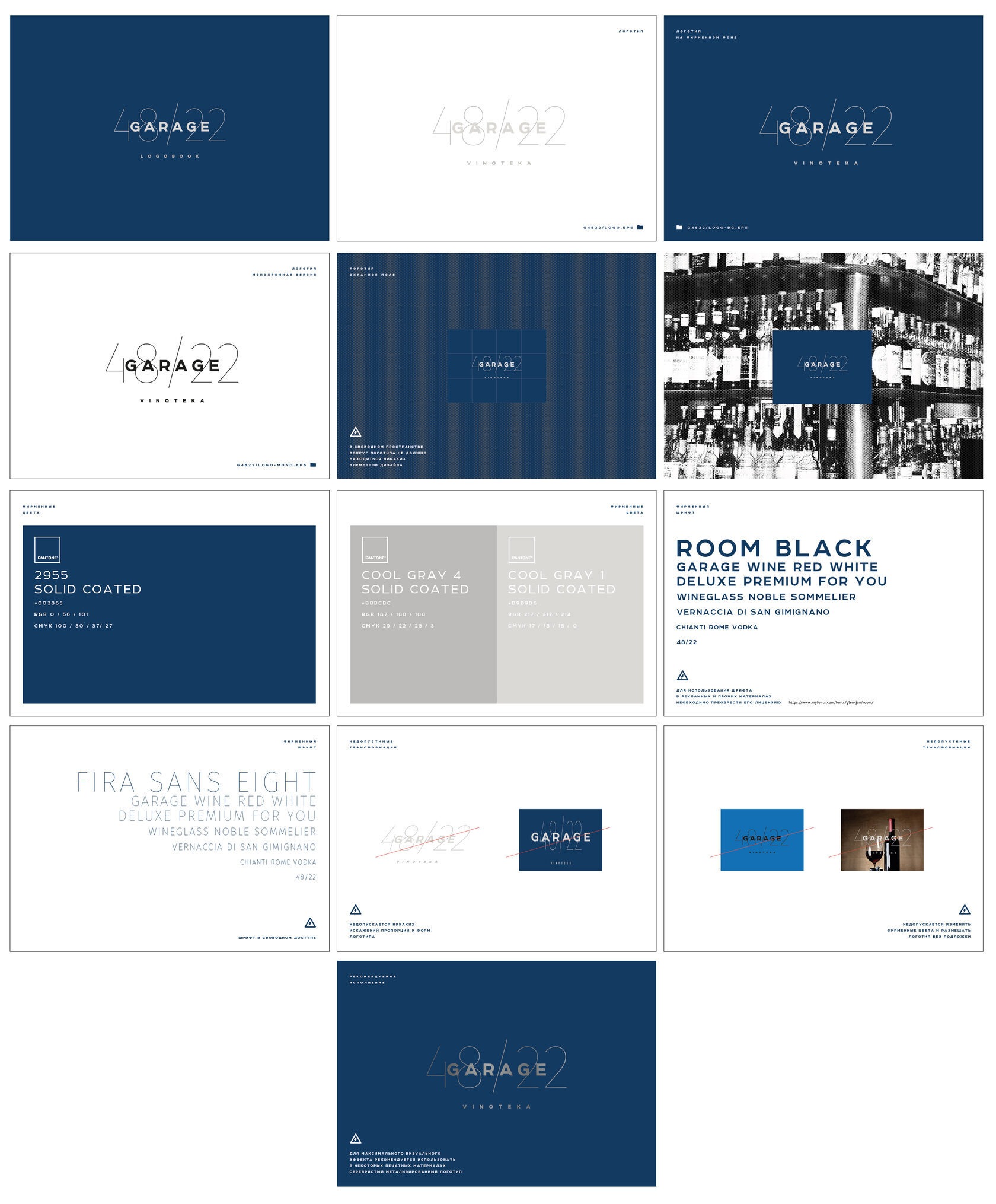
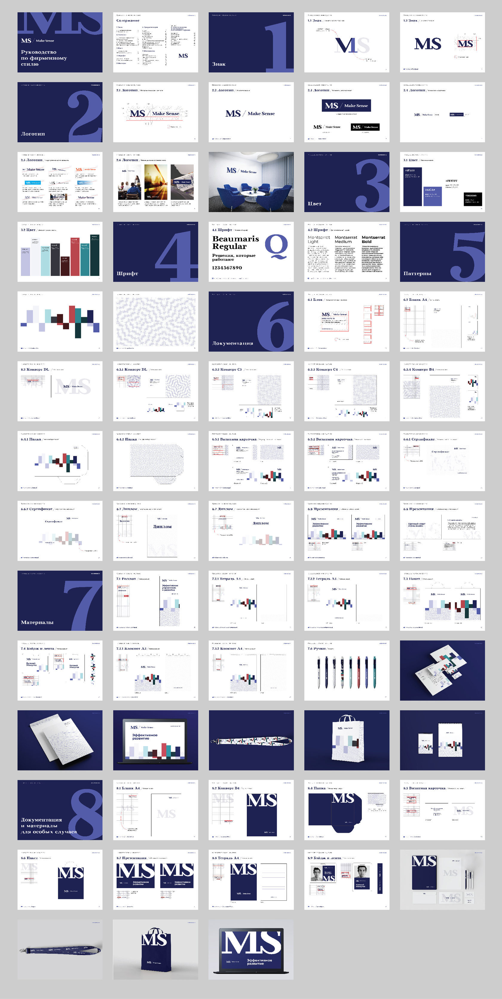
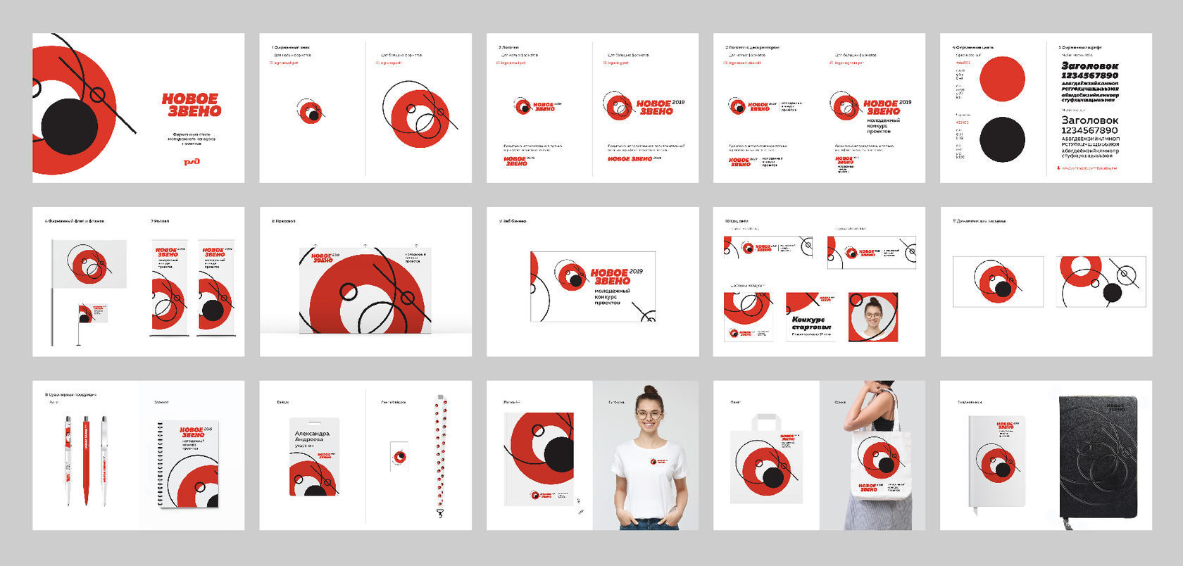
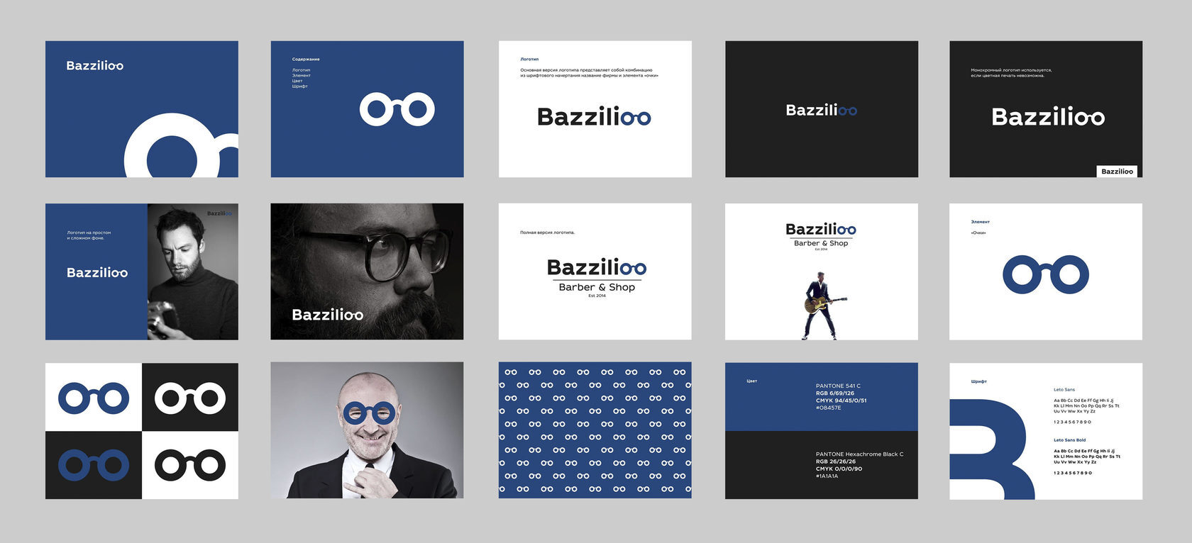
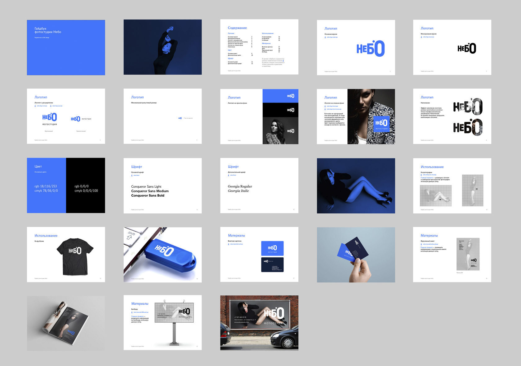
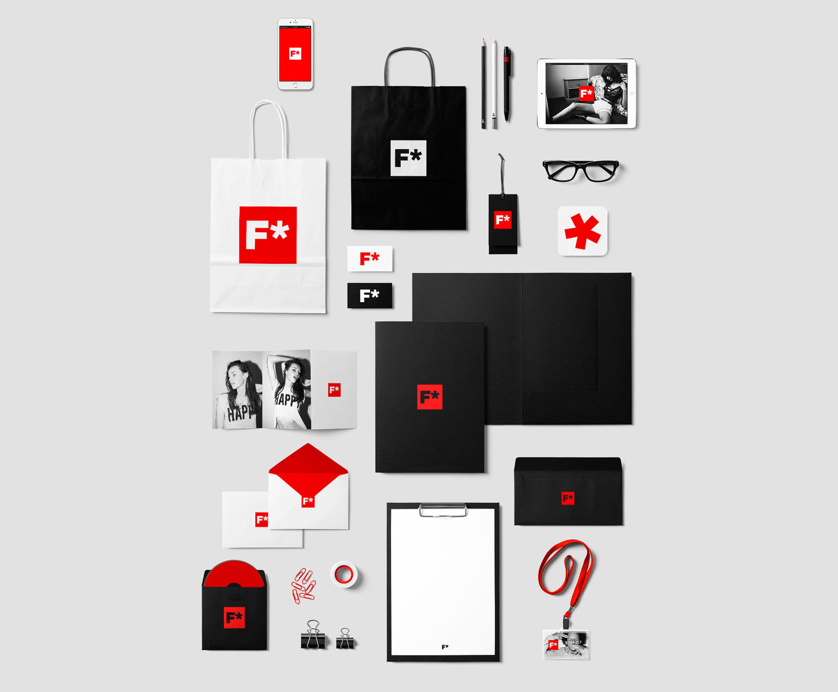
A selection of small brand identity projects: Garage 48/22, Make Sense, «Novoe Zveno 2019,» Bazzilioo, the «Nebo» photo studio, and F* — logo, colors, templates, and collateral for each brand.
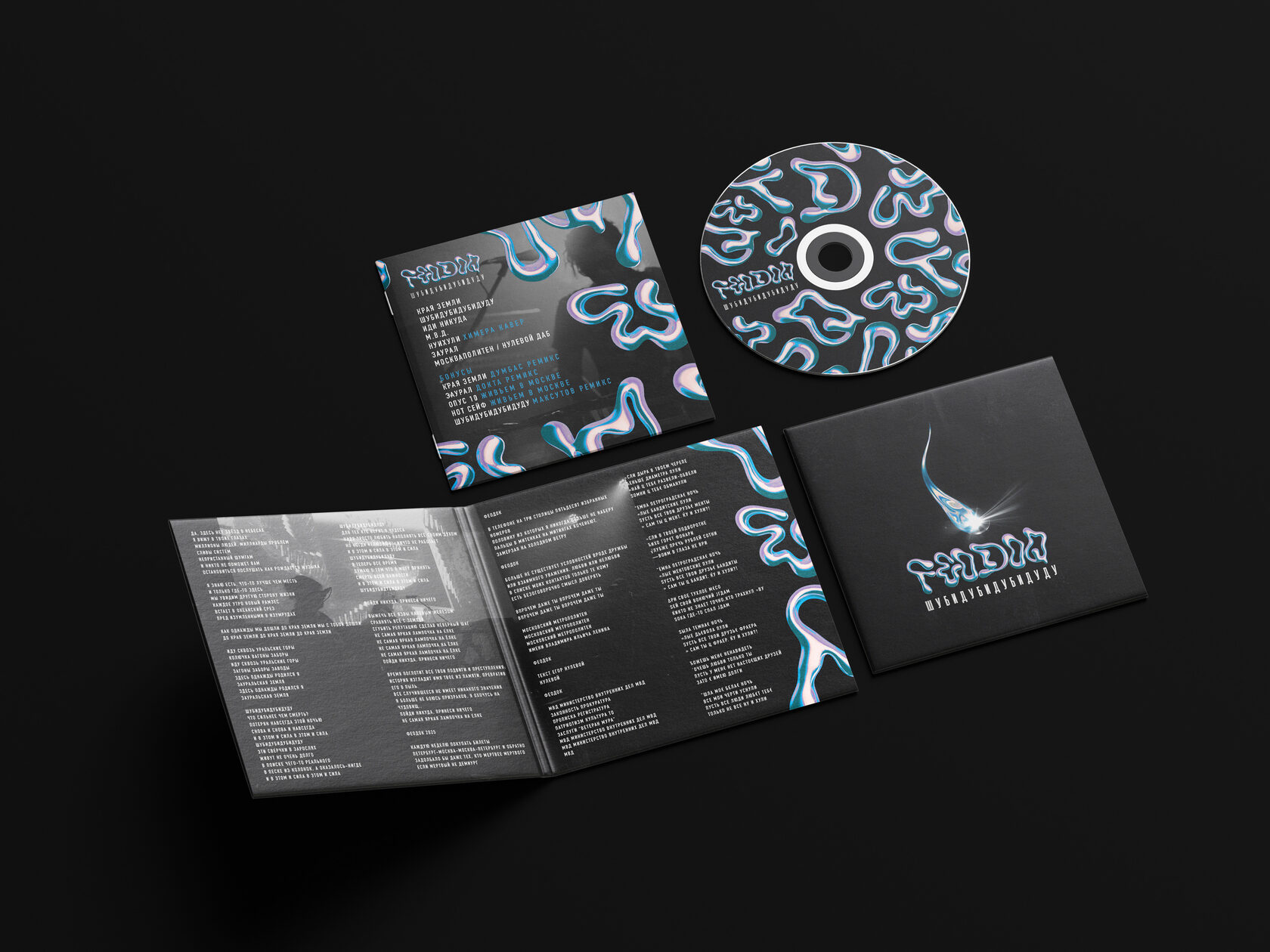
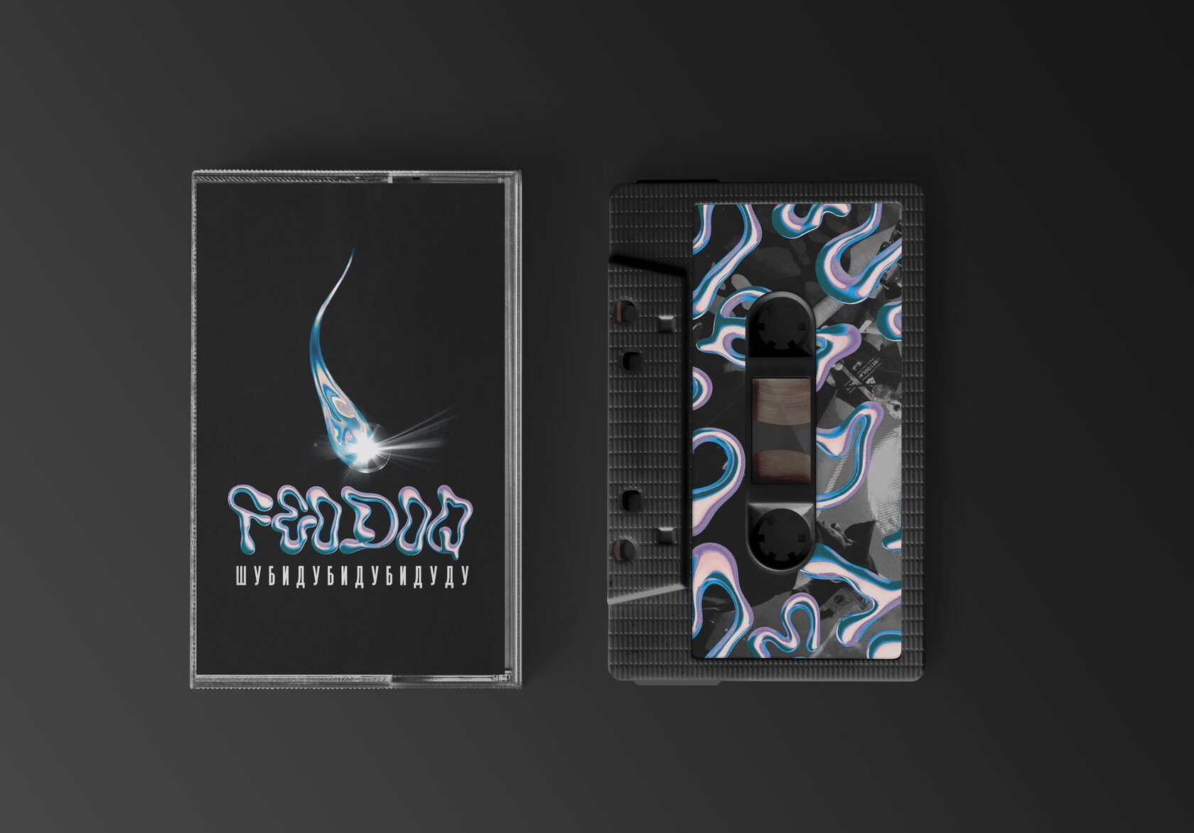
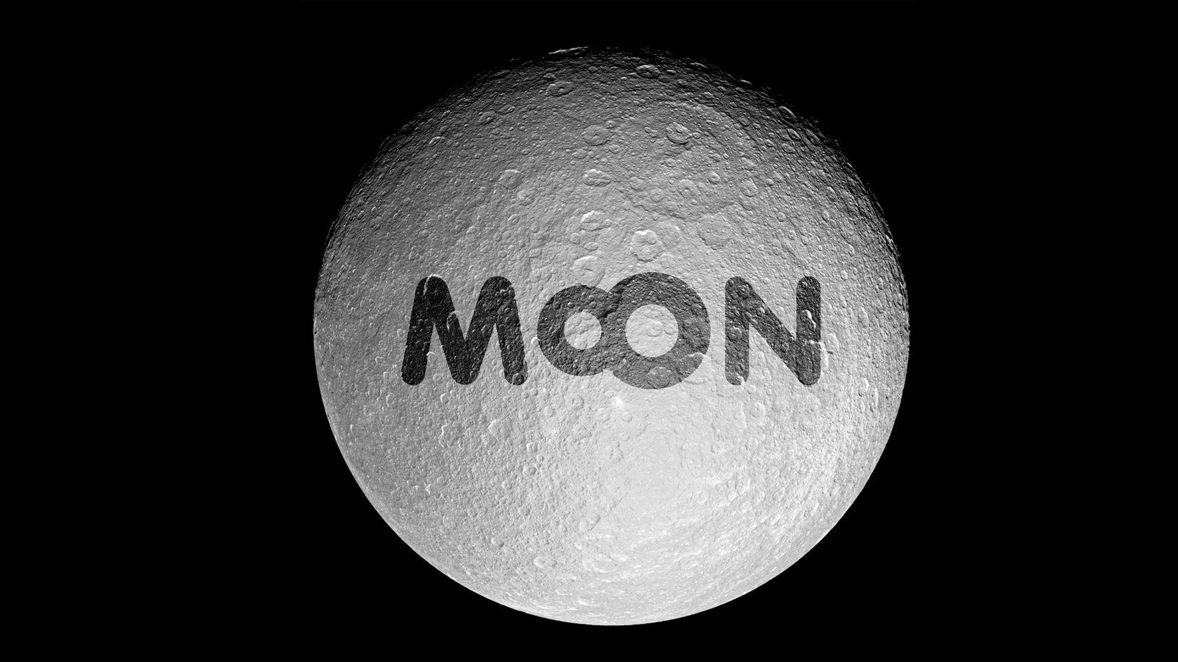
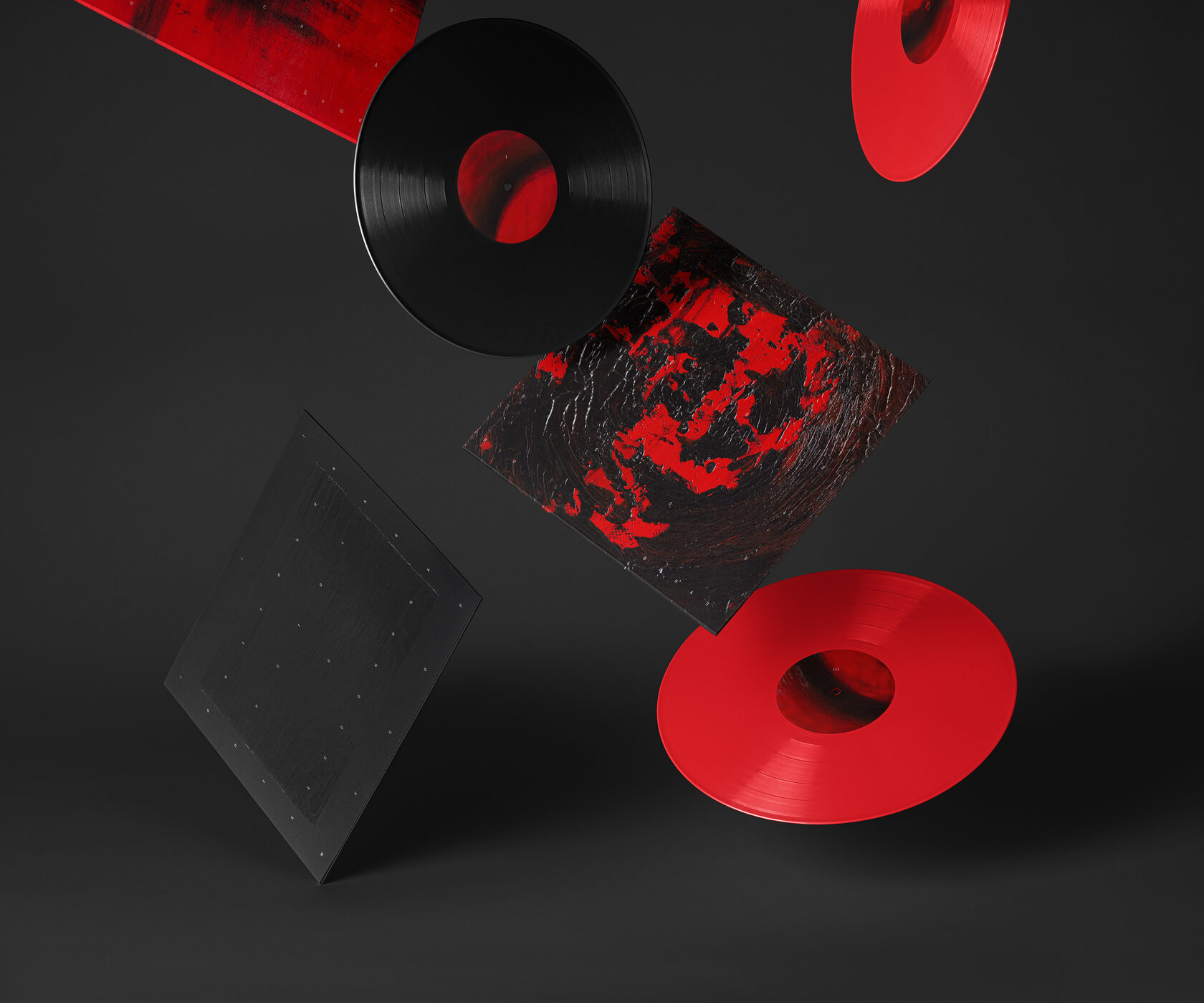
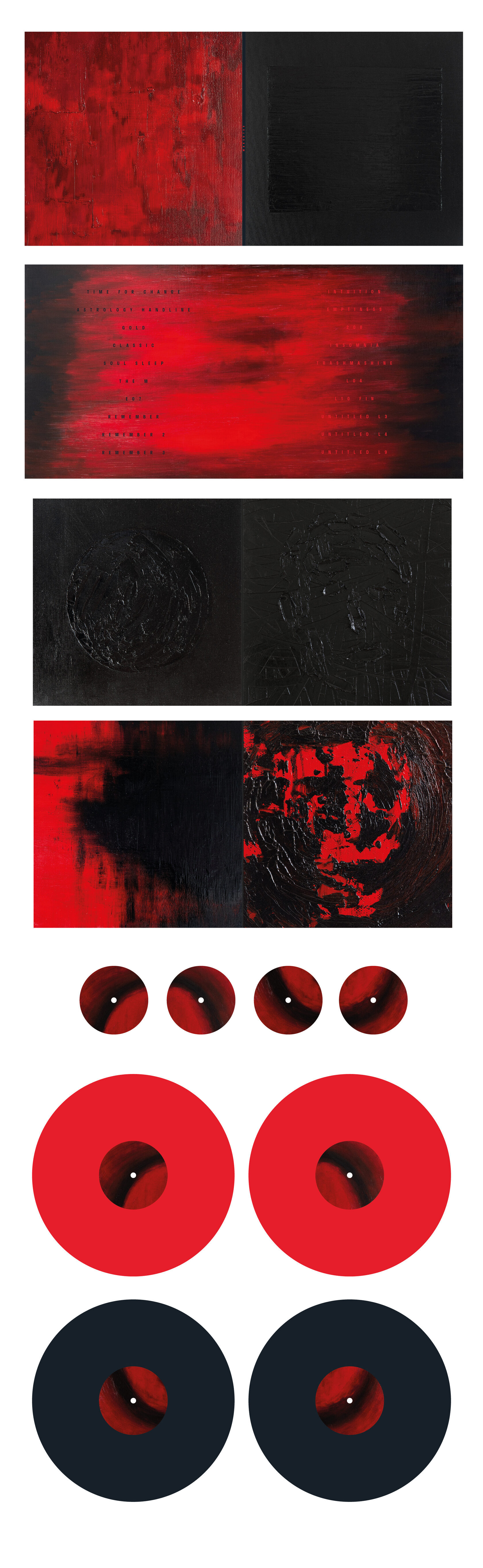
Cover and print design for music releases: the Feodoq CD and cassette, the cover and working disc layout for Dave Bay — «Moon 8,» and concept art for a vinyl record. Listen: Feodoq on VK, Moon 8 on Apple Music.

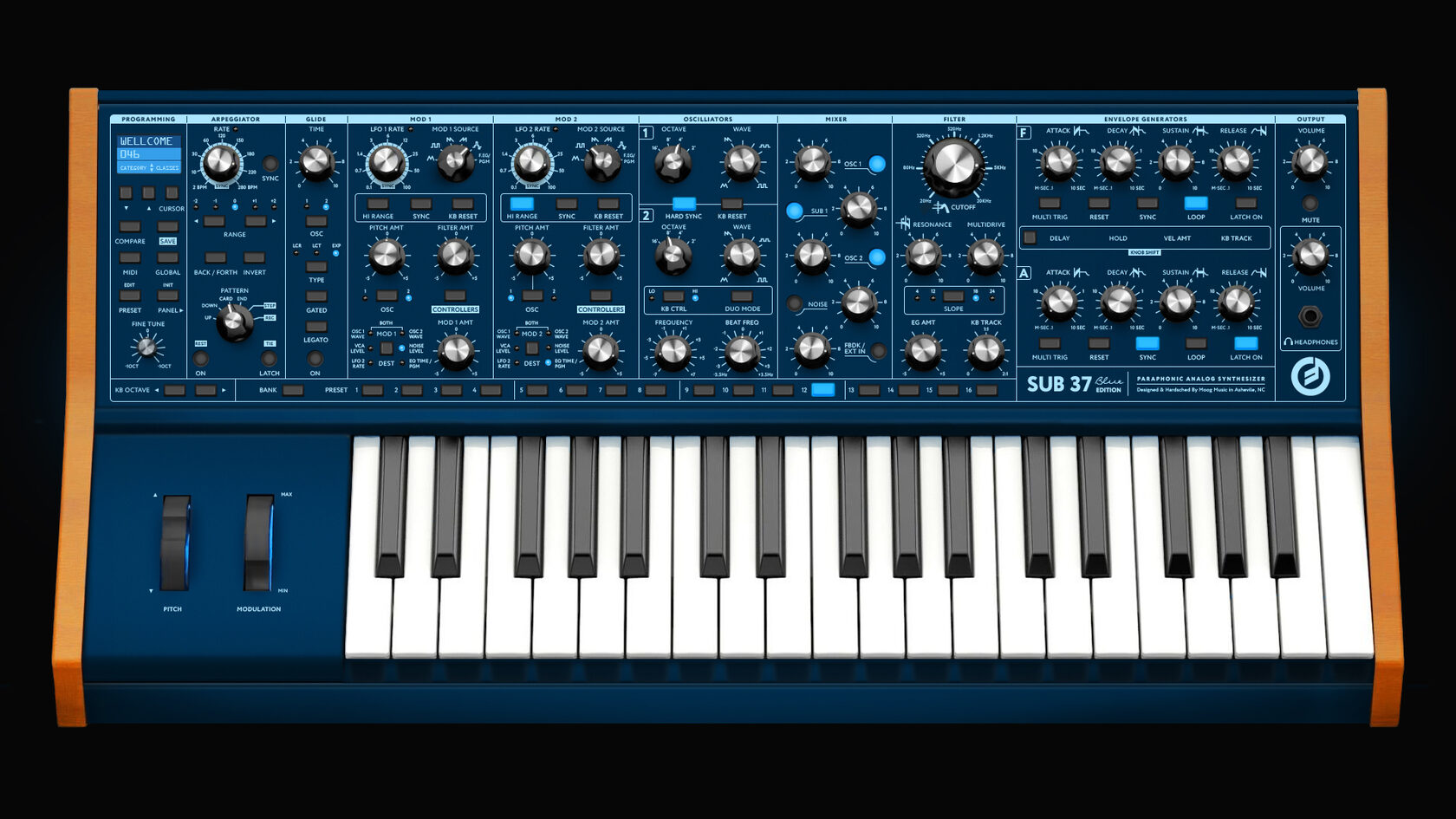
The MOOG Sub37 Blue Edition synthesizer is drawn entirely from scratch in Photoshop — not a photograph or a retouch, but a digital illustration.
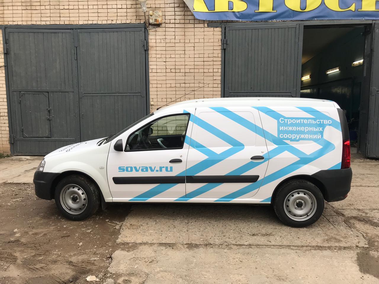
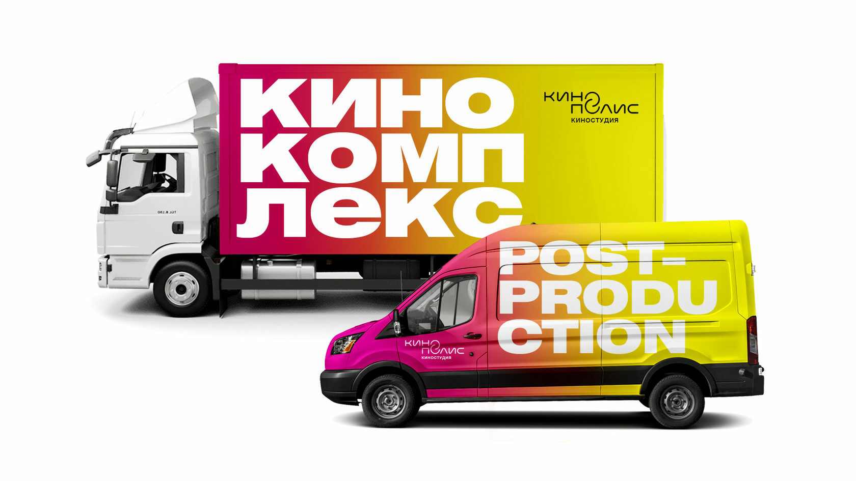
Branding for a company vehicle for SOVAV.RU («Construction of Engineering Structures»): body graphics and logo. The section also includes a bus livery for the Russian Railways «University» project (ORACAL® 970 vinyl wrap) and a livery for a truck and van for «Kinopolis.»


Recommended for full or partial vehicle wraps: ORACAL® 970 (10-year service life)

A set of promotional banners for the «State-Subsidized Mortgage» program: an animated banner and static formats for media placement. Before laying out the banners, an advertising communication concept was written: an analysis of the bank’s mission, identifying «help» as the key message, and segmenting the audience into «social» and «active» groups with different values and expectations from a mortgage.
Art direction for a photo shoot for a restaurant menu: molecular cuisine, soups, cocktails, and seafood. Art director — Evgeny Maksutov, photographer — Oksana Glushchenko.


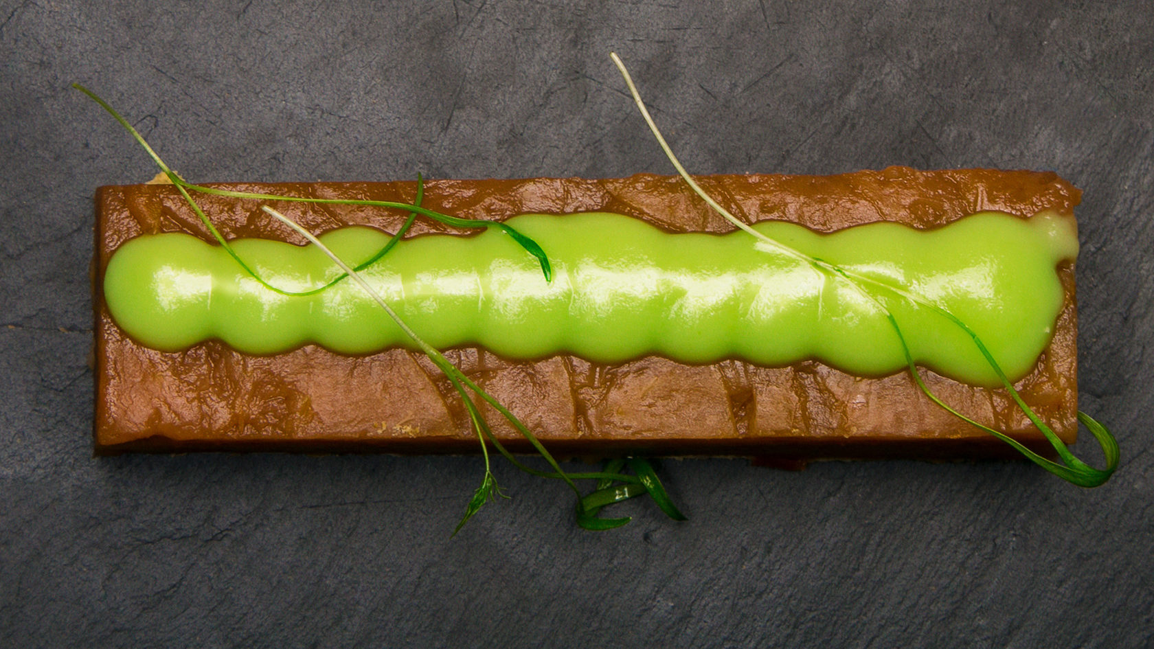
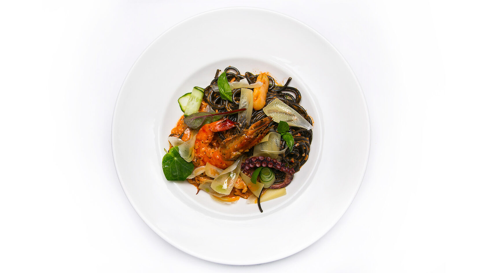
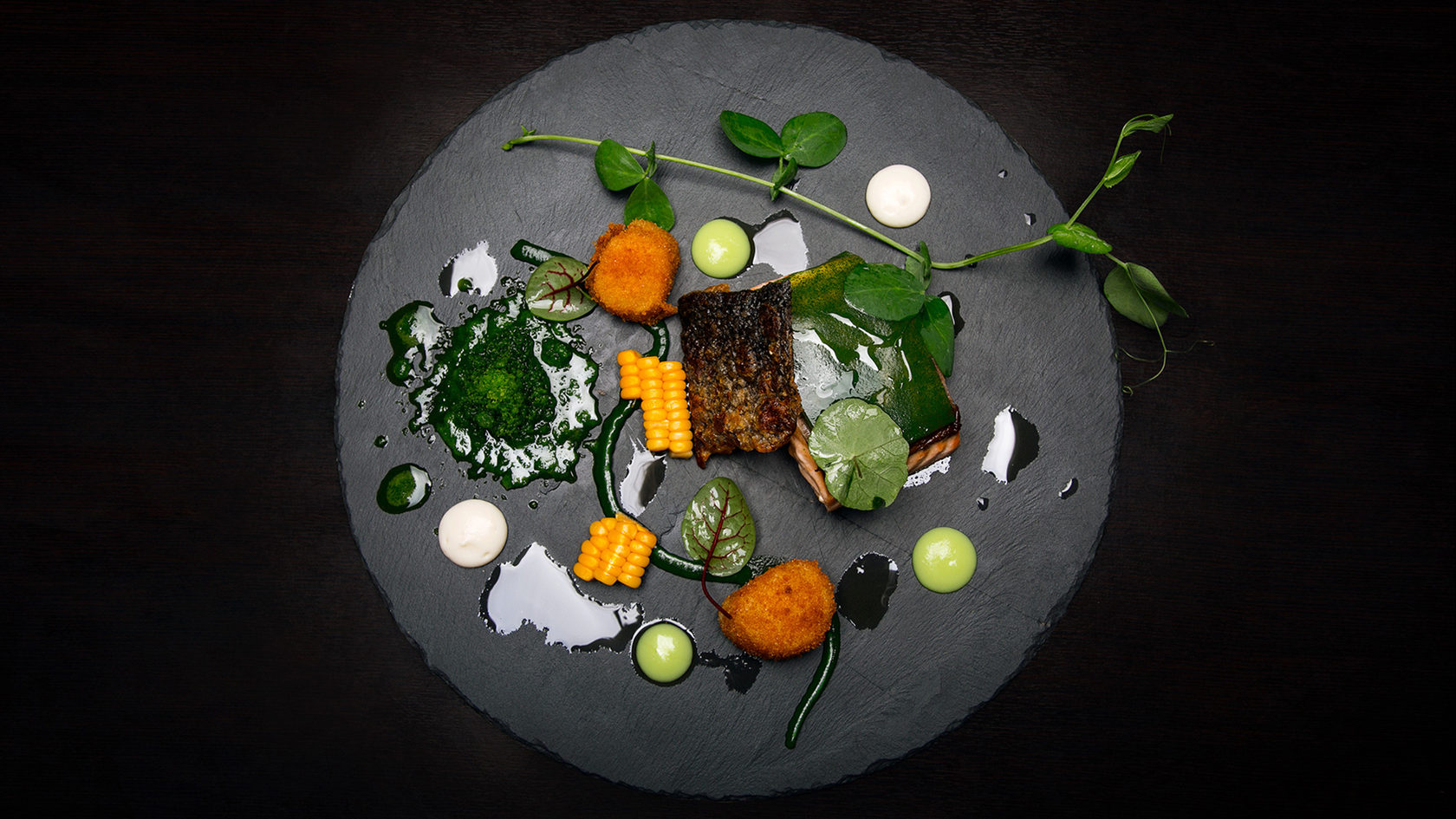



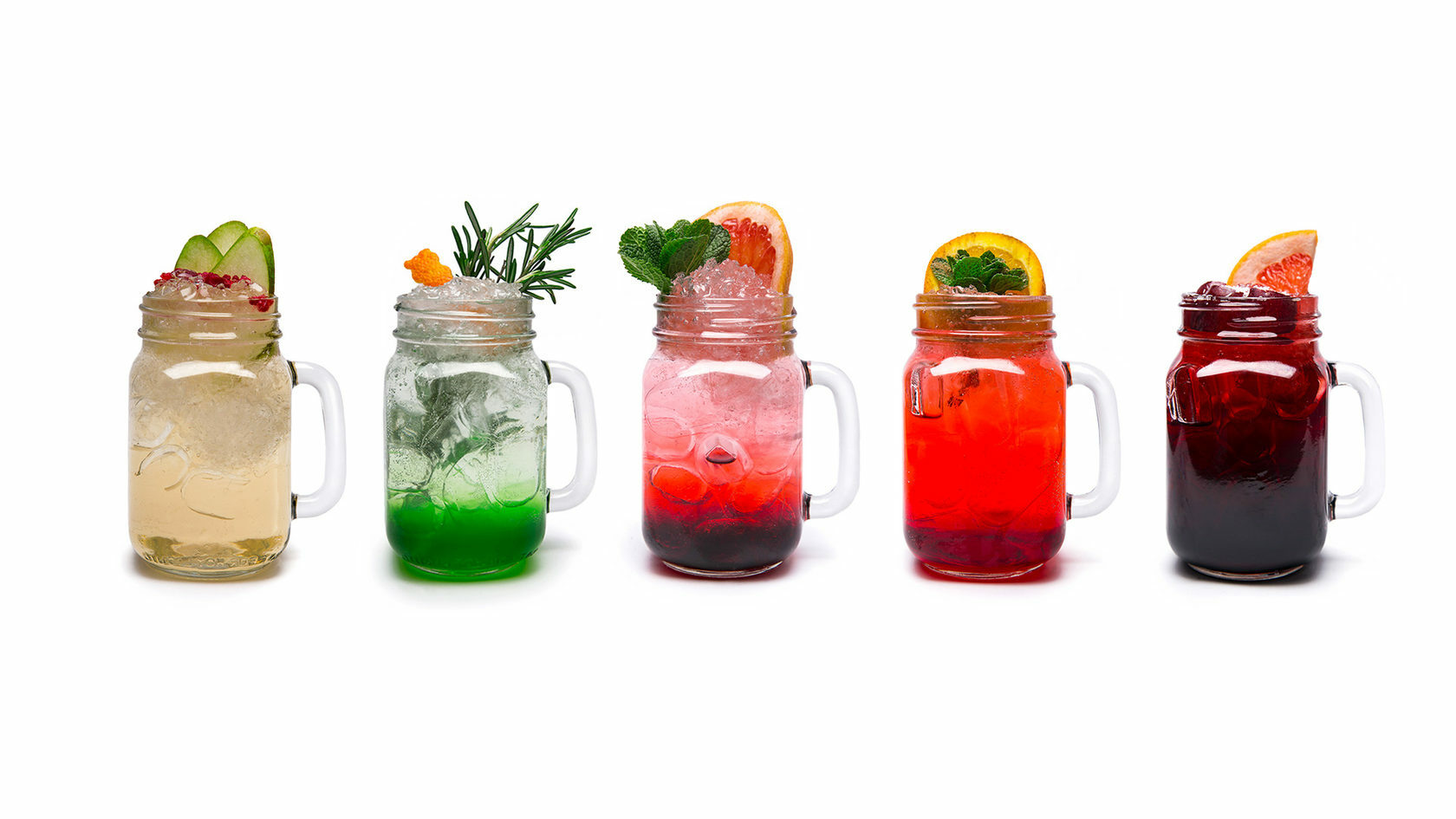
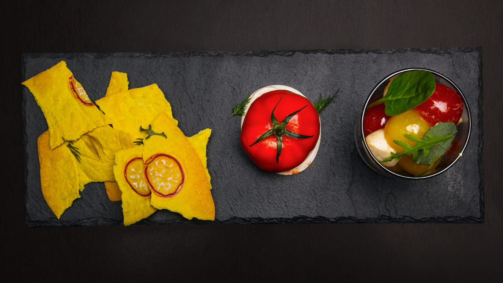
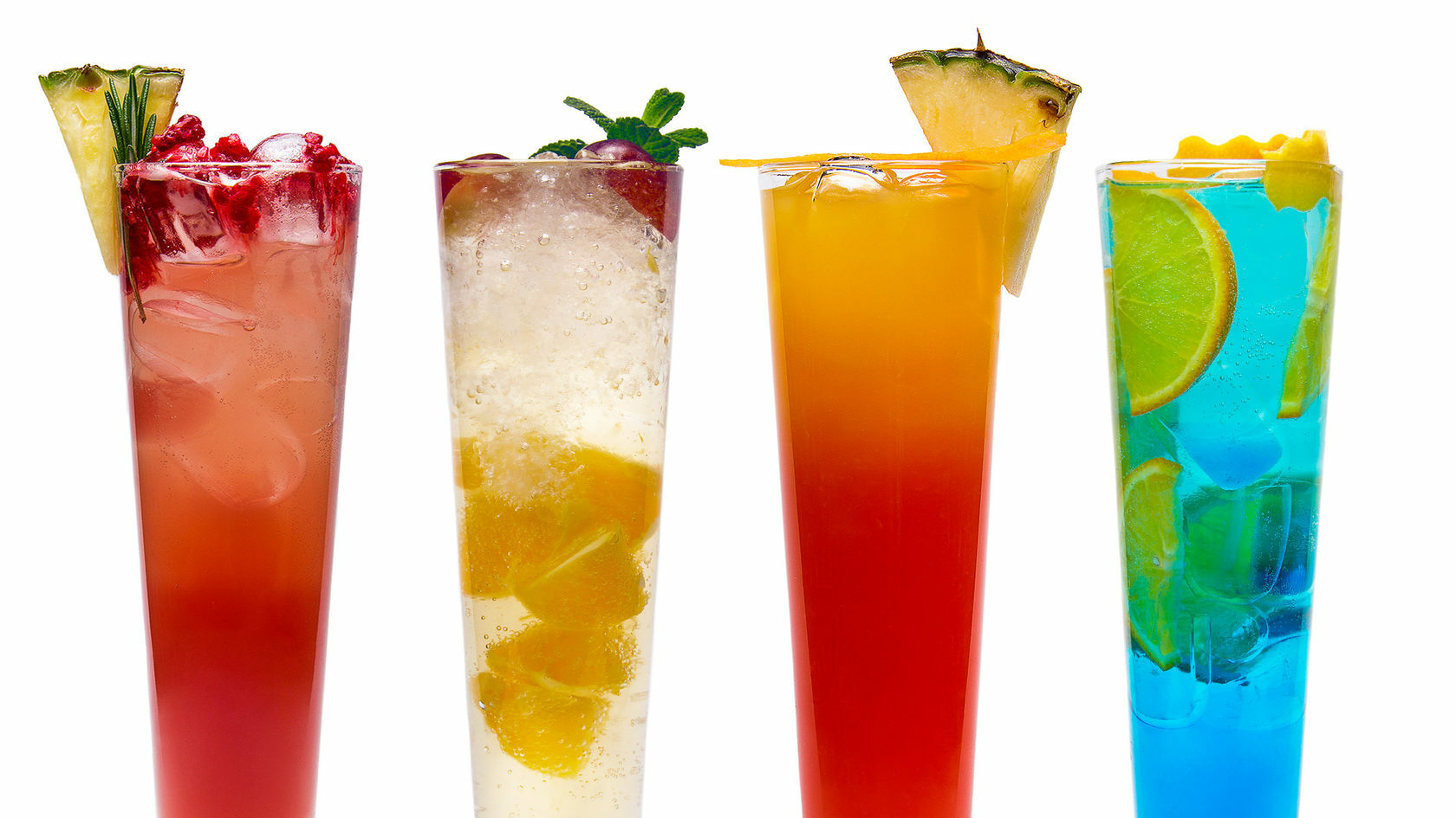
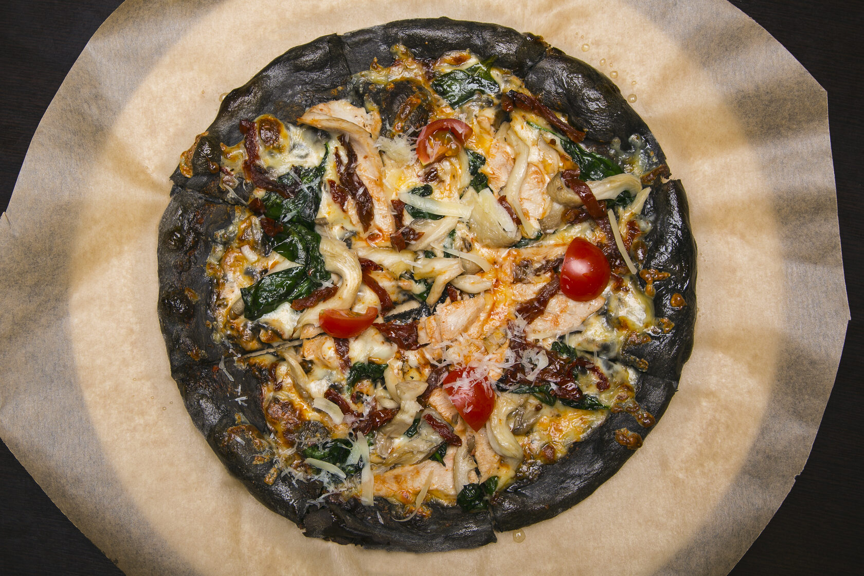
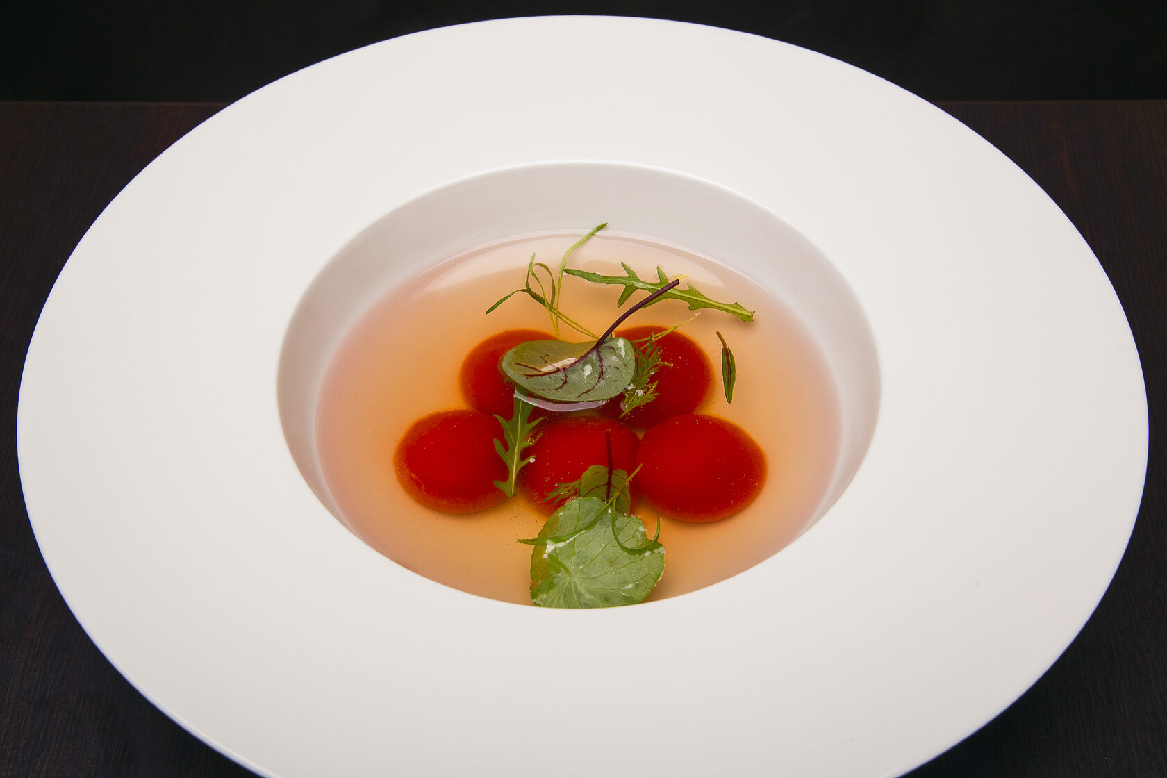
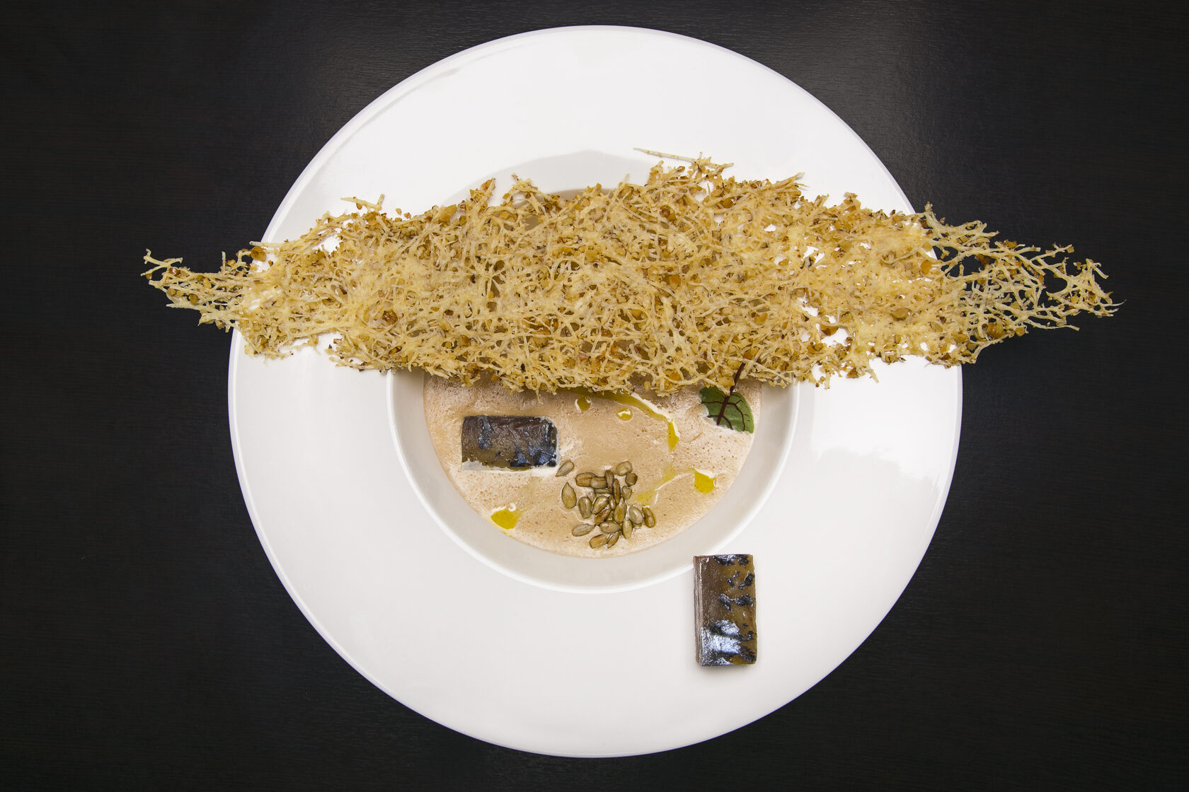
Art director Evgeny Maksutov. Photographer Oksana Glushchenko.
From August 1 through December 31, 2016, Mercedes-Benz RUS JSC ran the «Vans Evolution» competition for investment-attractive ideas and projects, aimed at strengthening the company’s position in the light commercial vehicle segment and using the challenging economic climate to look for new opportunities.
The company wanted to gather original solutions for retrofitting and upgrading existing Mercedes-Benz models, creating conceptually new niches for their commercial use, and finding new business models for interaction between the distributor, its clients, and its partners.
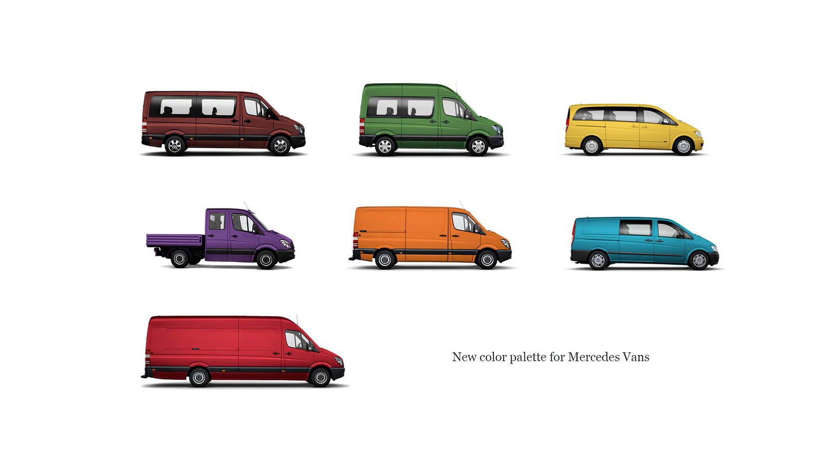
Vans Color series. «A unique color for a unique business.» An extended color range would attract businesses with a mindset different from the usual: design studios and film studios, modeling and advertising agencies, IT parks, record labels, universities, and many others.
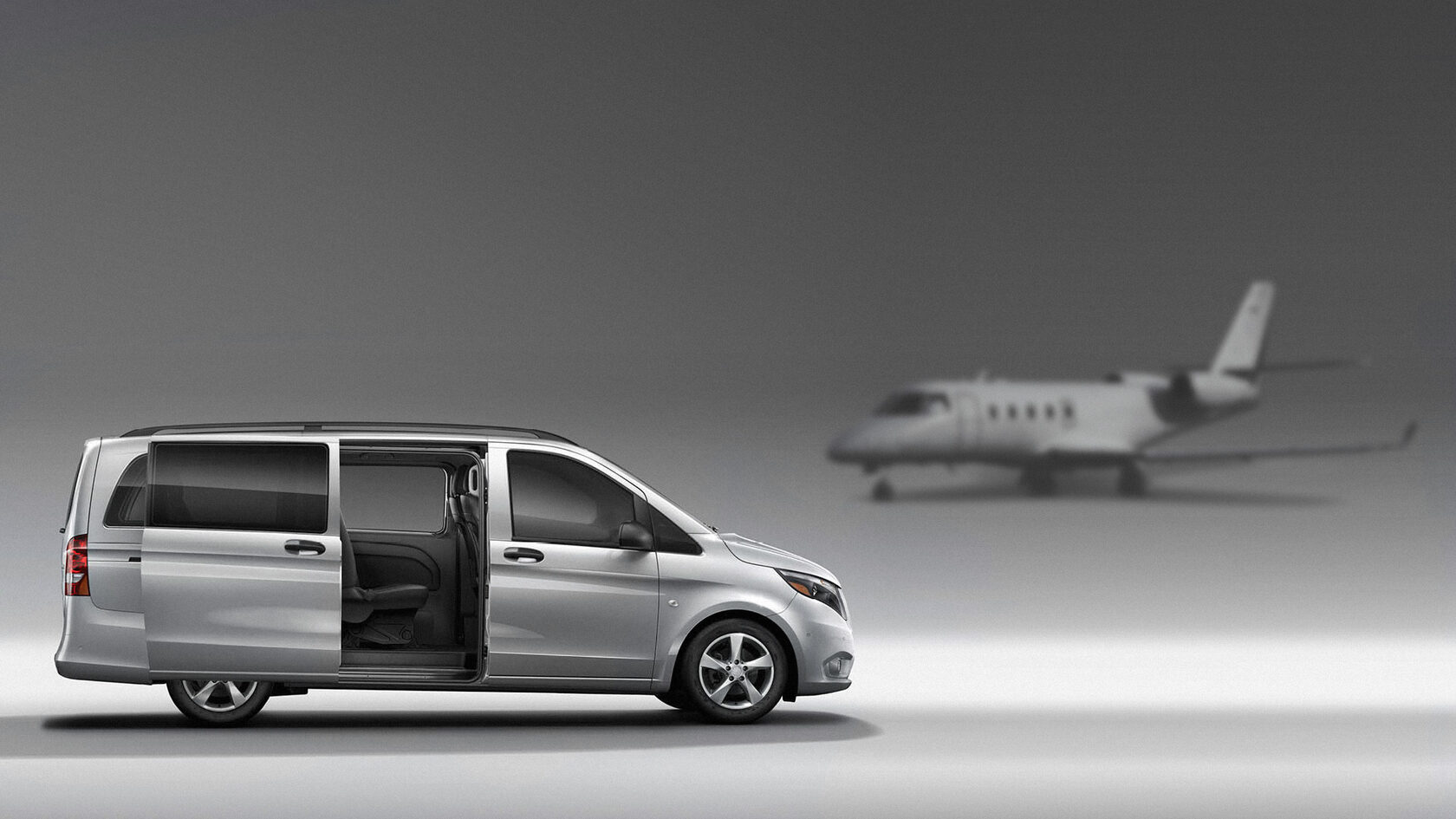
Driverless Vans. «A comfortable future, already here.» Example: use at airports, moving with particular comfort along a safe route to the runway.
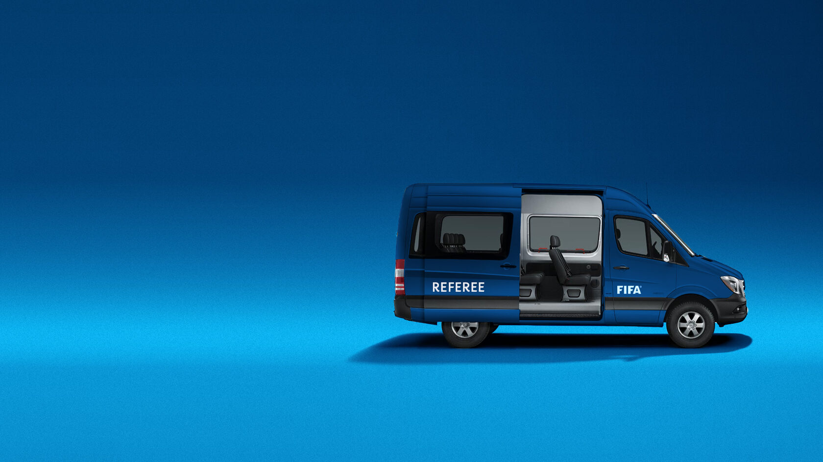
Quality and prestige. Example: transporting football players, match officials, and support staff. Vehicles used by the international federation FIFA.
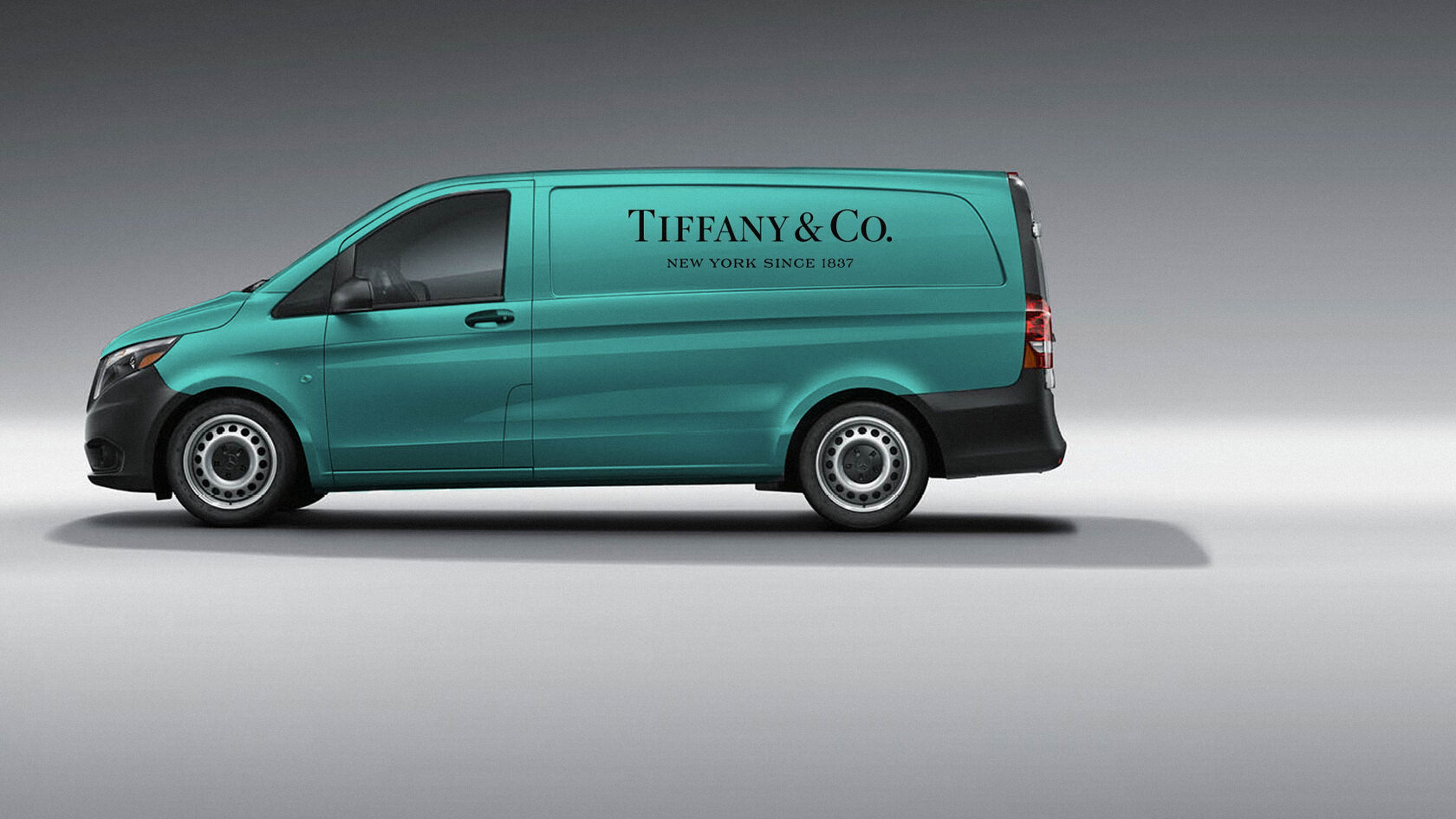
Example: armored vehicles for transporting gold and precious stones, jewelry and watches, and works of art for museums, galleries, and auction houses.
Mobile control. A mobile app would allow additional control and monitoring of the vehicle: start-up and warm-up, fuel consumption, and monitoring of components (brake pads, fuel filters, etc.).
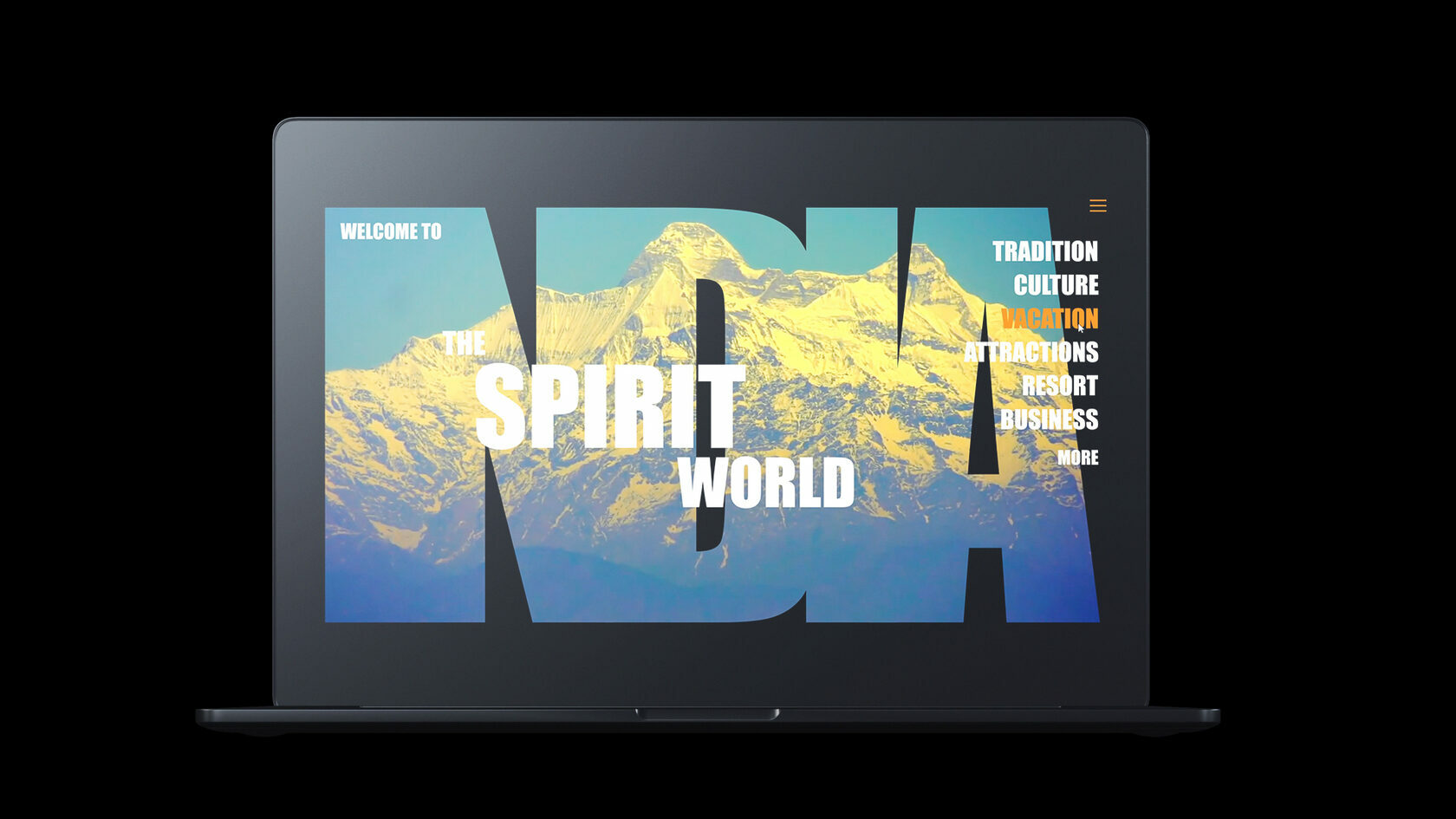
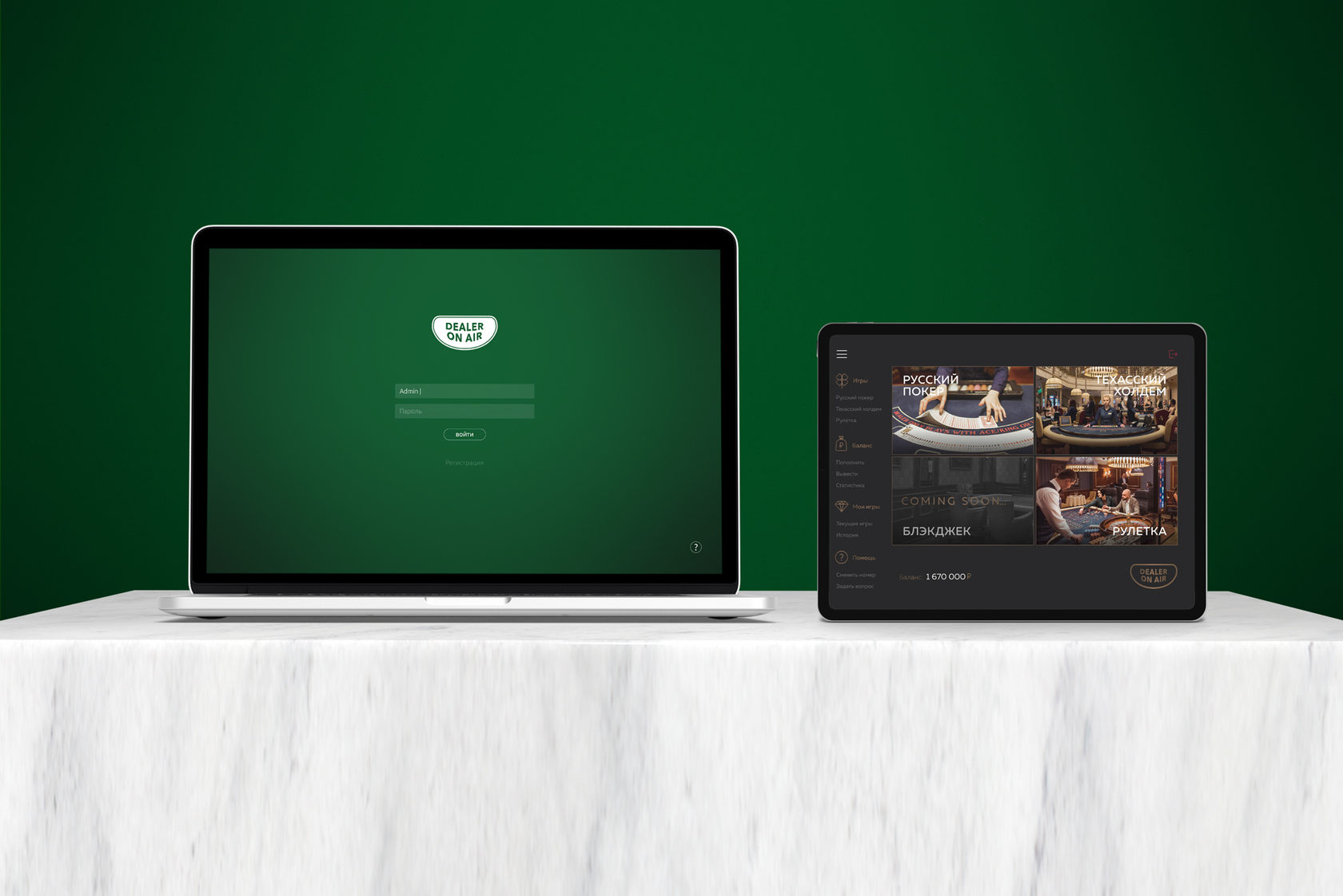
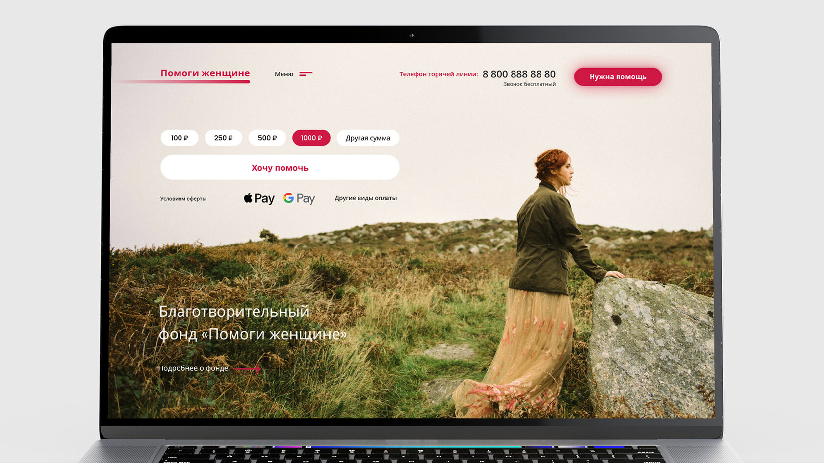
Homepage design concepts for various projects: a tourism portal for India, the «Dakar» rally, a landing page for the DOA gadget, a charity project, and a homepage for the TeraHash Bitcoin yield protocol.


TeraHash is a hashrate-pricing protocol that lets users buy, stake, and trade Bitcoin hashrate. Design support for the TERAHASH project: full project case study.
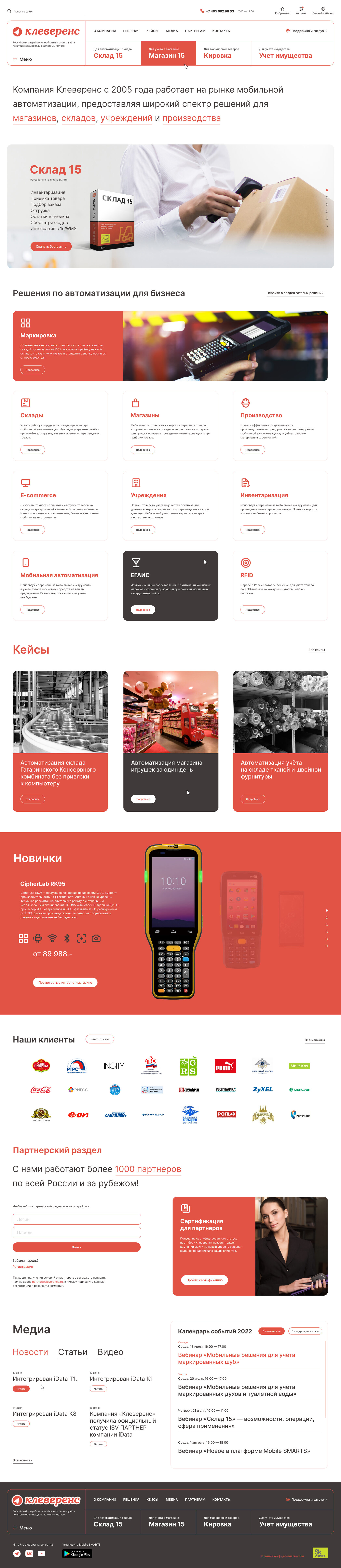
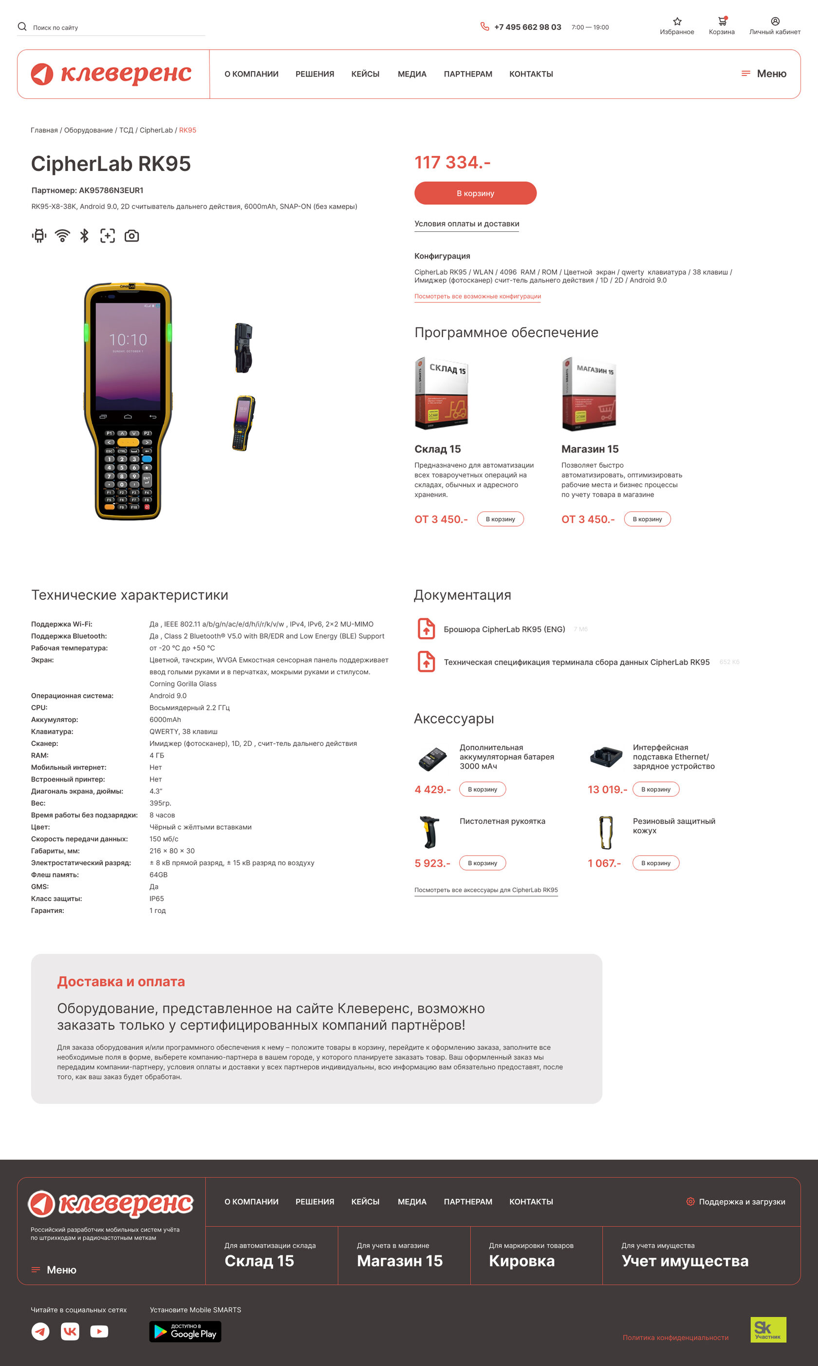
Design for an automation equipment online store: home page, catalog code and menu, and product page.

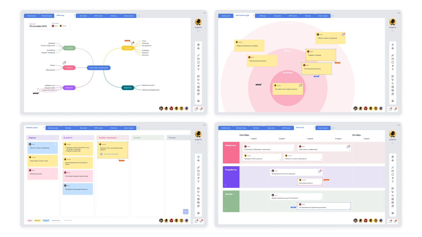
A dashboard design concept: task cards, a kanban board, and a visualization of the relationships between elements.
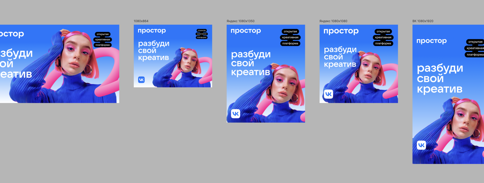
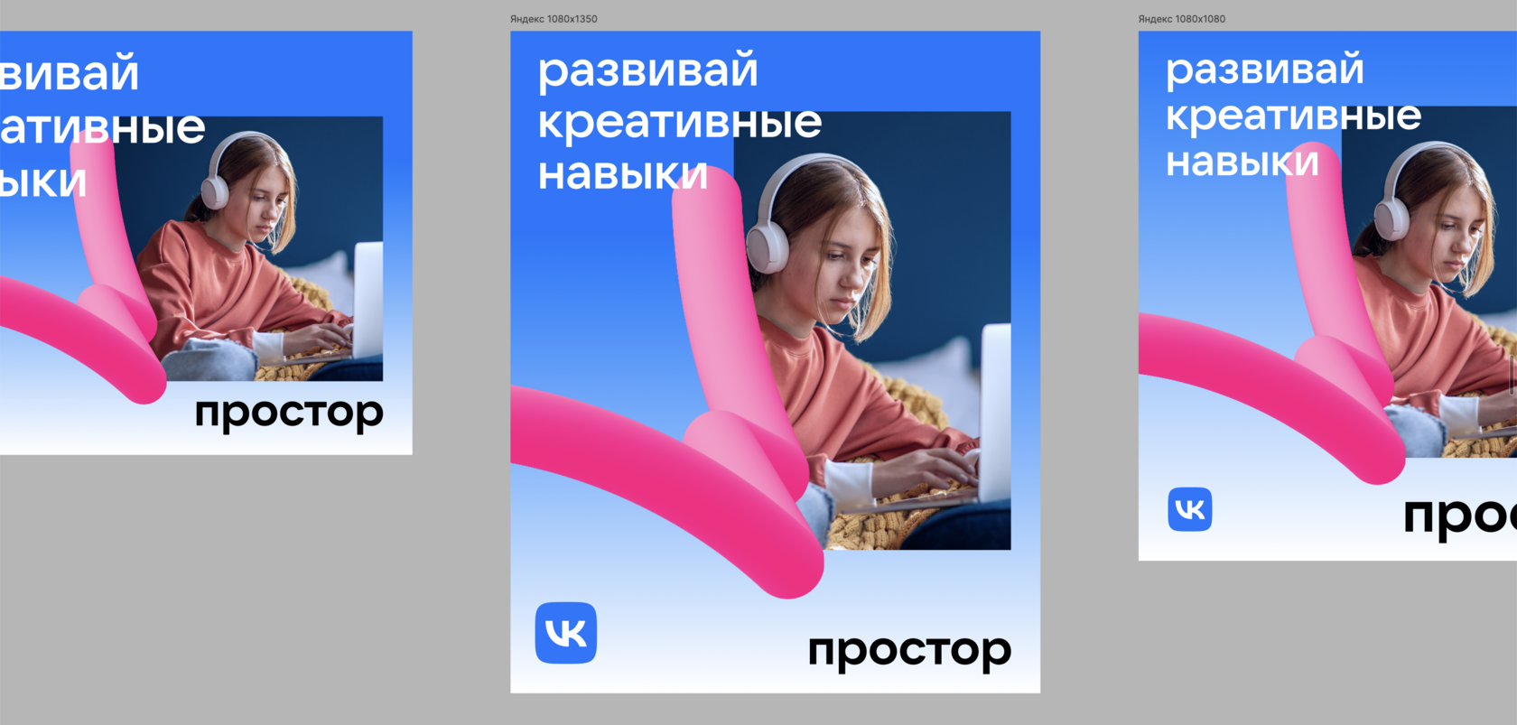
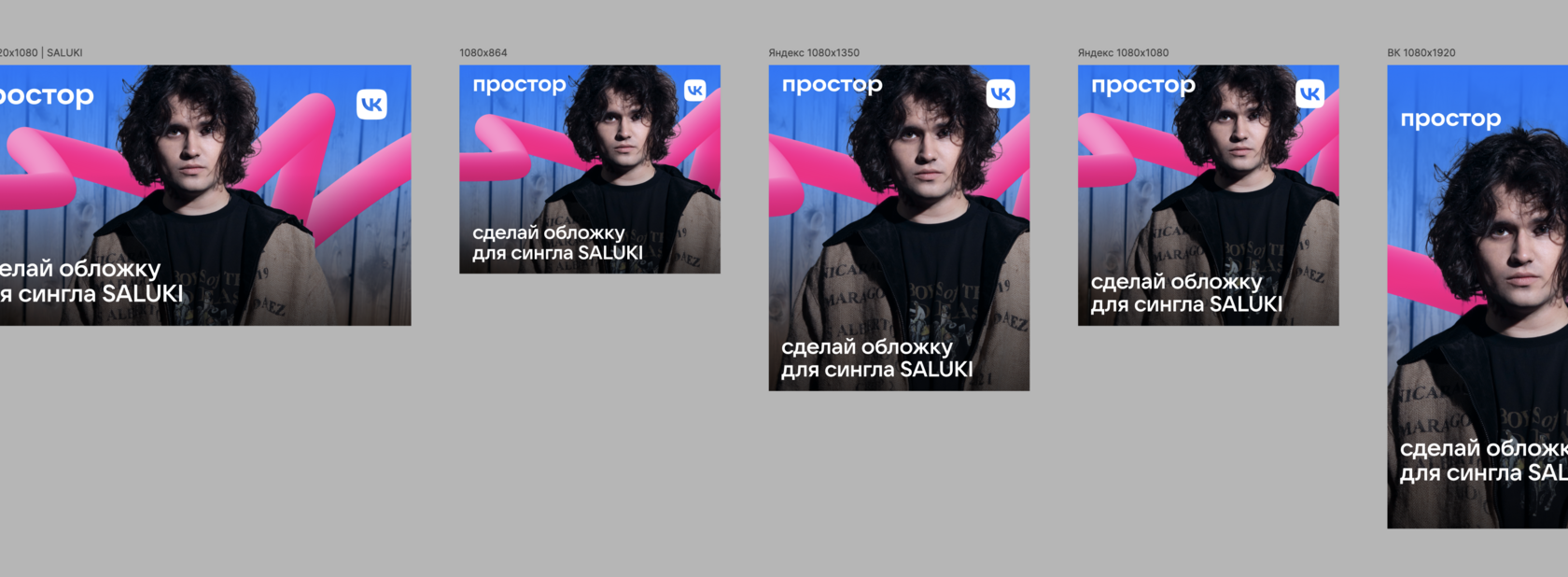
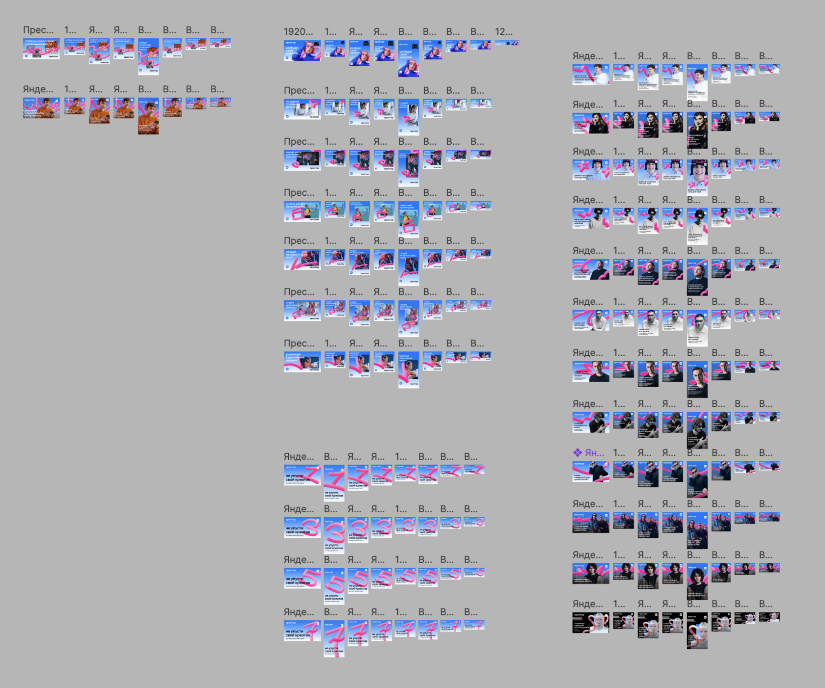
Adapting the «Prostor — Wake Up Your Creativity» ad layout for different placement formats: VK, Yandex, and other platforms.
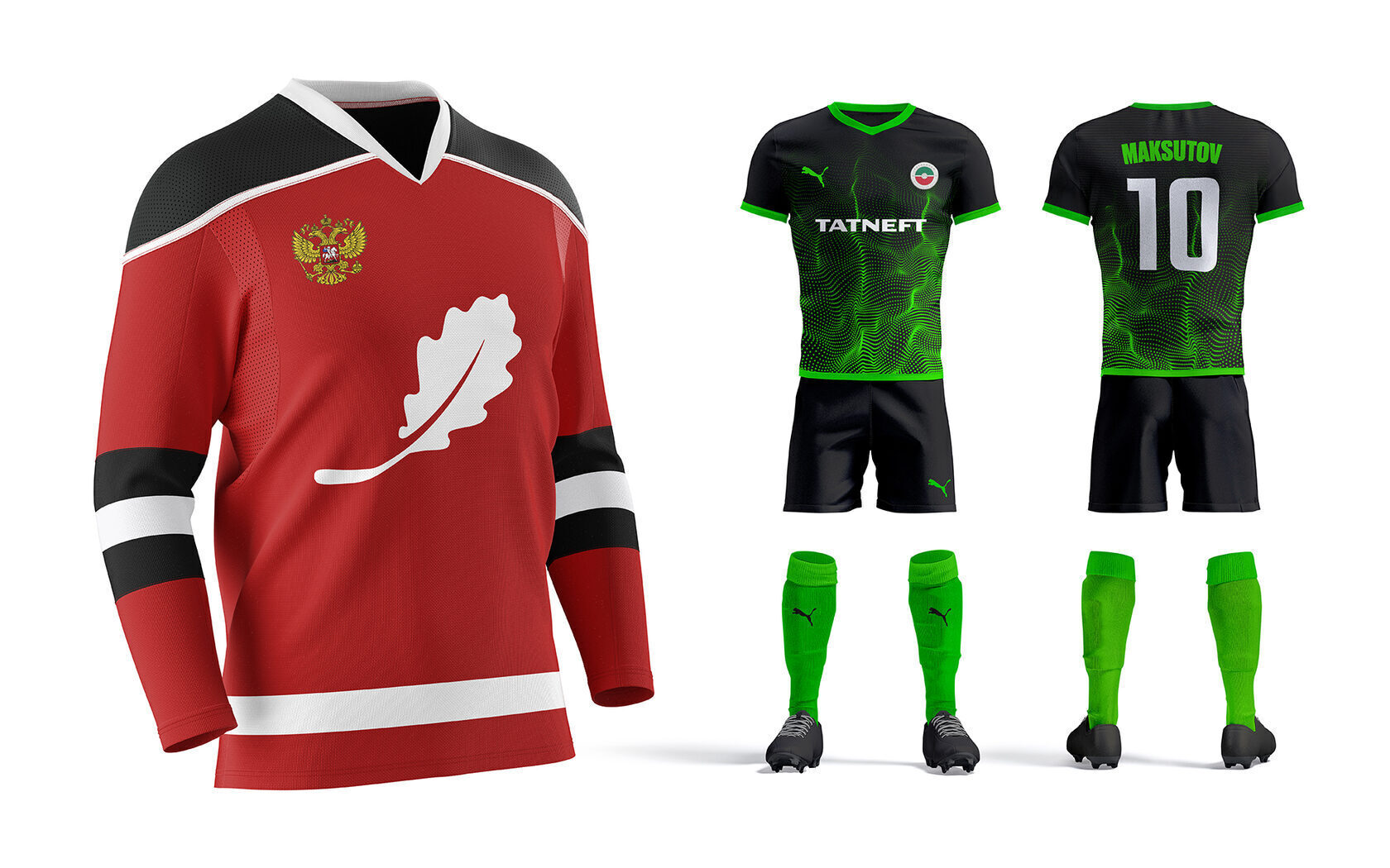
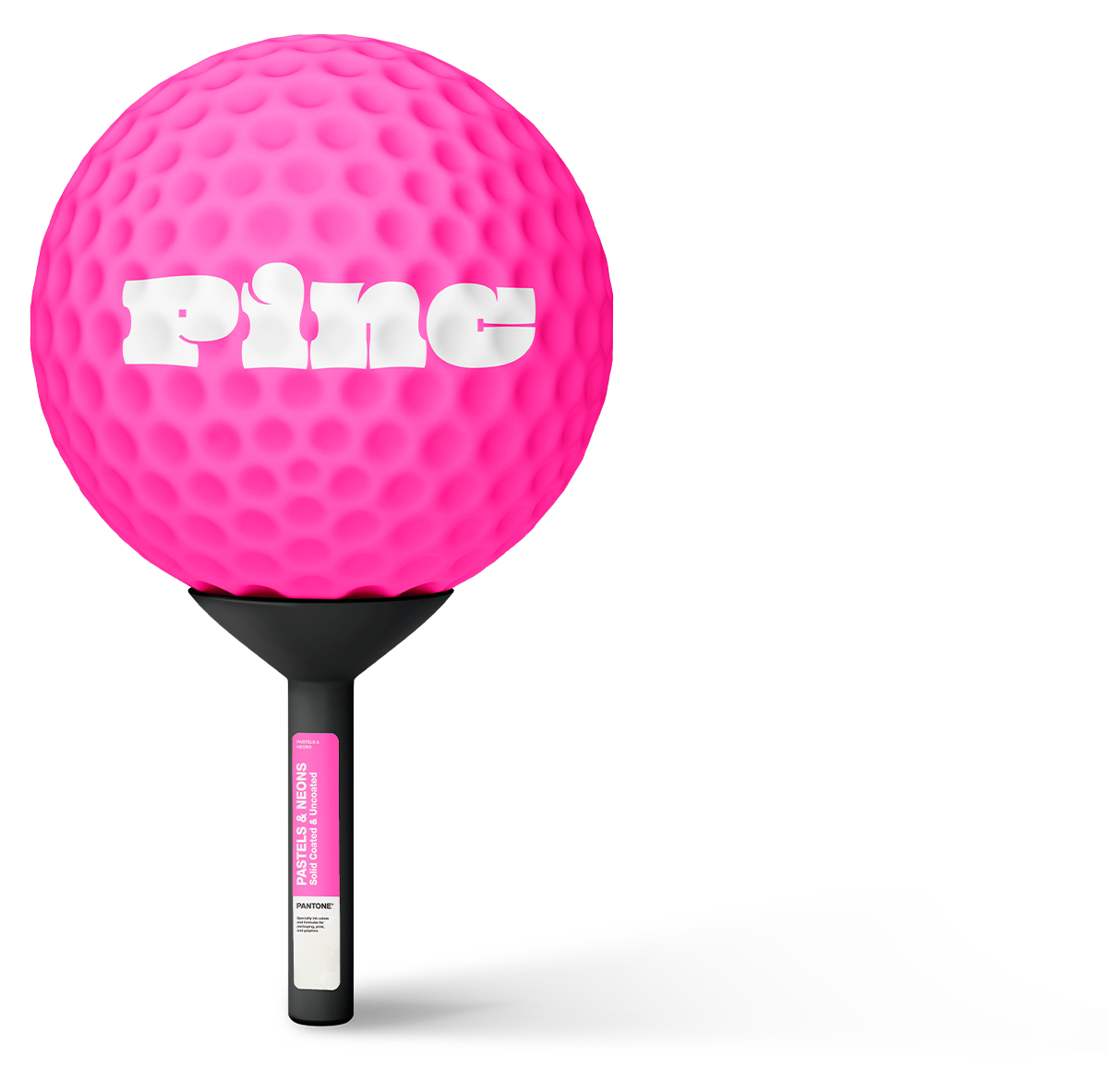
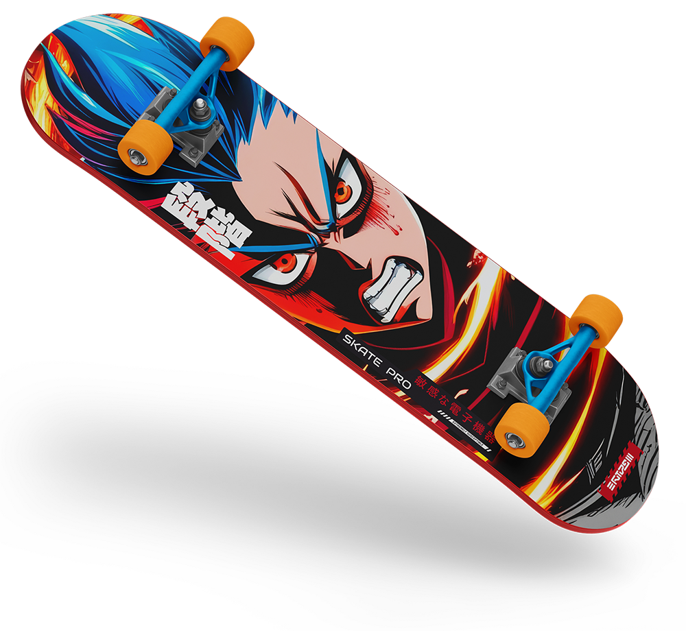
Creating unique visual solutions for kits, emblems, and promotional materials: hockey and football, tennis, skateboarding.
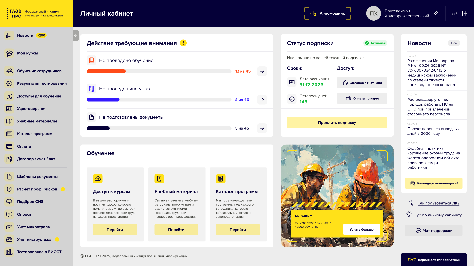
Design for a personal account dashboard: subscription status, onboarding, and actions requiring attention. Prototype built in Figma.
A collection of prints for F* men’s and women’s t-shirts, created by illustrators from different countries.
Illustration credits: Chloe’s Illustrations (USA), Katja Gerasimova (Indonesia), Marushchak Olha (Ukraine), Asakura1102 (Ukraine), Antoney (Belarus), masan4ik (Russia), MoreVector (Ukraine), dalinas, Nikita Konashenkov (Russia), Sudowood (Russia).
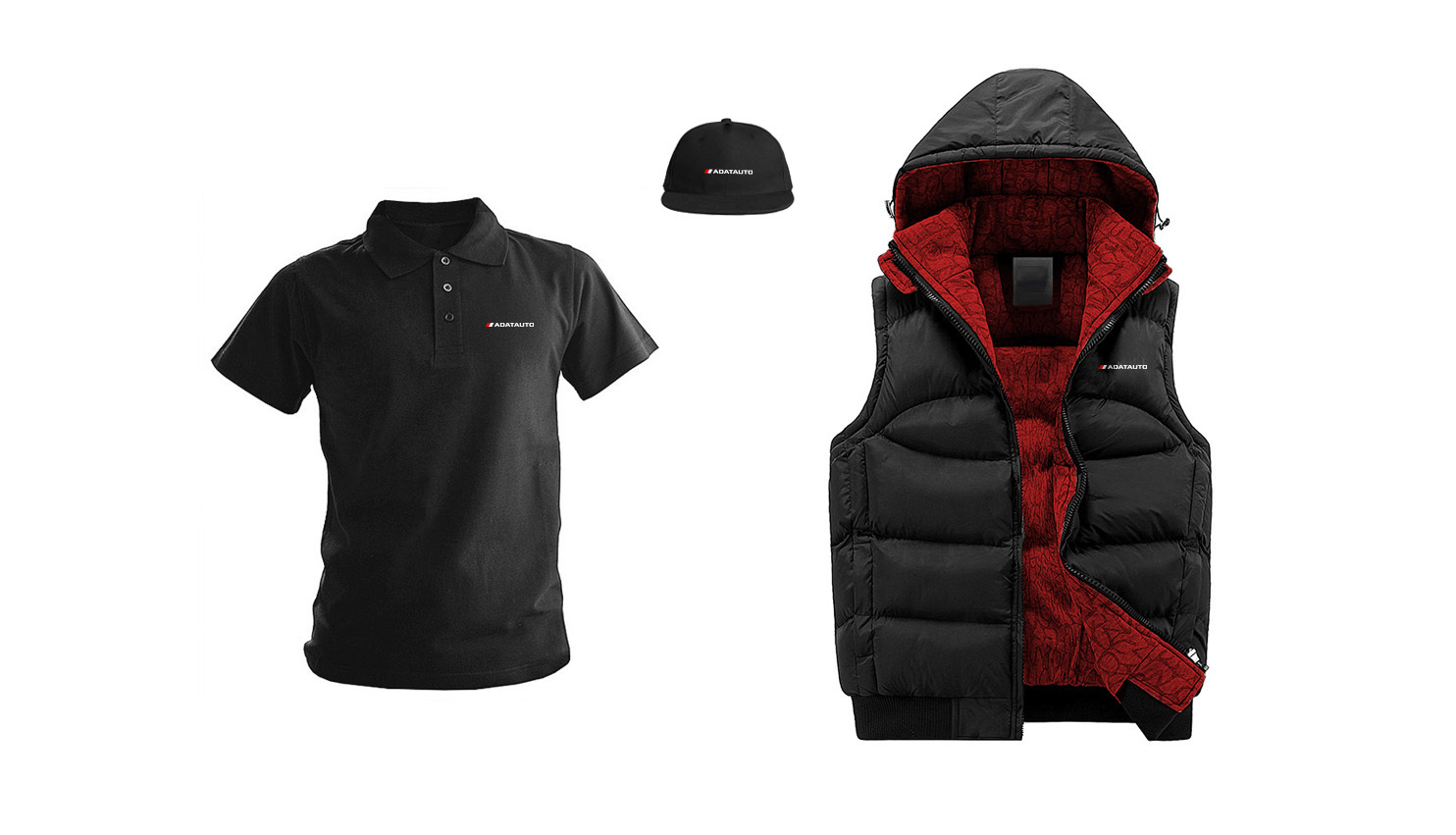
Branded apparel design for AdatAuto: a polo shirt, a cap, and an insulated vest with the logo.
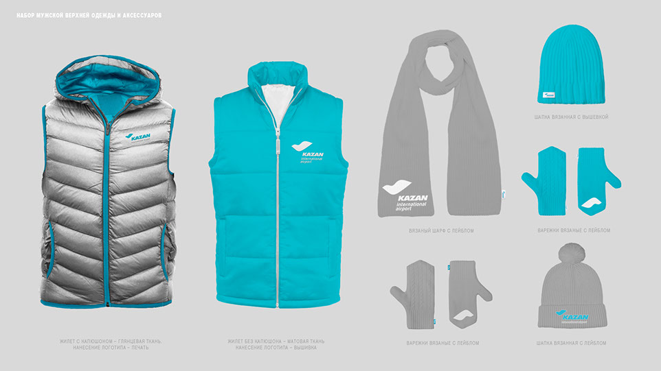
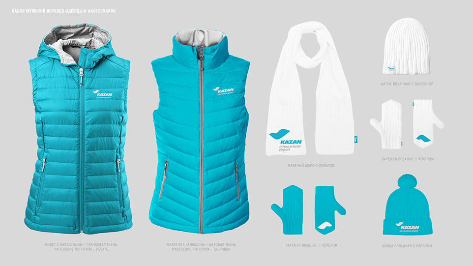
Branded apparel design for airport staff: men’s and women’s sets — vests, scarves, hats, and mittens.
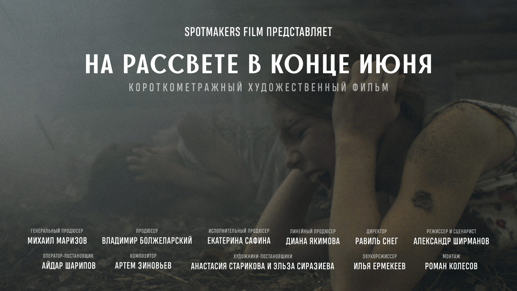
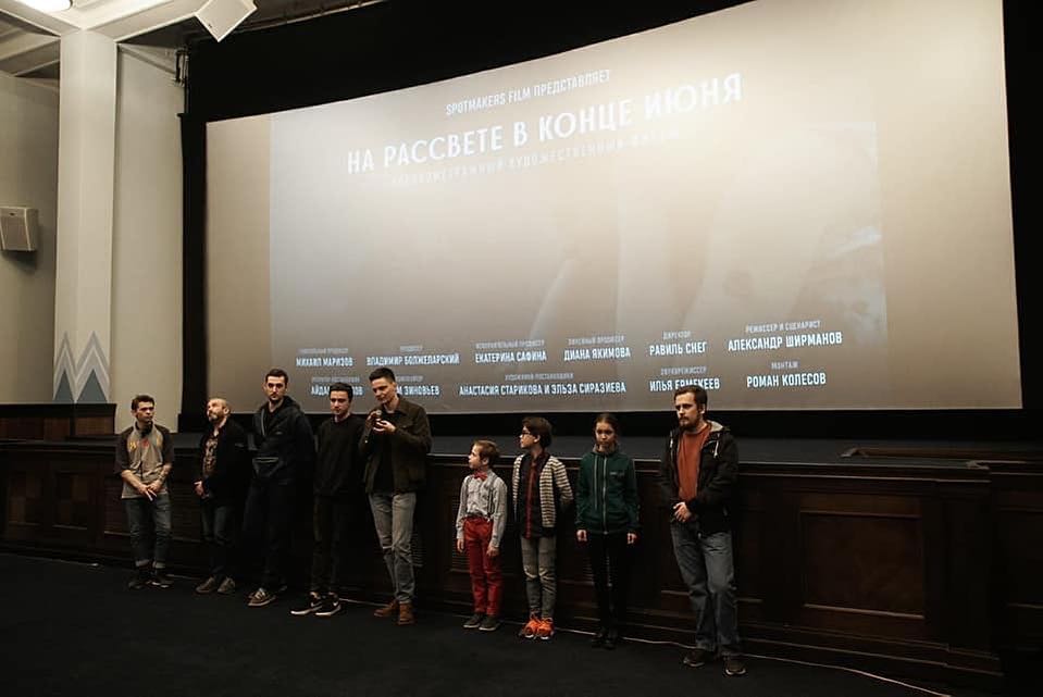
Design of end credits and a poster for the short films «The Claps» and «At Dawn in Late June»: crew names, typographic composition, and the overall mood of each film.

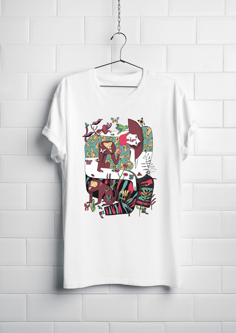
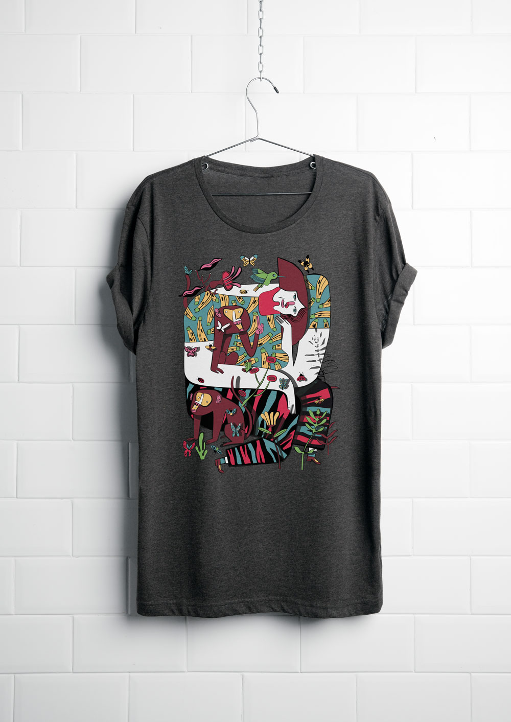
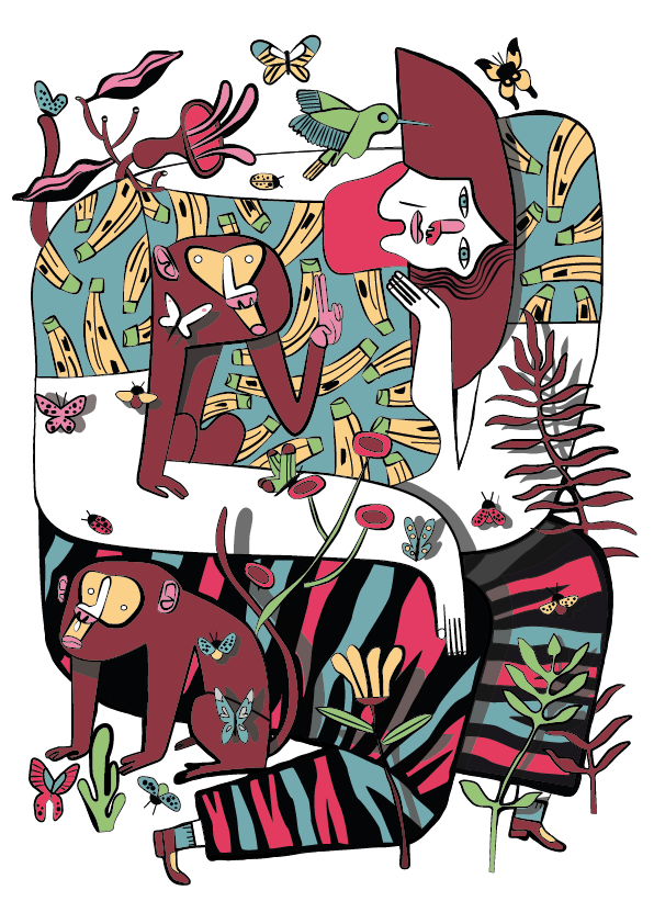
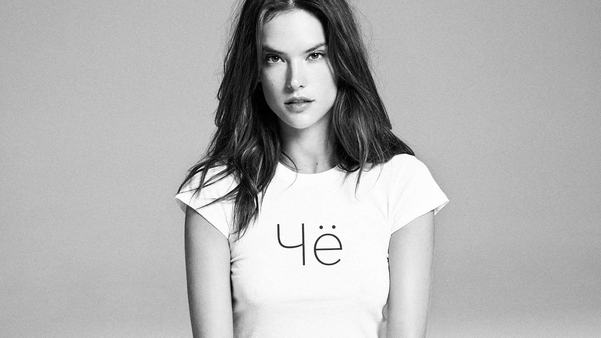
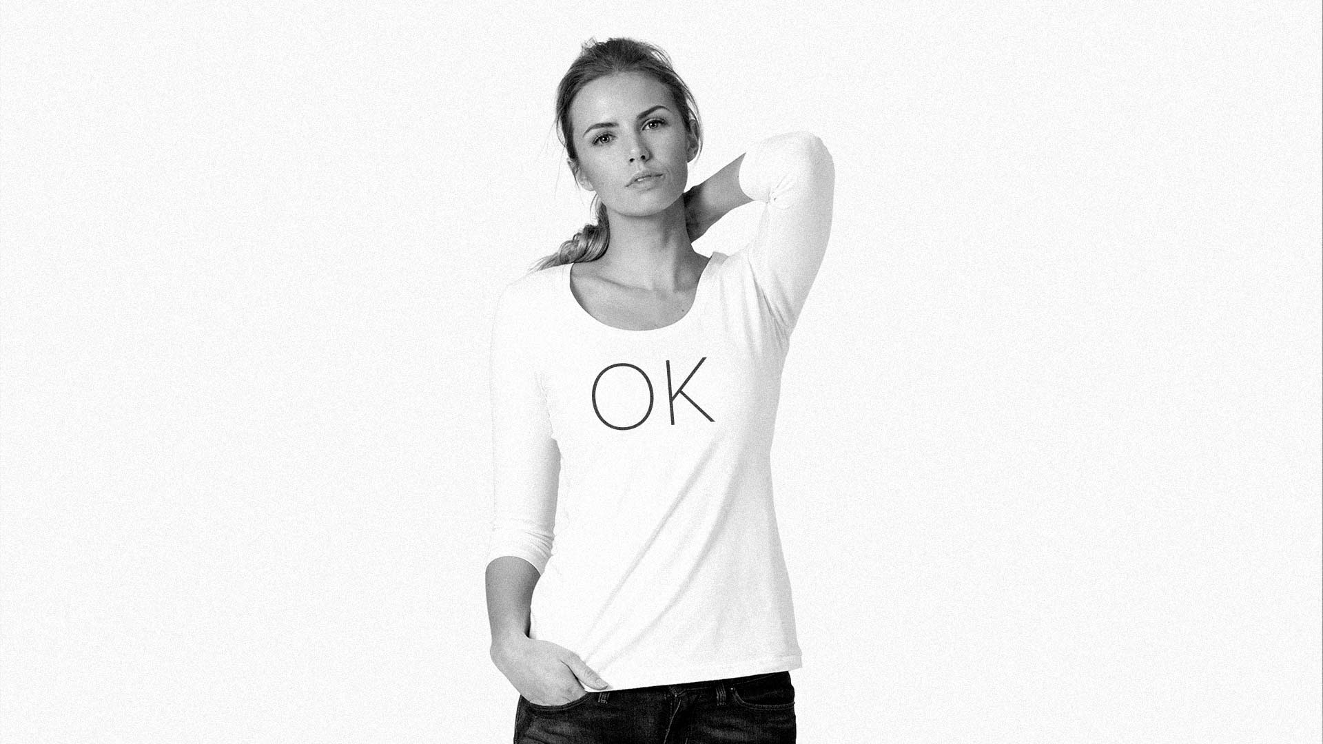
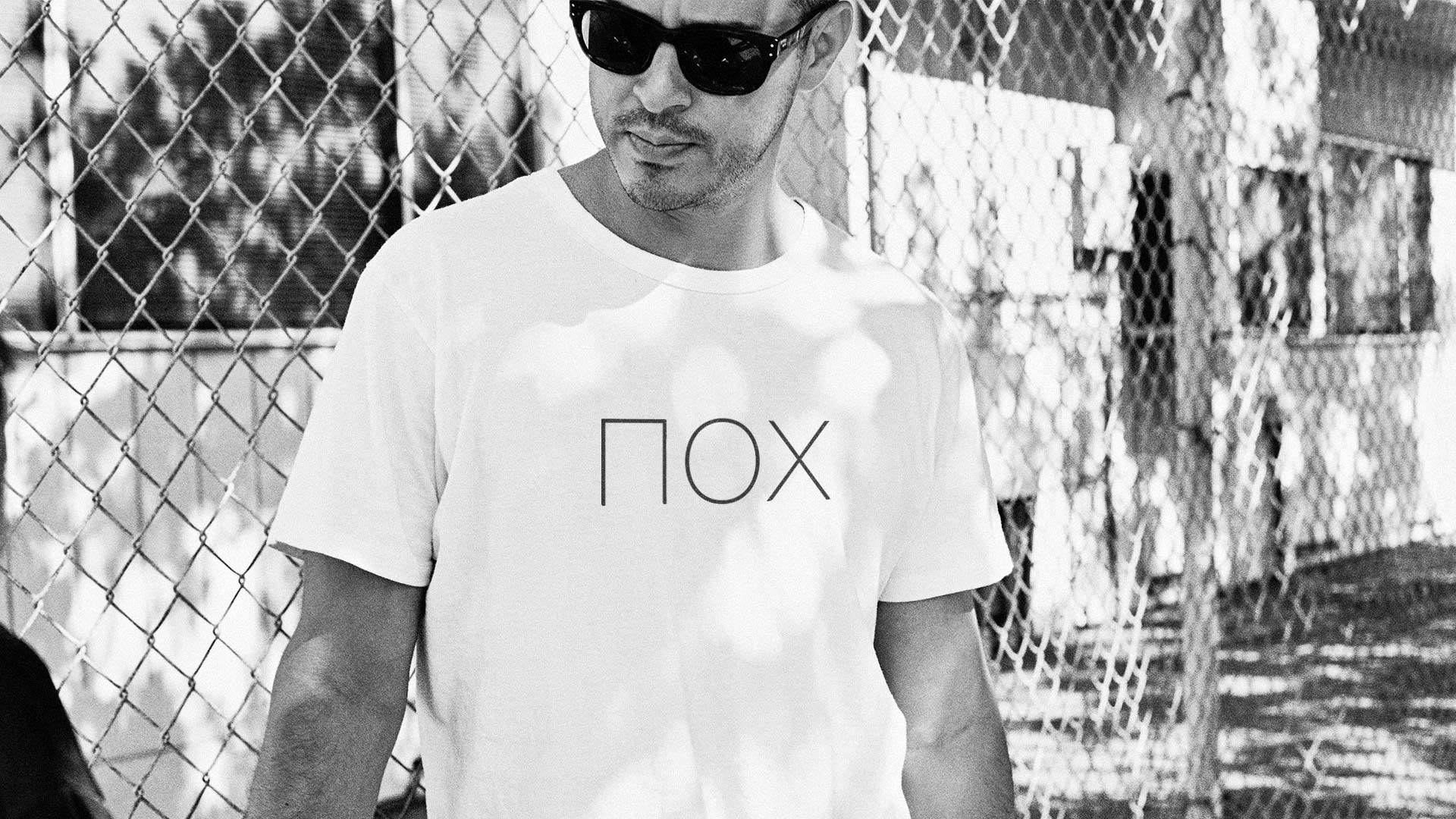
Several mini-collections of t-shirt prints: original illustrations of animals, t-shirts with slang abbreviations («Che,» «Hz,» «Poh,» and others), and «Karma Police» merch with a sheriff’s star.






The task: to develop an original souvenir puzzle with national character.
By slightly changing the connecting elements of the puzzle pieces, the assembly process became more enjoyable. The connectors were shaped like the national symbol — a tulip.
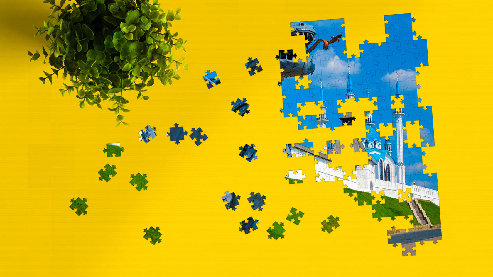
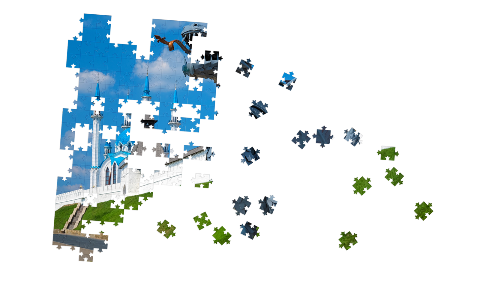

Piece set. A puzzle set can contain up to 2,000 pieces.
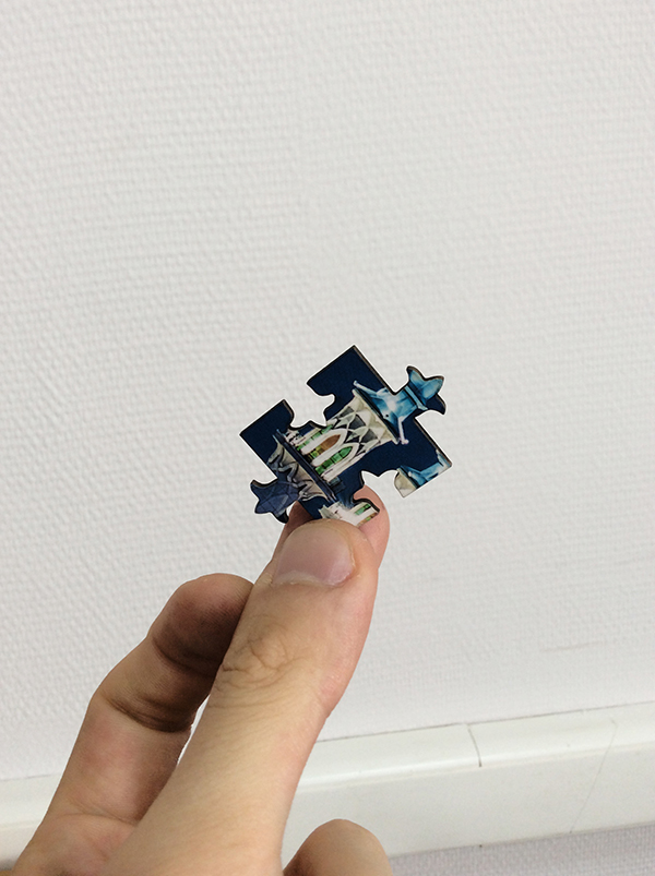
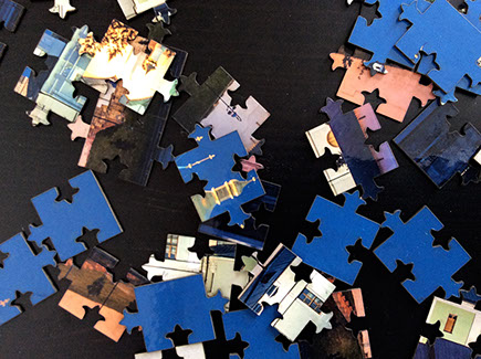
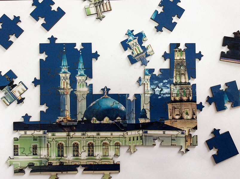
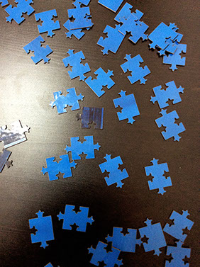
This change to the piece design did not affect the assembly process or the strength of the connections, while making it more interesting and enjoyable.
Rules of the game. The cards are shuffled and laid out on the table «golden side» up. Each player, in turn, flips two cards. If the two cards match, the player keeps the pair and is allowed to flip two more cards.
If the cards don’t match, they are flipped back over and it becomes the next player’s turn.
The winner is the player who reveals the most matching pairs.
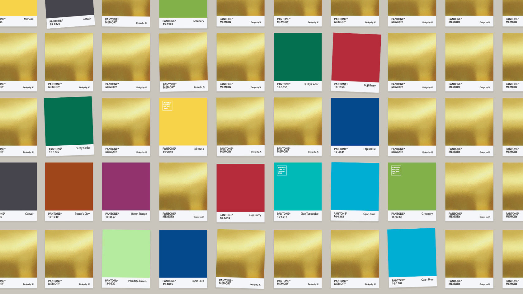
The set contains 72 pairs of cards
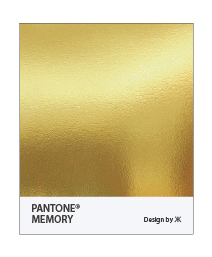
The golden back. Start of the game: cards shuffled and laid out face down
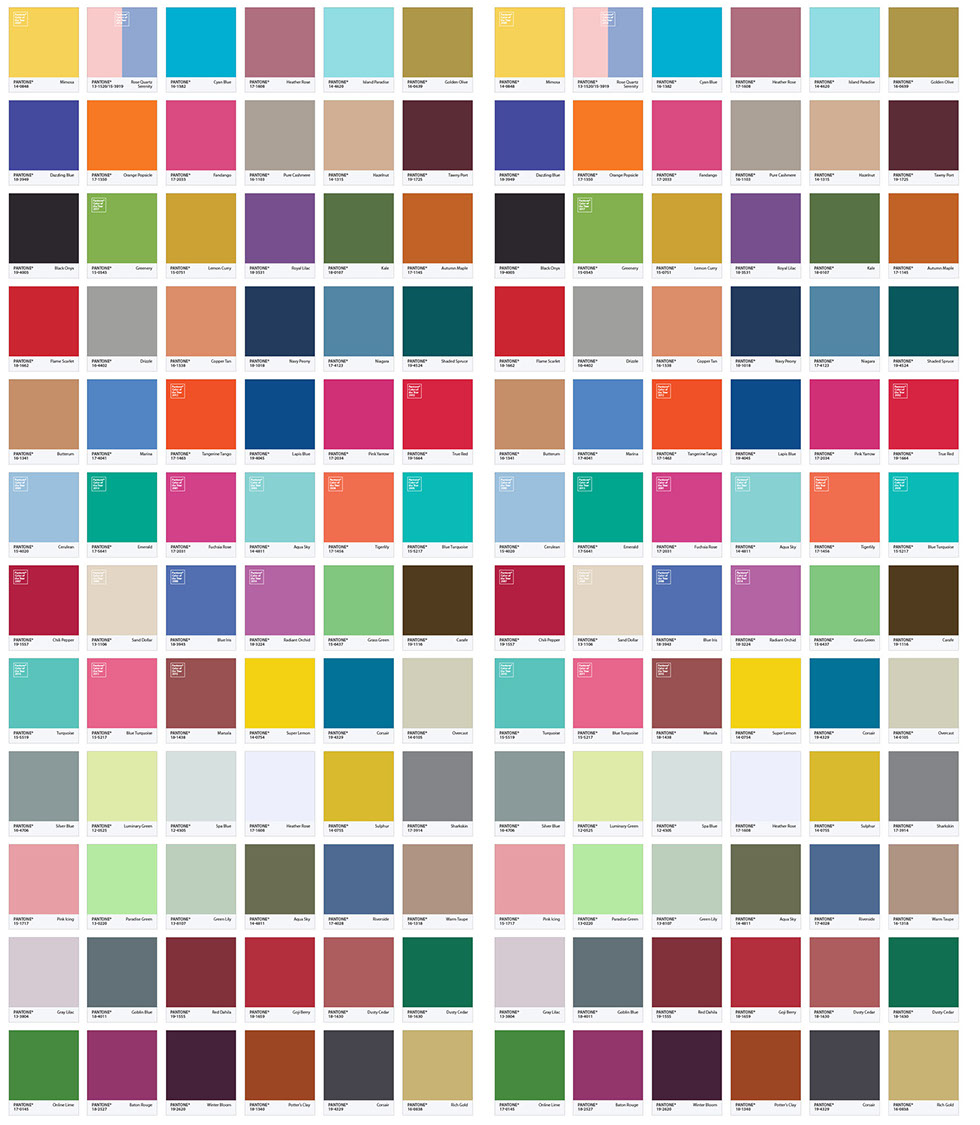
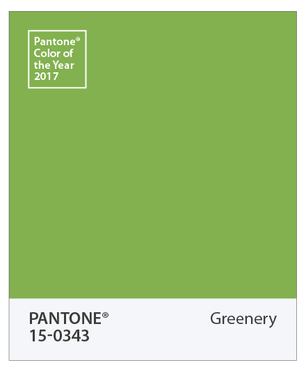
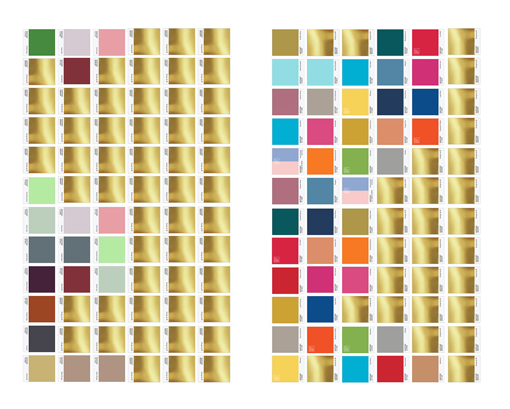
Every year, Pantone® unveils its «Color of the Year.» The set features 17 colors from 2000–2017. Each card also shows the color name and its reference number. In 2016, Pantone® chose two colors for its annual «Color of the Year 2016» presentation

For a quick two-player game, it’s recommended to split the card set into two halves, 36 pairs per player. Whoever reveals all their pairs in the shortest time wins.
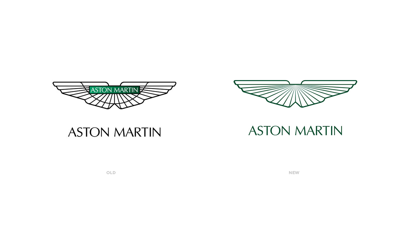
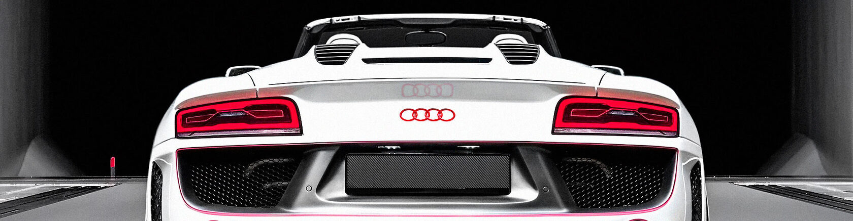
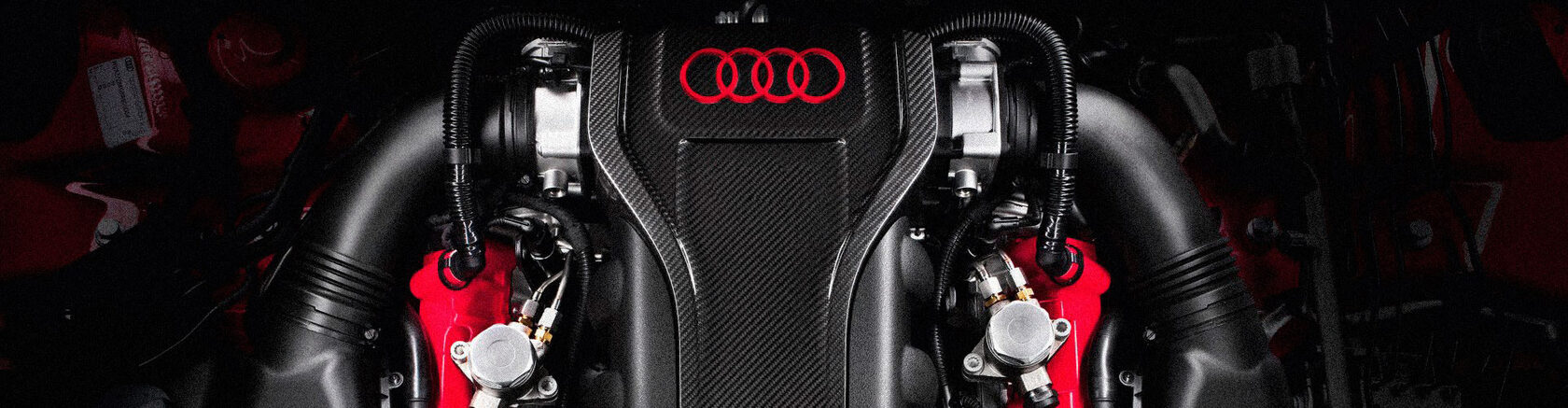
Competition entries and personal work redesigning car logos: Aston Martin — the winged emblem without a colored plaque, thinner linework, and an updated brand wordmark; concepts for BMW and Audi.
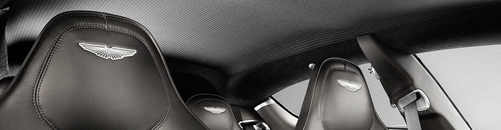
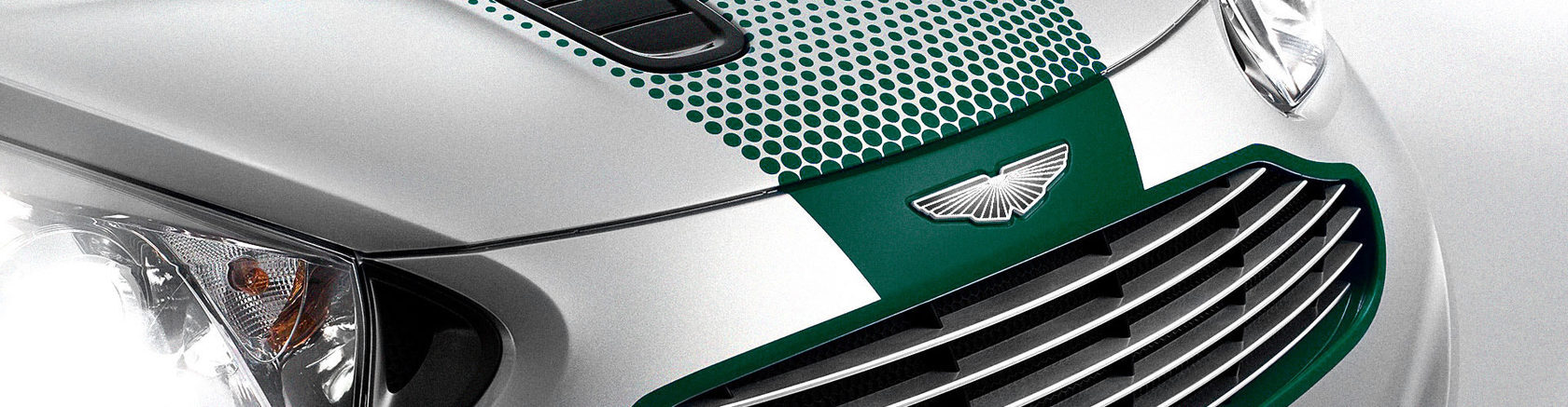
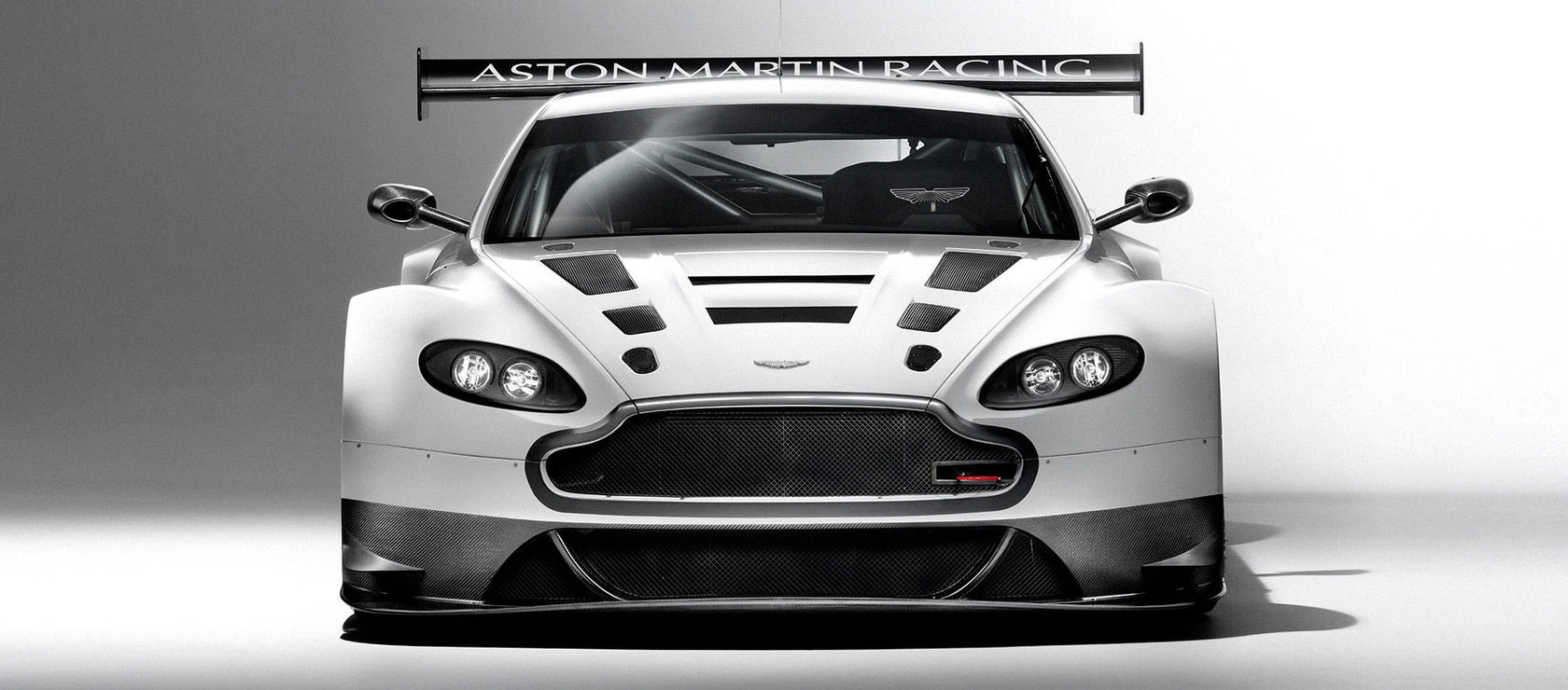
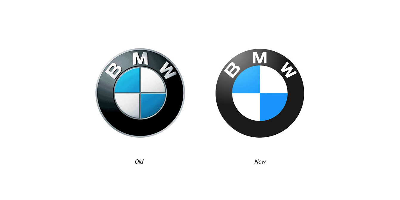

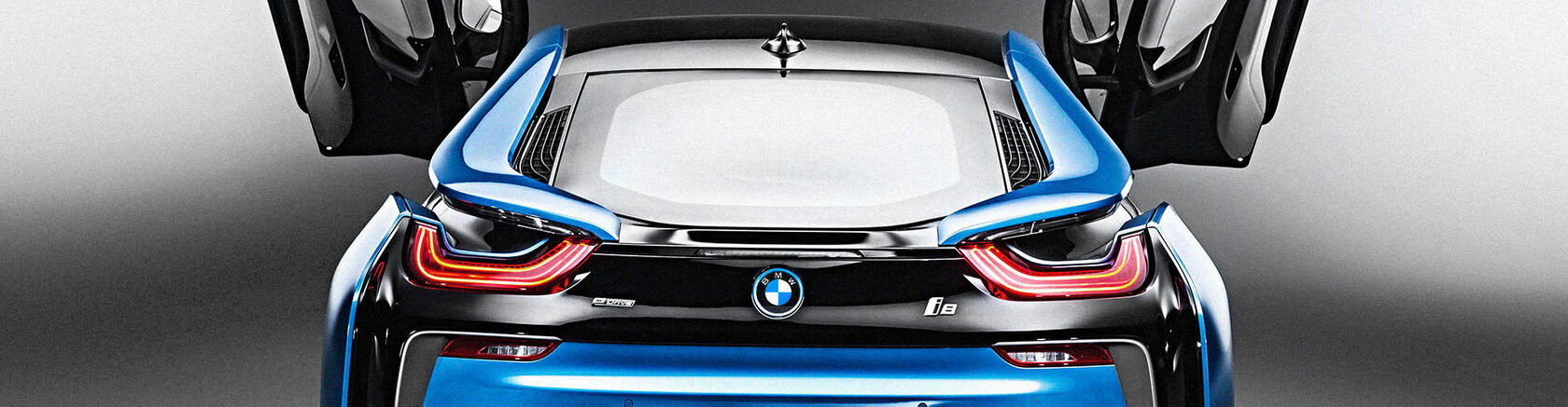
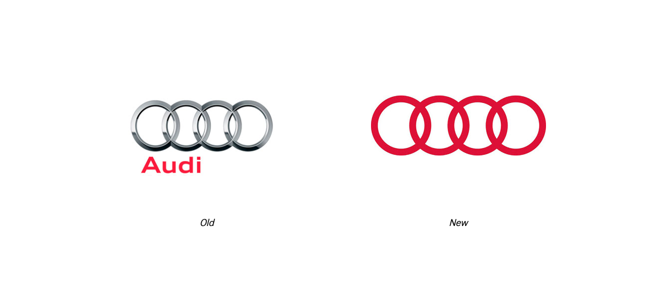
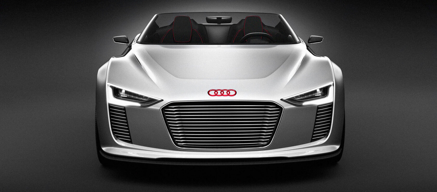
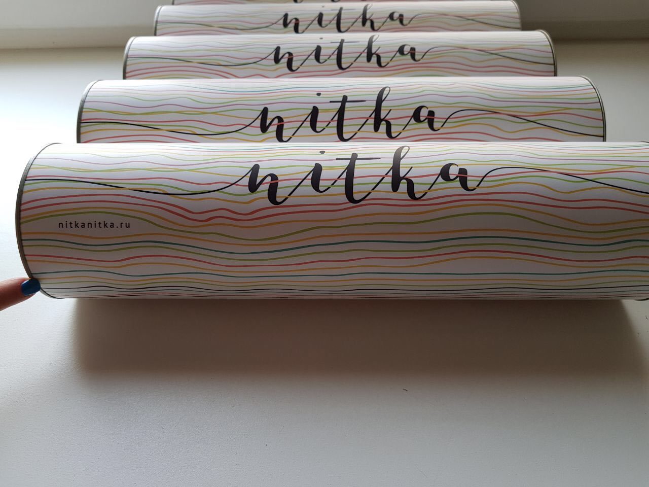
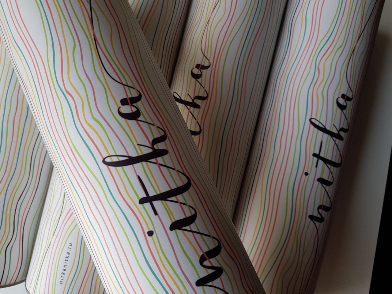
Tube packaging for the Nitka calligraphy studio: a wave pattern in the brand colors and the logo, applied along the full length of the cylinder.
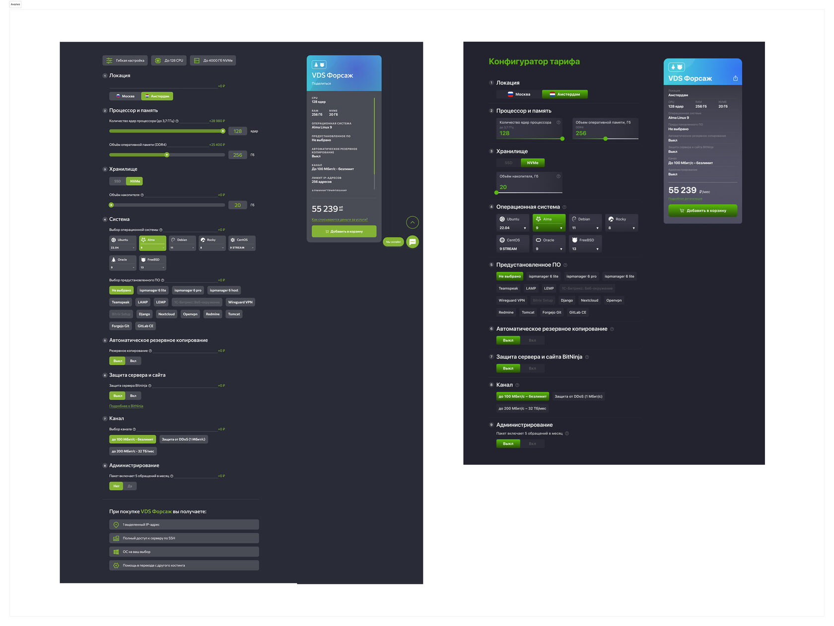
Redesign of interface widgets for two projects: the «Top Winners» leaderboard with updated typography and color treatment, and a plan configurator for a website — a prototype with sliders, toggles, and cost calculation.
Why change a logo design? A company’s logo needs to be refreshed and refined to keep pace with the trends and realities of the modern world. Global, large, and mid-sized companies rebrand or redesign their identity so that consumers, partners, and competitors always see a dynamically evolving company. 5–10 years is roughly the period after which an existing identity system needs to be updated and presented in a new or refreshed style.
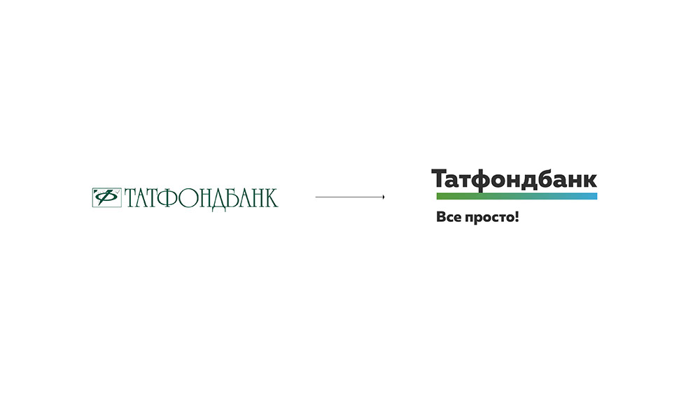
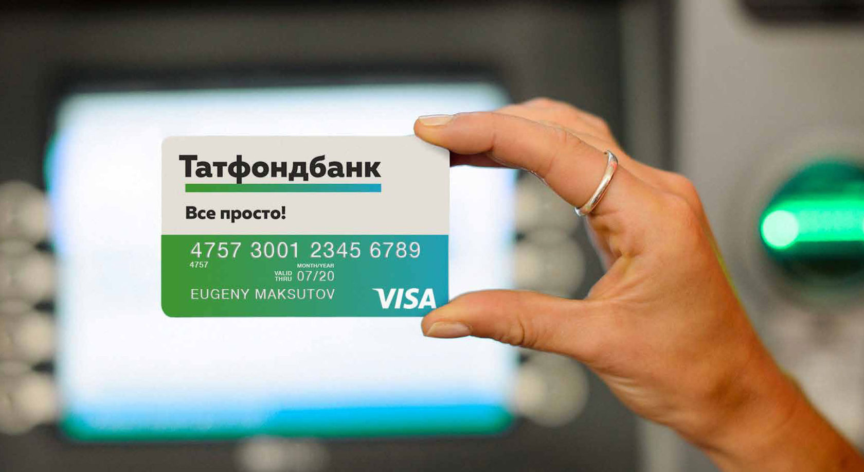
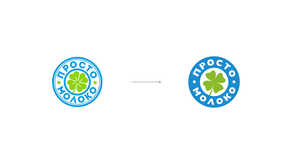
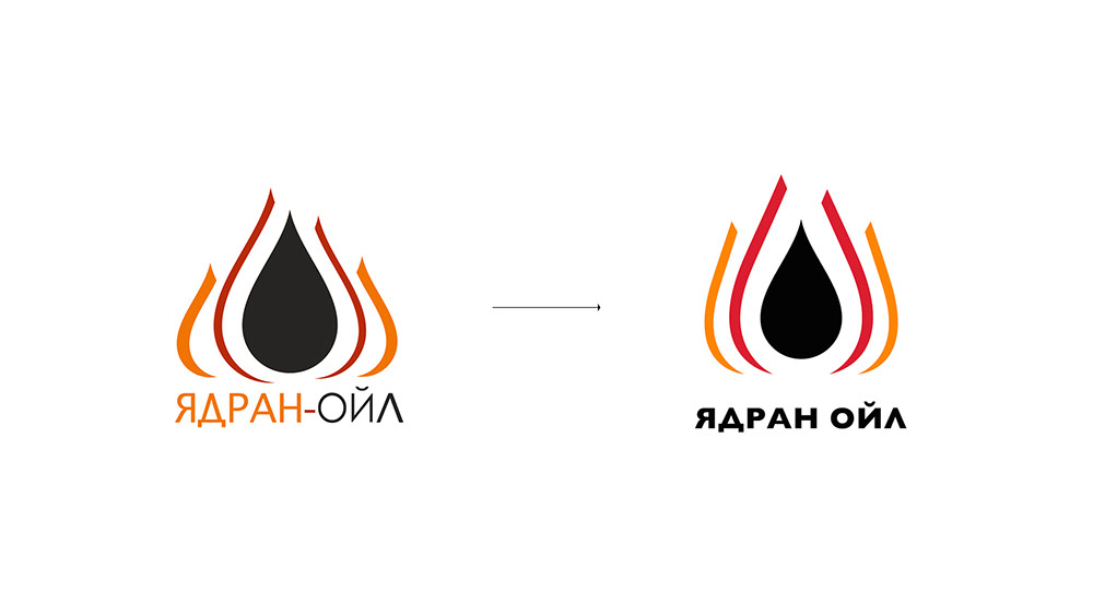
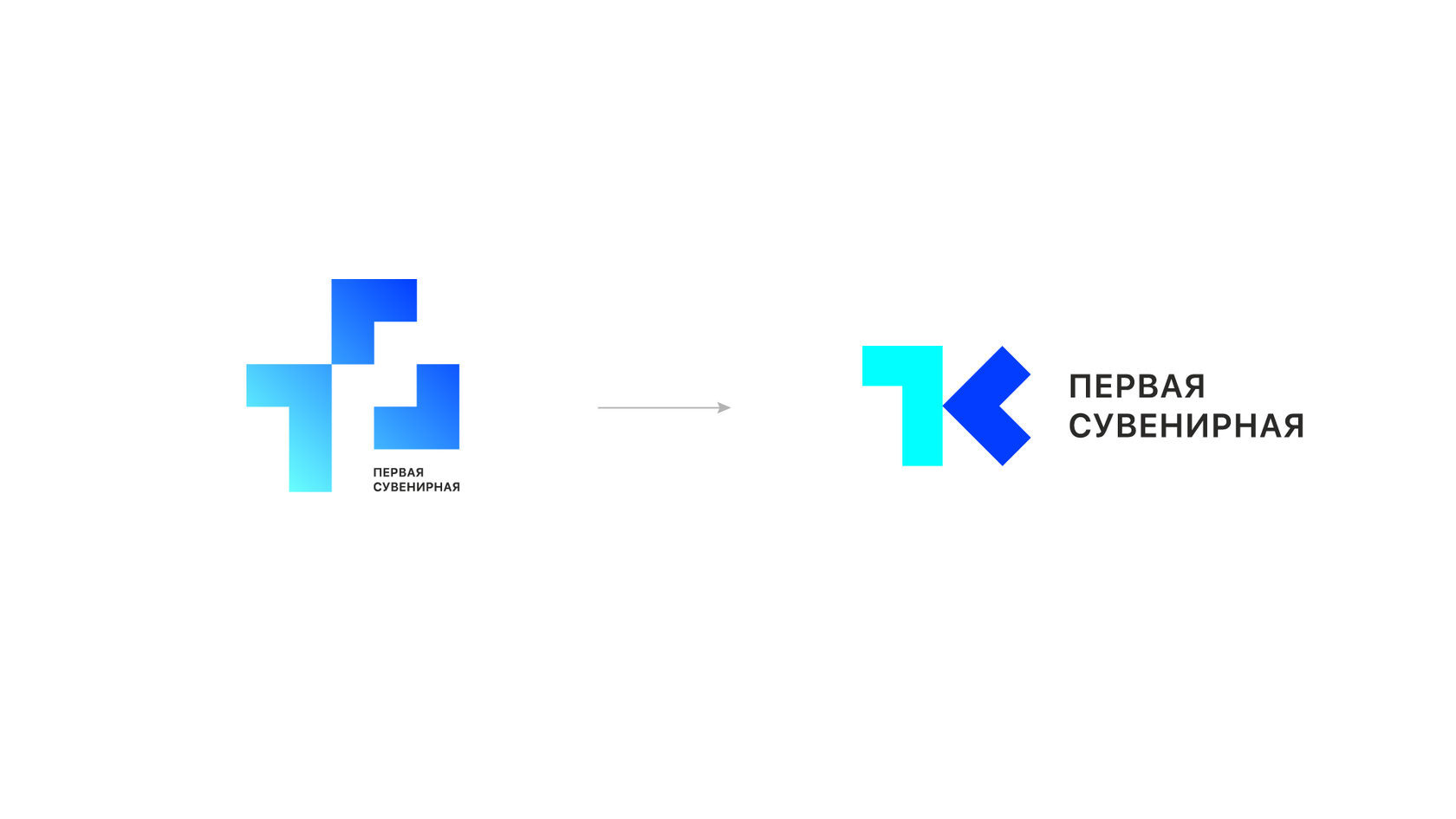
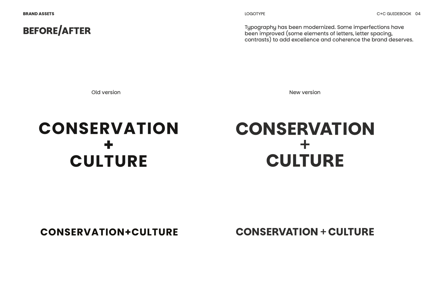
«Before/after» examples: the Tatfondbank logo (simplifying the mark and switching to a solid plaque with a green-and-blue stripe), the «Prosto» dairy brand (a denser, more legible mark on packaging), the «Jadran-Oil» oil company (unified name lettering and cleaner graphics for the drop with flames), the «Pervaya Suvenirnaya» logo (a concise geometric mark replacing a compound one), and a typography update for the C+C brand book — refining the letterforms, tracking, and contrast so the typeface better conveys the brand’s character.

Still-life photo shoot of ice cream and tea.








Photographer Maria N. Art director Evgeny M.
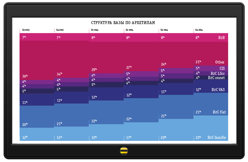
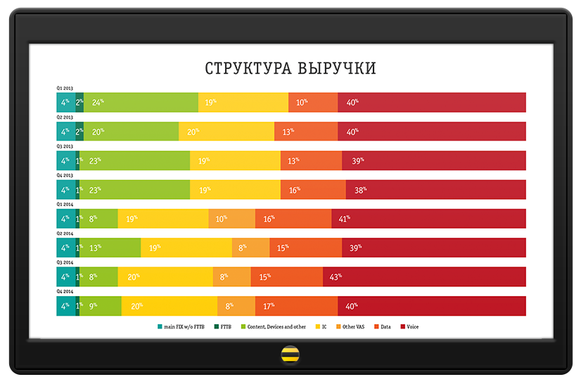
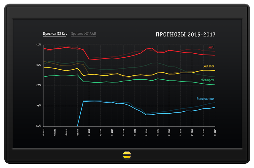
Advertising graphics for Beeline.

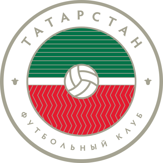
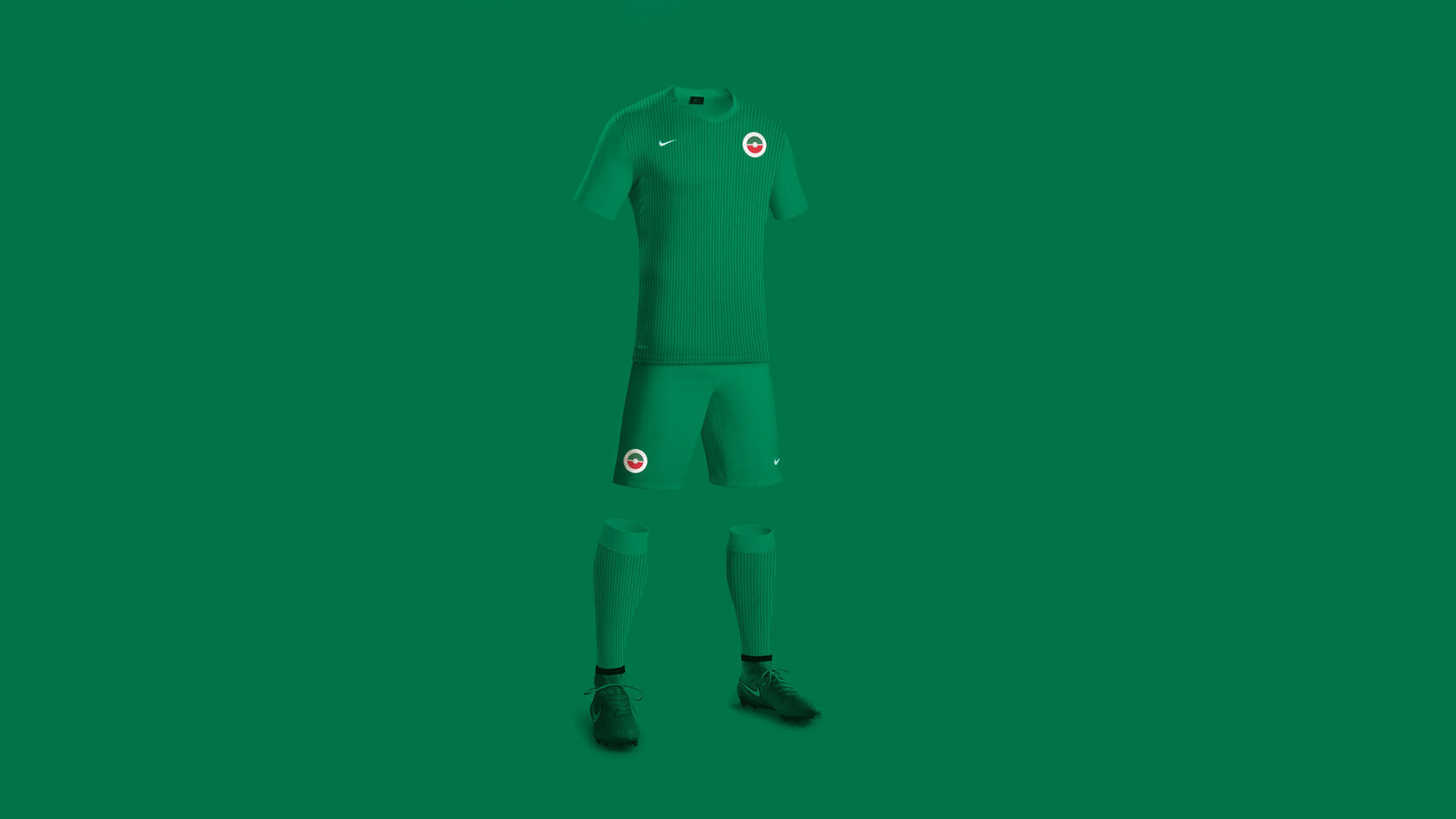
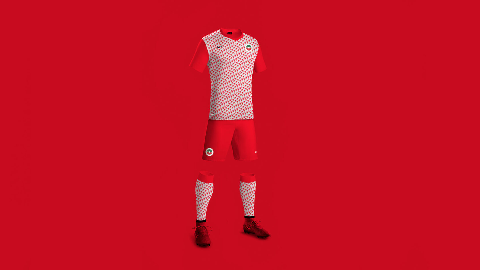
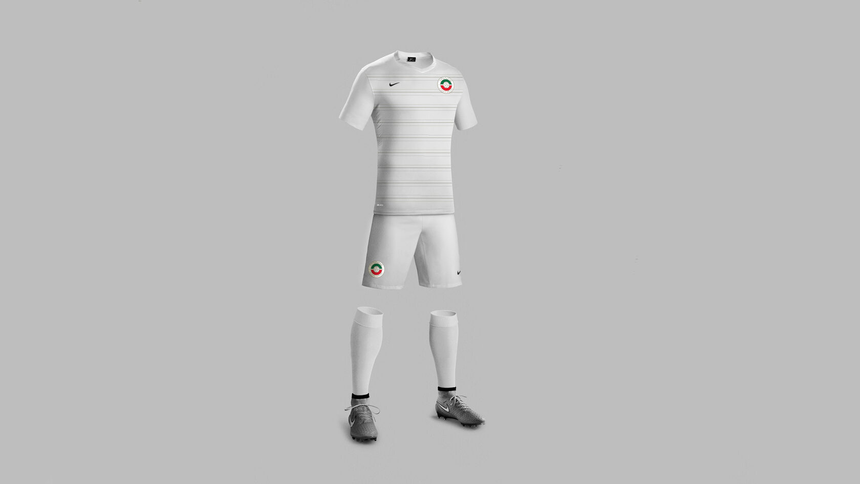
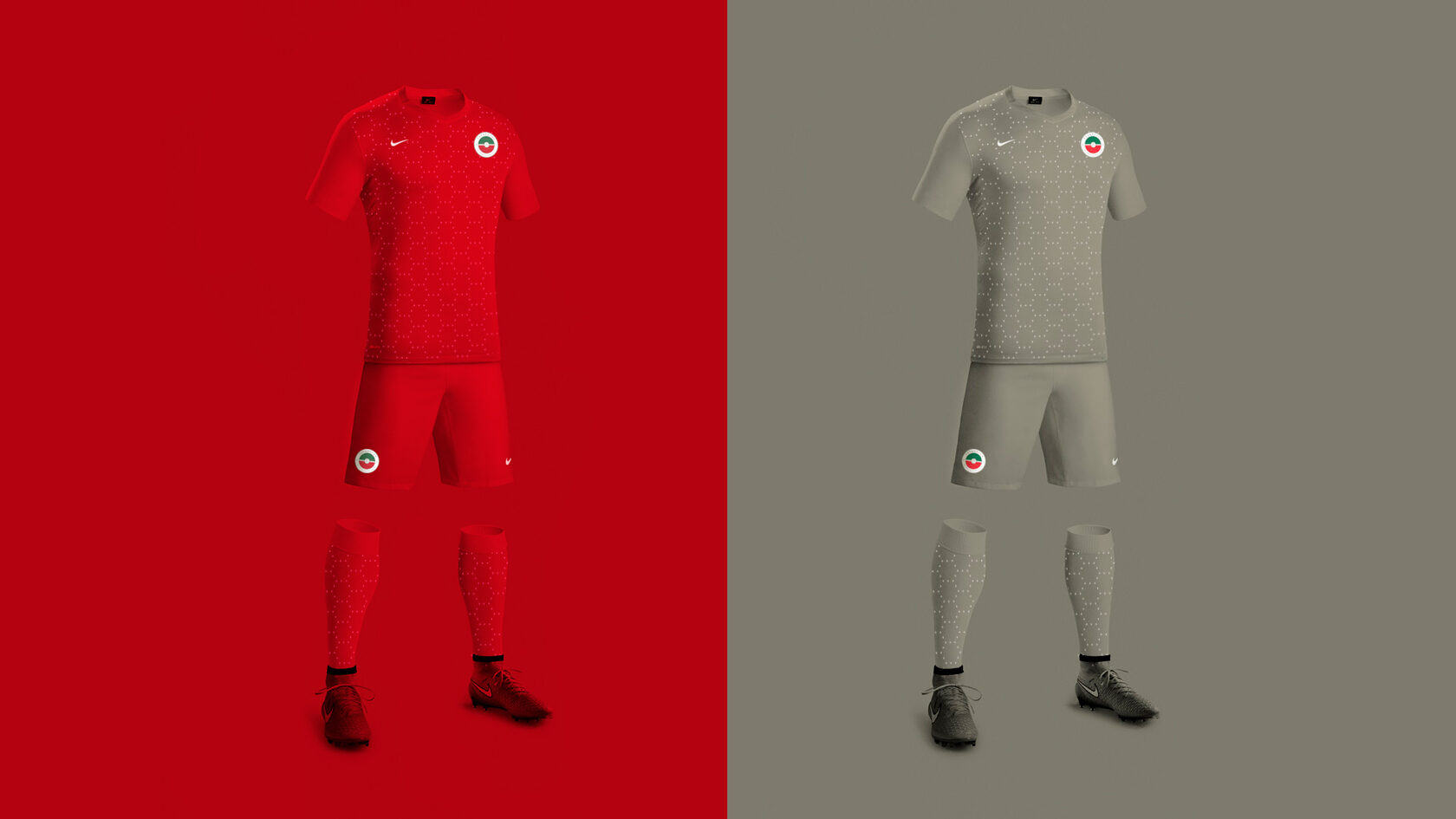
Crest and kit sets for the football club FC Tatarstan: home, away, friendly-match, and goalkeeper kits.
Home kit
Away kit
For friendly matches
Goalkeeper kit
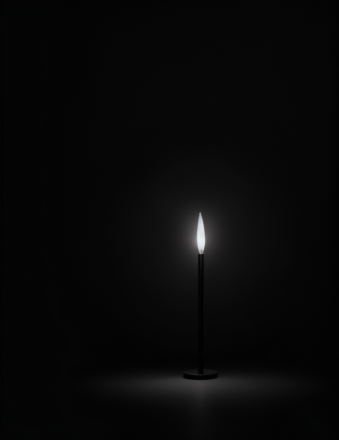
A night light concept shaped like a smoldering candle in the dark.
Uniform design for Pobeda Airlines: a flight attendant’s dress in the brand fabric with a bright trim.
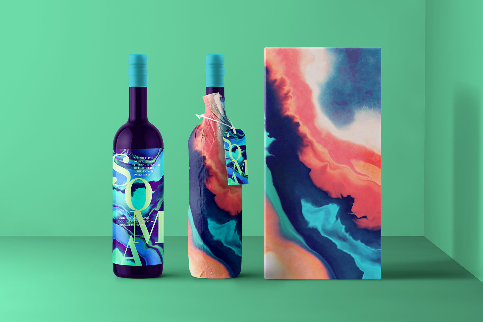
Packaging design for Soma wine: an abstract painterly label on the bottle and the gift box.
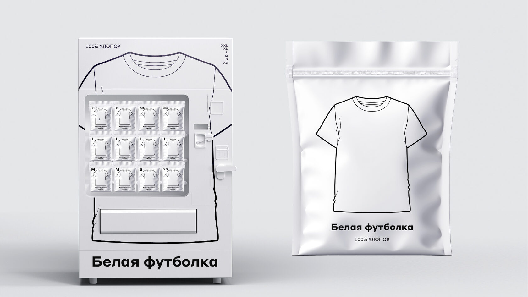
A concept for a vending machine selling 100% cotton white t-shirts in individual vacuum packaging.
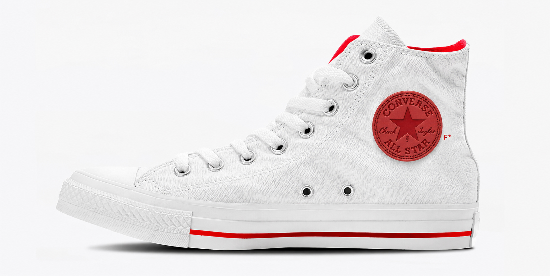
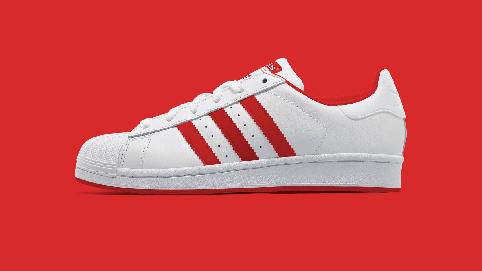
Sneaker design with a branded accent trim.
The uniqueness of the «Black Lake Park» brand lies in reviving, adapting, and developing its original cultural and historical tradition. The park is known to have been one of the main gathering places for the people of Kazan, drawn there by the music playing.
A brand concept built on a foundation of music will make it a genuine object of world cultural significance. A fusion of «timeless classics,» national rhythms, and contemporary musical styles and genres will shape a positive brand image that draws attention not only from the people of Kazan but from people all over the world.
Mission. Here, cultural events and public leisure appear as they should be.
Goal. Black Lake Park is an iconic venue known around the world.
Values. To preserve historical traditions and cultivate the cultural upbringing of society.
Character. Music is timeless — it sets the rhythm of life, educates, imparts knowledge, and expands and transforms consciousness. Music is absolute; it possesses every quality of character, free and independent.


«Music can create harmony and comfort wherever it plays.» Every day, the music here begins at daybreak. Respected music critics, art scholars, the creative elite, journalists, other authoritative figures, musicians, and many more all take part in shaping «Black Lake»’s musical programming.
Thanks to a carefully engineered sound system, sound will spread softly and evenly across the entire surrounding area and beyond, drawing in ever more visitors. Anywhere in the park, guests will be able to fully enjoy rich, high-quality sound. But… «Black Lake» is not simply a place where music plays. It’s a place where musical events of a truly unique lineup take place.
«Kazan High Music Week.» Russia’s first annual neoclassical music festival: the festival’s uniqueness lies in its lineup of participants. Here, legends and contemporary geniuses of the genre can gather together at the same time. A carefully curated lineup will attract enthusiasts not only from across Russia but from neighboring countries as well. Potential: the festival becomes iconic after its first season. Stage: the Lake.
«Only once a year, all together in one place.» «Guitar Days» in Kazan: an open, free festival that anyone who plays guitar can join. Thanks to careful selection of entries, the festival’s musical lineup will be both professional in character — with every guitarist able to show what they can do — and a platform for discovering new names. Here you’ll be able to hear the most intricate Spanish flamenco runs, melodic ballads and singer-songwriter tunes, and the energetic, popular, contemporary riffs of electric guitars. And what festival would be complete without world-famous stars? Potential: the festival becomes iconic after its first season. Stage: the Amphitheater.
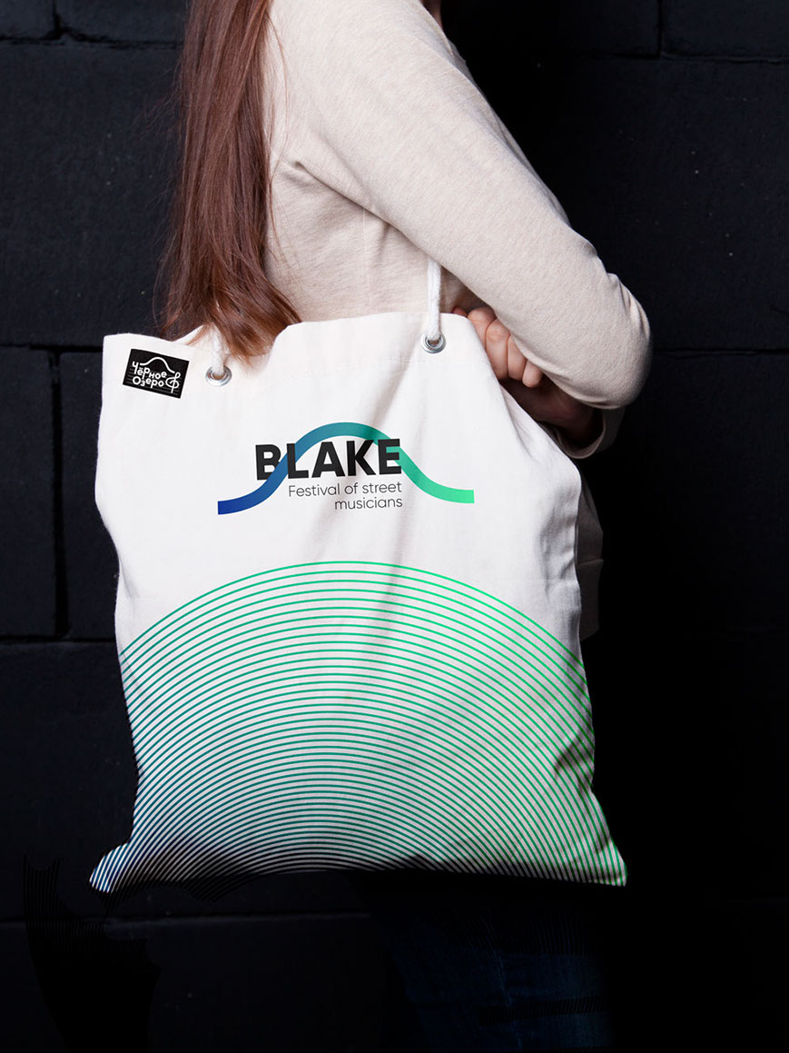
«Blake + Lake = Blake.» The «Blake» street musicians’ festival. Potential: the festival becomes iconic after its first season. Stage: Central Square.
«Nota.» The «Nota» children’s musical creativity festival helps discover new talent and draws attention to children’s creative work. Stage: the Amphitheater.
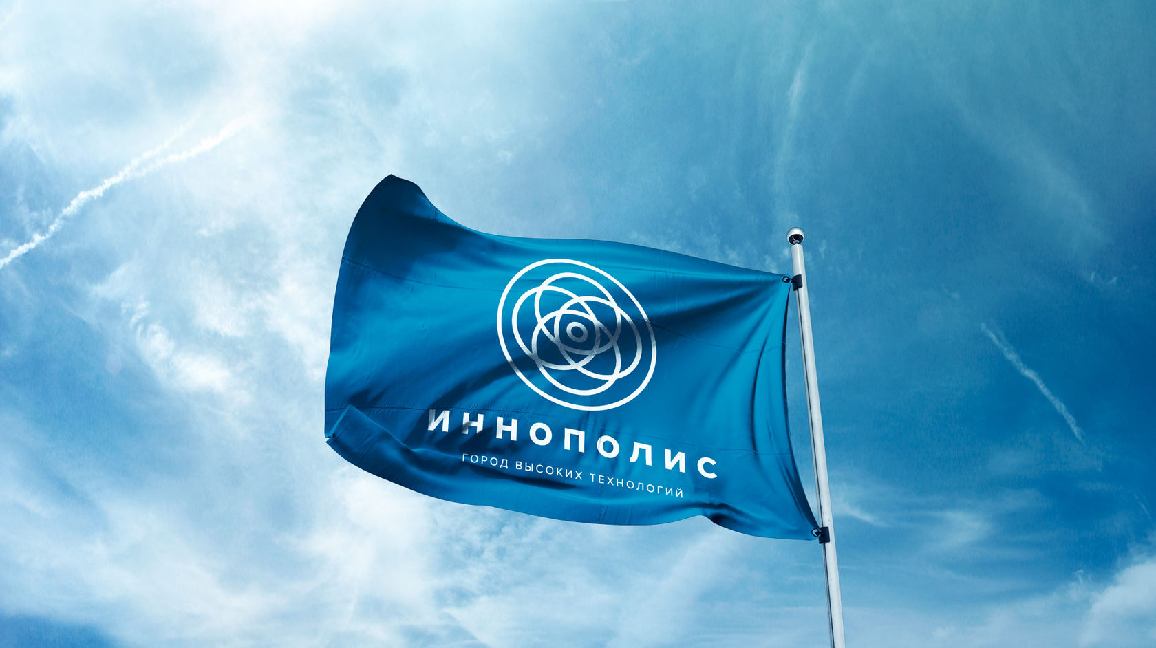
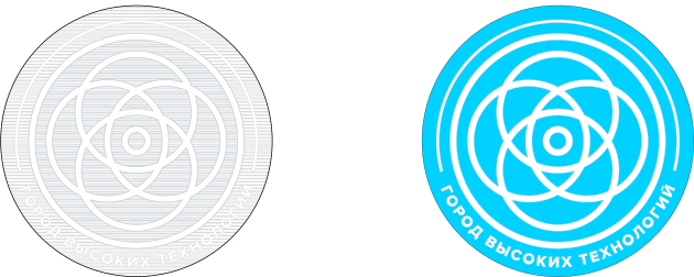
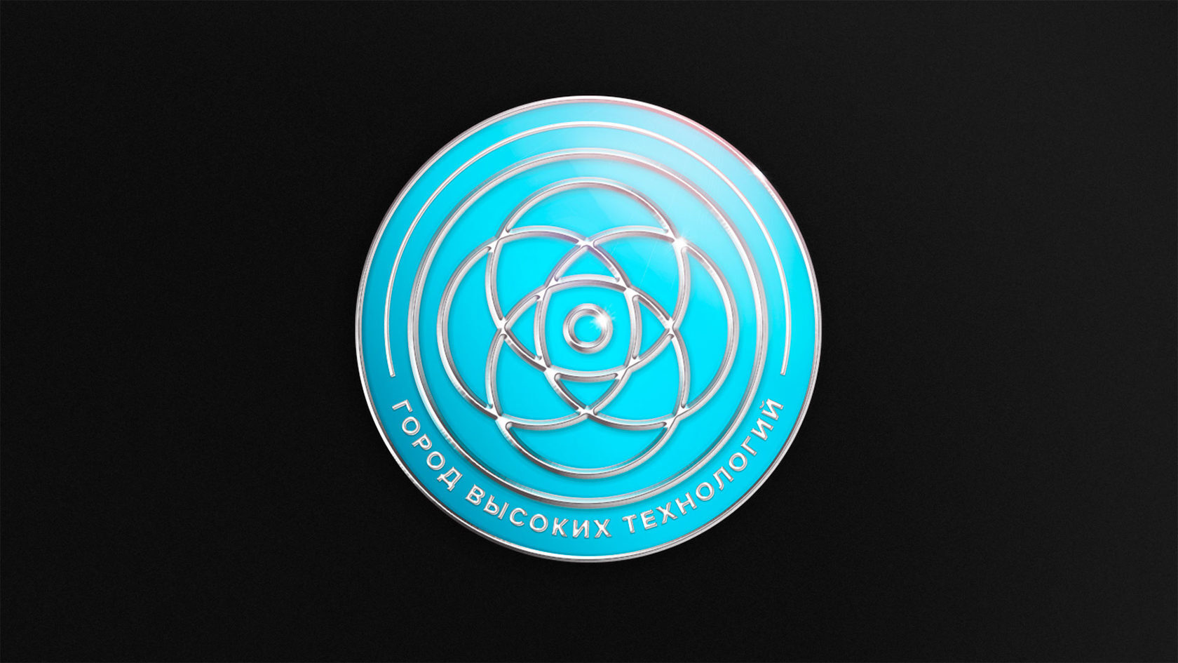
The basis for developing the coat of arms and emblem of the city of Innopolis was personal observation and research, as well as scholarly articles by Mikhail Yuryevich Medvedev, chairman of the Guild of Heraldic Artists.
Functions of a coat of arms. The main functions of a coat of arms are representative (ceremonial), legal, and identifying — but it’s the role of the coat of arms as an identifying mark that is key. A coat of arms must be recognizable, so we can conclude that it can be executed using simple graphic techniques.
Foundation of the coat of arms. The foundation of the coat of arms should be a heraldic shield. The shield’s shape was determined based on two factors: a functional-graphic one (a circle is the simplest geometric shape) and a historical one (Tatar-Mongol warriors carried round shields, a fact confirmed by numerous archaeological finds), as well as a continuity factor — the round coat of arms of the Republic of Tatarstan.
Content of the coat of arms. A coat of arms shouldn’t try to reflect every local feature, as that results in an overloaded composition that resists reading. A coat of arms is created for the ages, while traits such as production structure or territorial boundaries can change radically within a few years. Since Innopolis is a special zone that calls itself a «City of High Technology,» the coat of arms should depict not progress — which grows and becomes obsolete every day — but fundamental knowledge, which underlies the structure of the entire world: perhaps something eternal.
Symbolism. «In socially symbolic systems as actually practiced, a symbol is very often not a thing referring to consciousness (let alone a thing referring to a thing), but an inner phenomenon of consciousness; and in systems with as high a degree of symbolic abstraction as heraldry, this understanding of the symbol dominates completely.» «What matters is that it is consciousness itself that makes a symbol ‘ideal’ or ‘not ideal.’ For one person, given their erudition, imagery, and habits of thought, a swan signifies creativity; for another, purity; for a third, hypocrisy; for a fourth, the Prussian monarchy; for a zookeeper, a swan might turn out to be the ideal symbol of their daily routine. The swan itself, in a certain sense, has nothing to do with any of it.» © M. Yu. Medvedev
Result. «The only true standard of a coat of arms is its heraldic description (blazon). A pictorial standard is not permitted.» © M. Yu. Medvedev. Taking into account Mikhail Yuryevich’s scholarly observations and the core components identified for the coat of arms, and after analyzing the symbolism and introducing a certain sacred-fundamental symbolism, the result was a system of circles carrying the meaning described below.
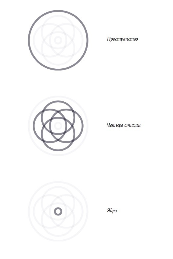
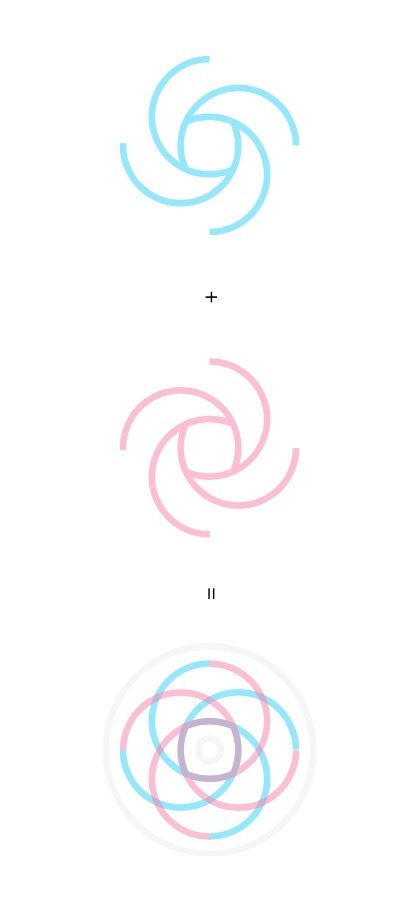
Sacred content. The fusion of two elemental systems into a new, unified system of life, where the masculine principle joins the feminine. It symbolizes the union of two lineages for the development and continuation of offspring.
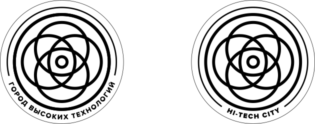
Color. The single-color heraldic rendering and the color scheme.
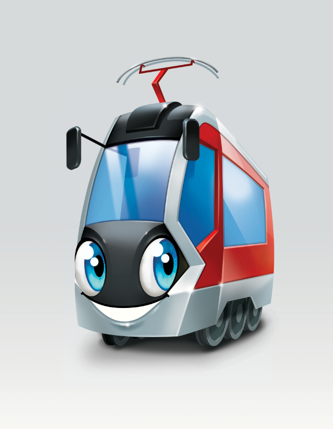
A character for the Nizhnekamsk tram depot.
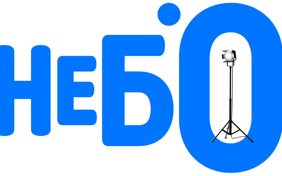
The logo is built around the photographer’s main tool.
The logo is recognizable at both very large and very small sizes, and even when it’s out of focus.

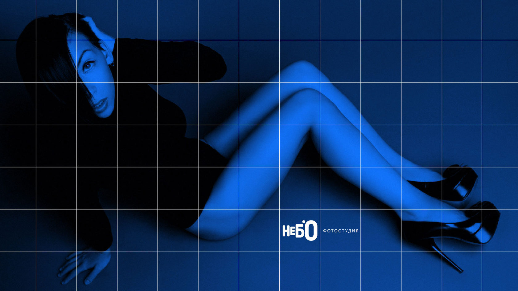
A universal grid was also developed for placing the logo on photographs. The main rule: place the logo in the open space of the photo, using this grid.
A universal grid for placing the logo on photographs: the logo is positioned in the open space of the frame.
Developing logo concepts for the Sjaj brand: situation analysis, direction-finding, and working through mark variants — a full 30-slide presentation.
Positioning and naming for the «A+» office center: a full 21-slide presentation — from analysis to the final mark and the name’s lettering.
Next